Concept work · Brand Creation
26 North
You have owned a boat before, and you remember the eleven months a year it spent waiting for you.
- Category
- Private members' fleet
- Scope
- Naming, identity, fleet system, burgee, crew
- Fleet
- Six vessels, ninety members
The situation
They have all owned a boat. They remember the eleven months it sat there.
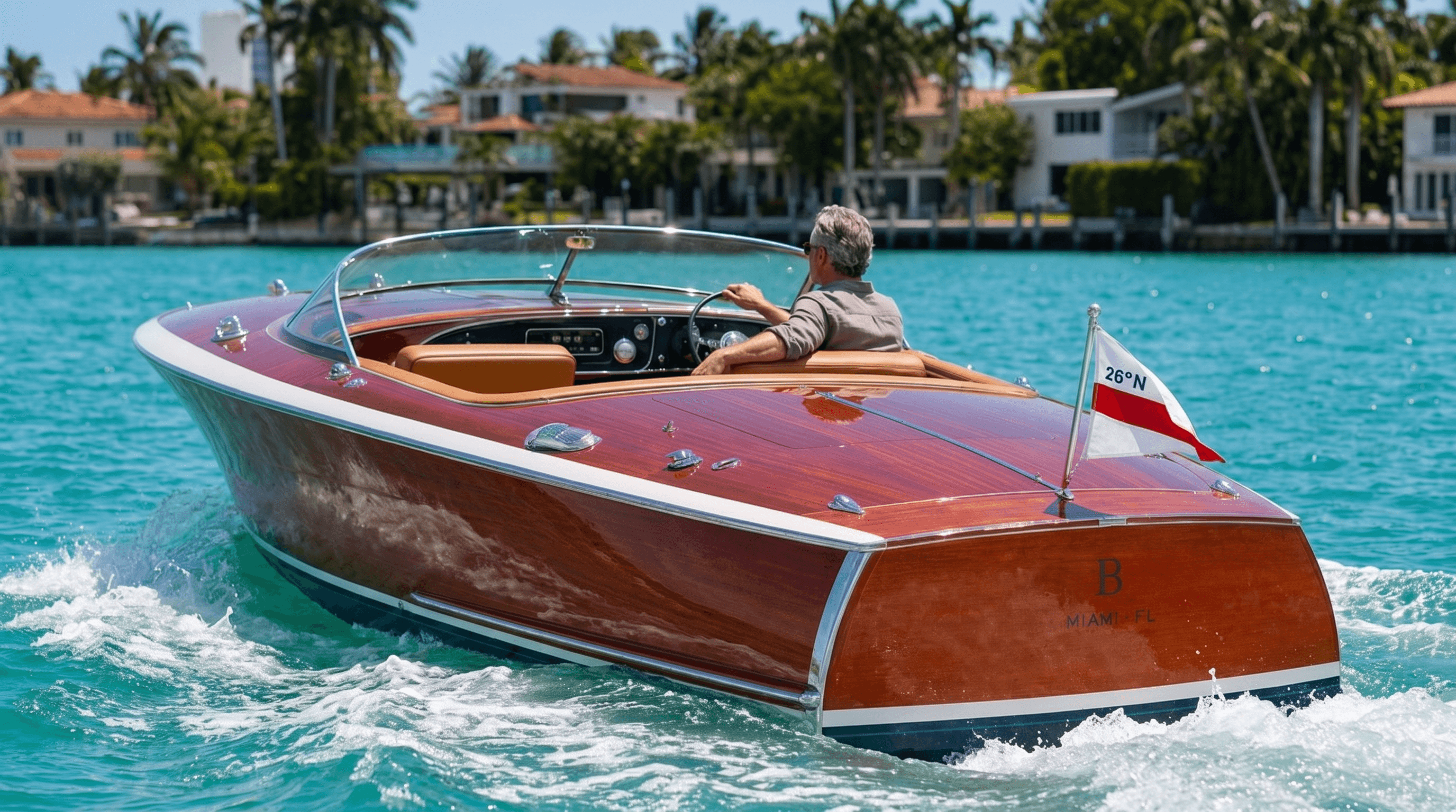
A private fleet on Biscayne Bay, offered by membership rather than ownership. The members are not new to this. Most have owned before and remember what it cost them, which is not the purchase price but the eleven months a year the thing sat unused while somebody billed them for keeping it that way. What they wanted back was the twelve good days, without the rest of it.
The enemy
A DJ booth on the flybridge, and anyone with a credit card can book it.
Miami charter at this size is a rental business wearing a luxury costume. A vinyl-wrapped eighty footer, a name in gold script across the transom, a DJ booth on the flybridge and a slide off the back at the sandbar. It is available to anyone with a credit card, which is precisely the problem, because the entire proposition of a private fleet is that it is not.
The position
The only fleet in Miami chosen the way you would have chosen it yourself, for people who have owned a boat and would rather never do it again.
Identity
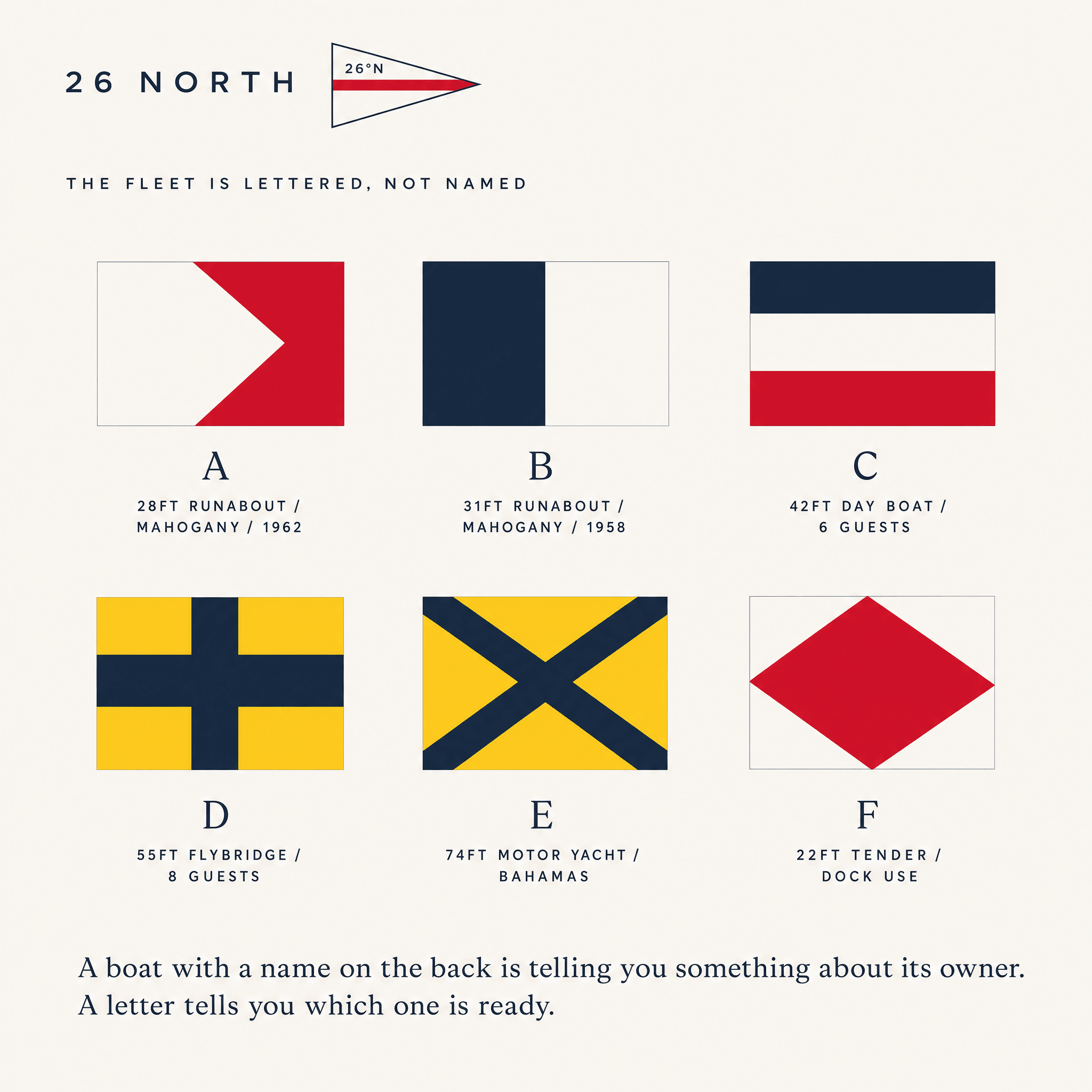
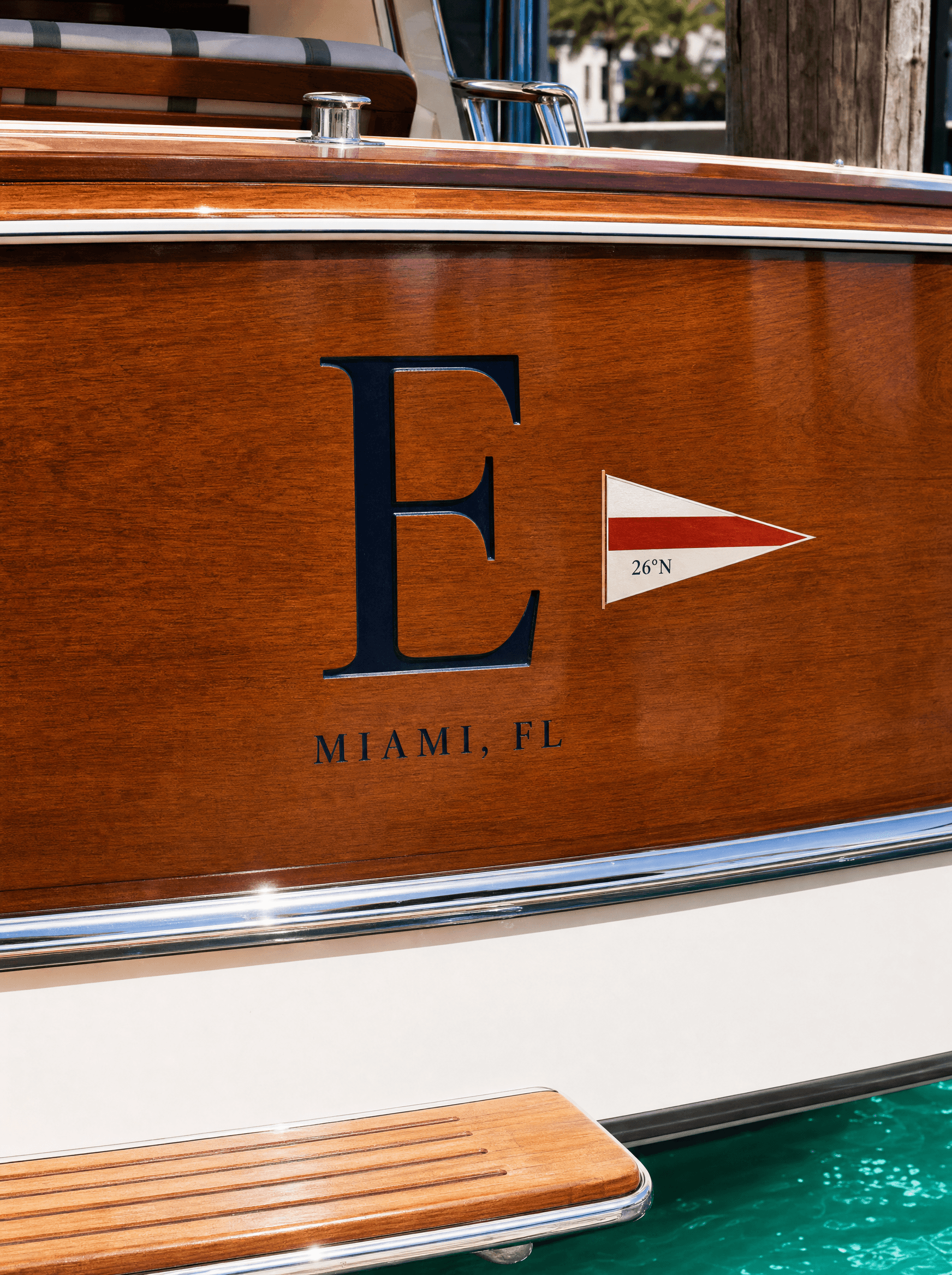
The fleet is lettered, not named
Every vessel carries a single engraved capital and its own signal flag. No names. A member books B for Thursday, and the crew know which boat that is before the sentence finishes. It solves three problems in one decision: it refuses the gold-script convention outright, it gives ninety members a shared shorthand, and it lets one identity survive being applied to a twenty-eight foot mahogany runabout and a seventy-four foot motor yacht without redrawing anything.
Colour
White and wood, with one flag colour
Gelcoat white and varnished mahogany carry almost everything, taken directly off the boats rather than chosen for a palette. Signal red appears only in the burgee and on the flags, which means the one saturated colour in the system is also the one element that has a job. Nothing in the identity is navy-led, because navy is what every marine brand in the category already reaches for.
Typography
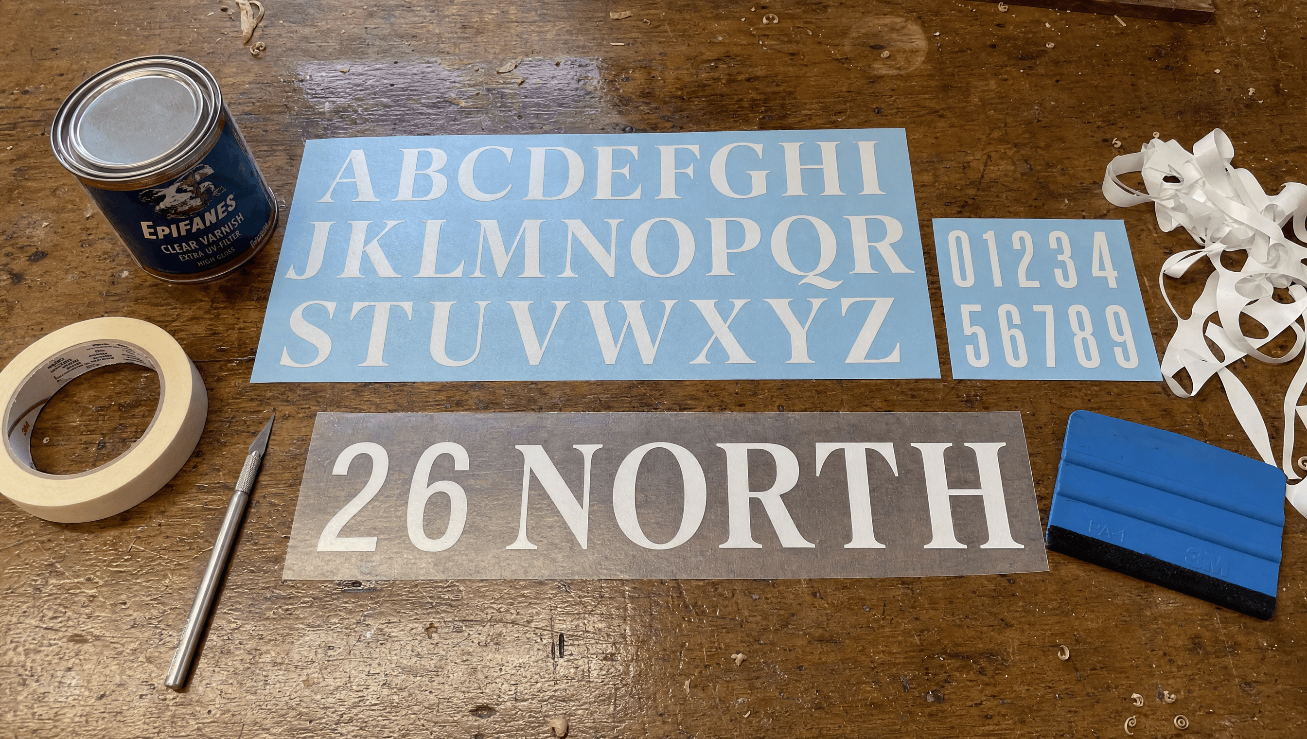
The serif is reserved for the letter
A formal engraved serif is used for the vessel letter on the transom and for nothing else in the entire system. Everything a member actually has to read at speed, meaning departure times, dues, crossing dates and slip assignments, is set in a plain grotesque. Reserving the serif for the one permanent physical thing is what stops it becoming decoration.
Application
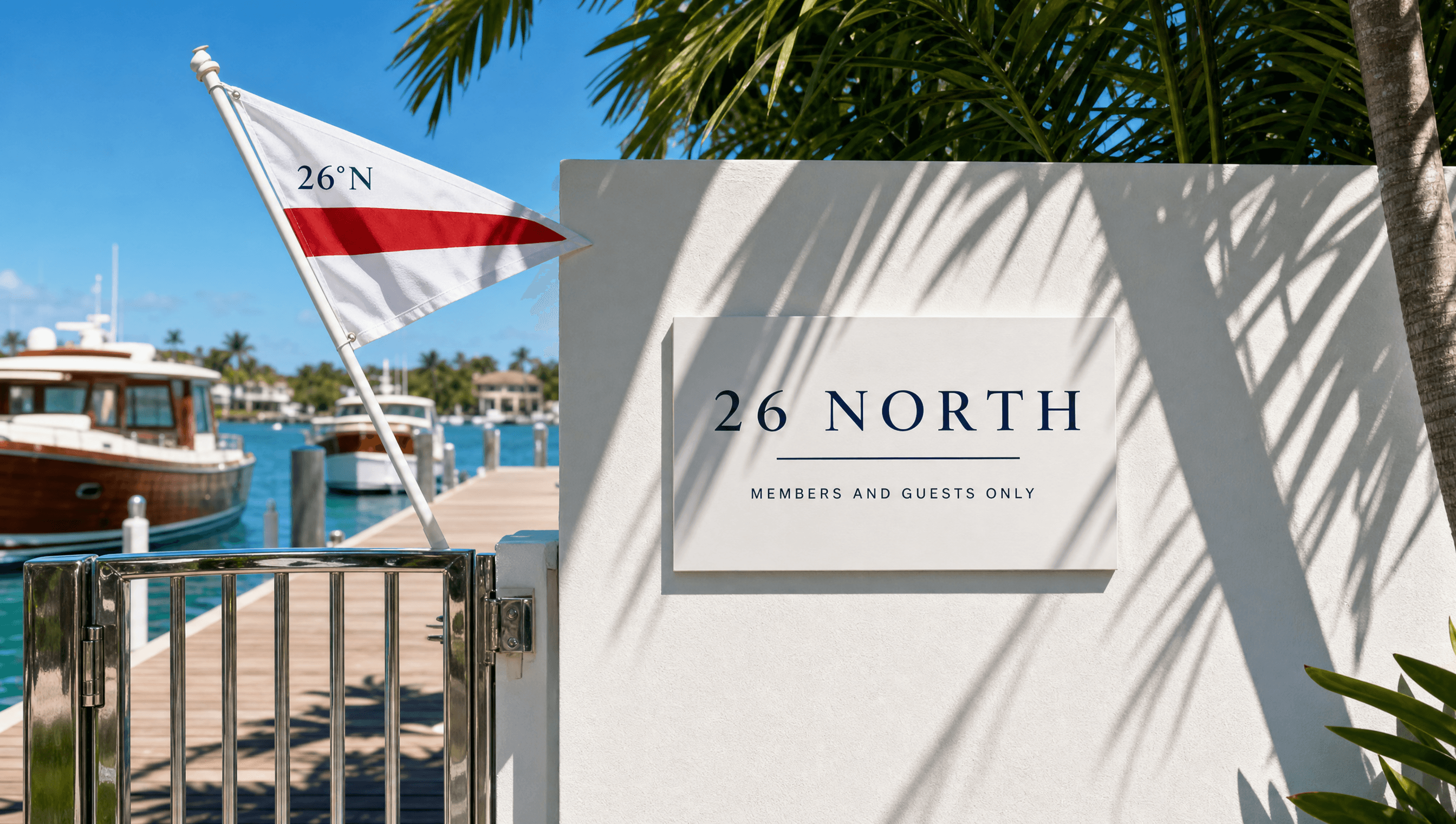
The burgee introduces the member before the member does
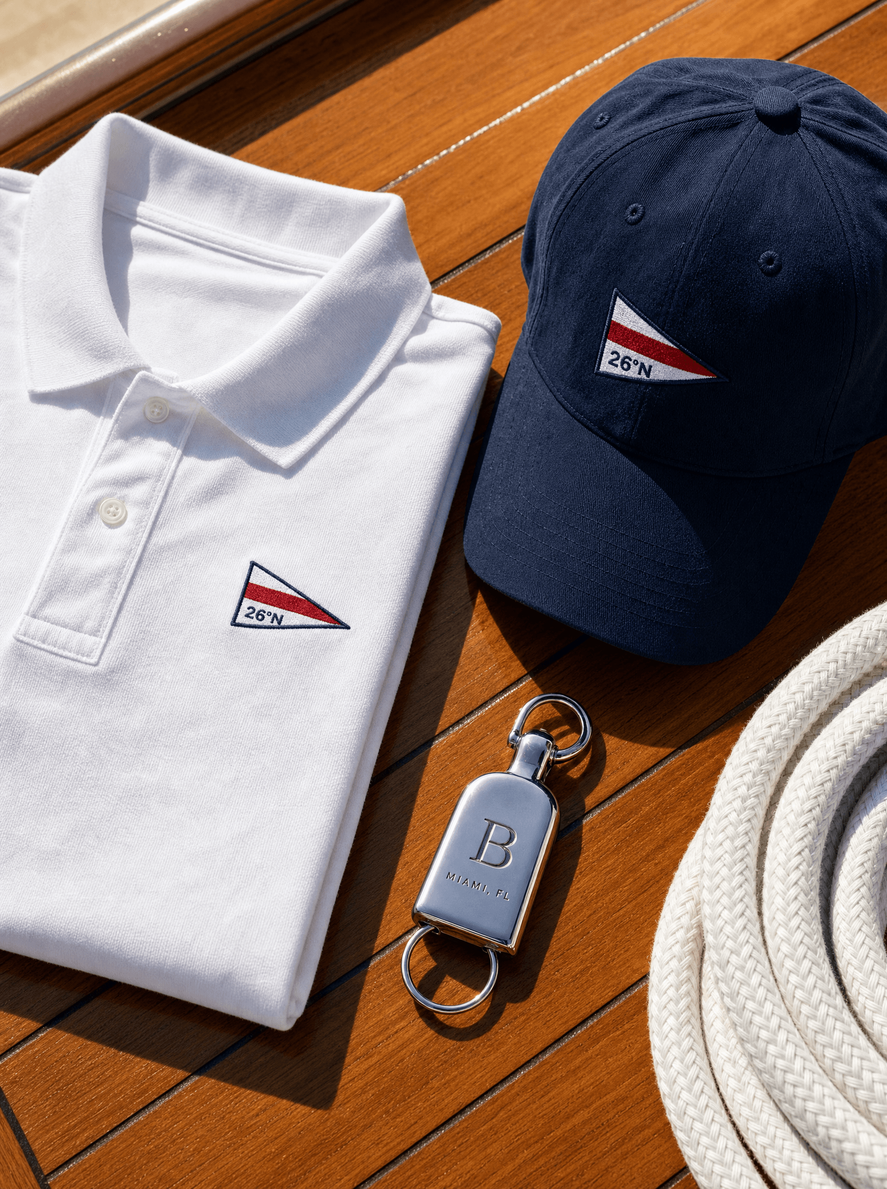
A burgee is the oldest working instrument in club identity and almost nobody treats it as a design asset any more. Here it is the primary mark: flown at the stern, painted on the transom, embroidered on crew kit, mounted at the dock gate. It is the one element that appears on every surface the club touches, and it is legible at four hundred metres from another boat, which is the only distance that matters on the water.
Palette
Gelcoat
#F4F2ED
Mahogany
#7B3B22
Signal Red
#C8102E
Ink
#16202A
Bay
#2E7D74
Voice
Members and the water, since 1931.
Every vessel was chosen by a member who had owned one before.
A boat chosen badly is a weekend spent apologising for it.
There is no slide. There will not be one.
Crossings depart Thursday. They return when the weather says so.
Club formality with the certainty of an institution that has already decided. Longer sentences than anything else in the portfolio, and comfortable refusing things outright. It never sells, because a club that sells is a club with vacancies.
Typefaces
Engraved Serif
The vessel letter, and nothing else
Grotesque
Dates, dues, departures
Credits
Kyle C., Brendan Forbes
Strategy, identity and art direction
Next
Fenwick