
Concept work · Brand Creation
Fenwick
Every house closes at two.
- Category
- Private members' club
- Scope
- Naming, identity, brand language
- Market
- Second location
The situation
Open a second room the usual way and the membership stops meaning anything.
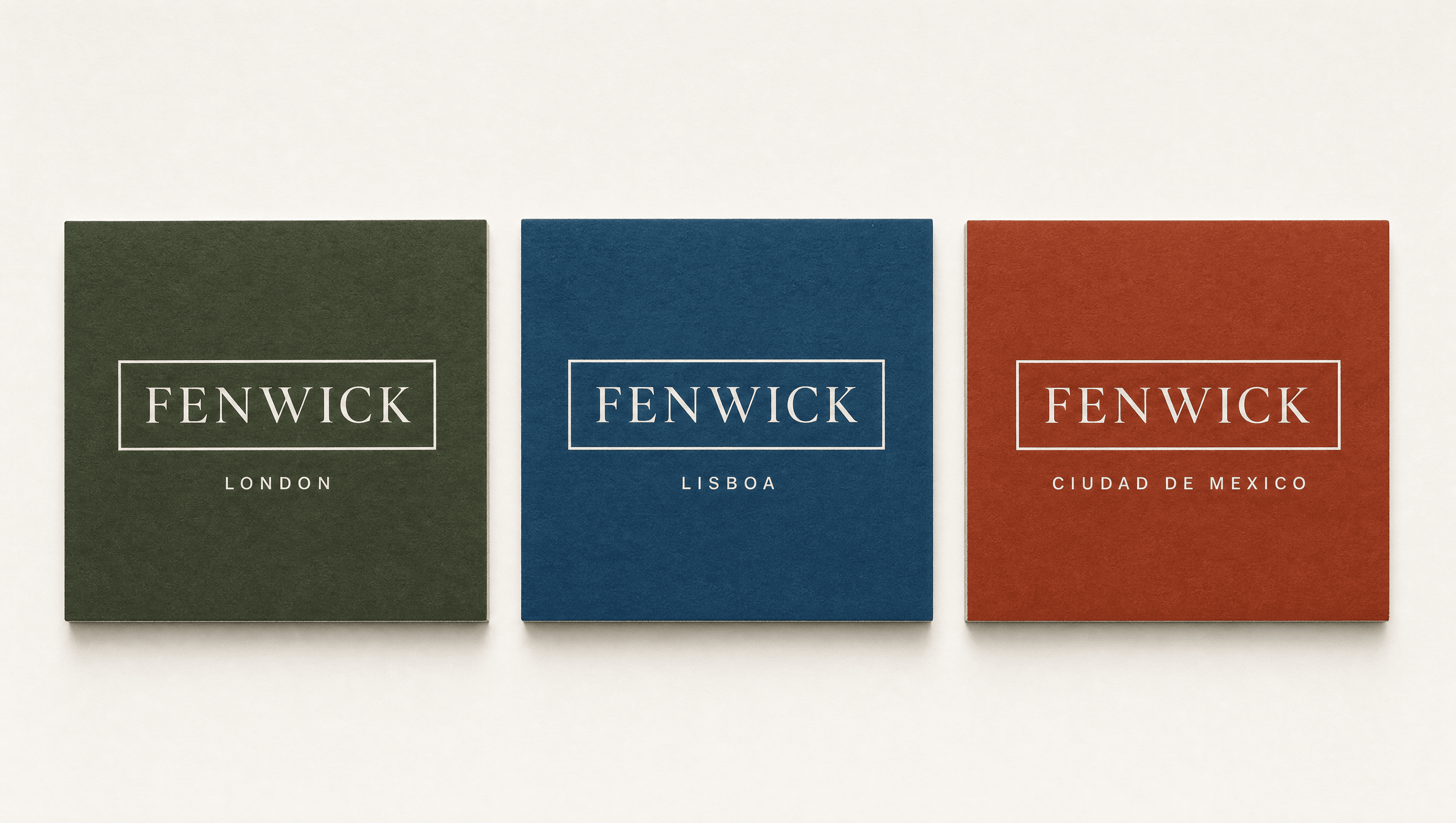
A private club opening its second location, in a city that already has three creative-industries clubs indistinguishable from the one in London. The founders wanted the second room to belong to its city, and were unwilling to buy growth by exporting a format.
The enemy
The same room, the same menu, the same chair, in every city.
The exported-everywhere club format: identical room, identical menu, identical furniture, city to city. It scales beautifully and it is the reason a membership stops signalling anything. The identity is built out of the city it stands in, so there is no format to export.
The position
The only private club whose interior and programme change with the city, never a global format dropped into a new postcode.
Identity
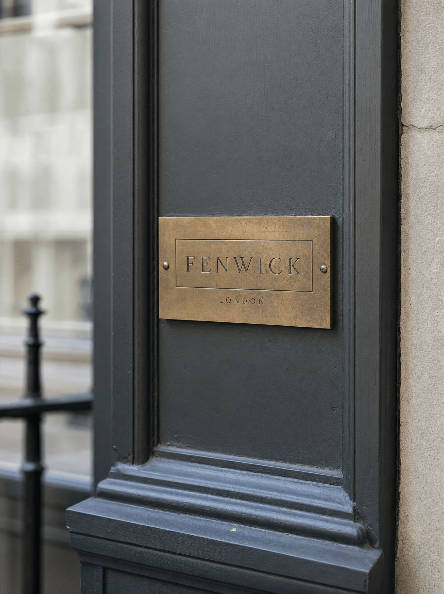
A frame that holds a city
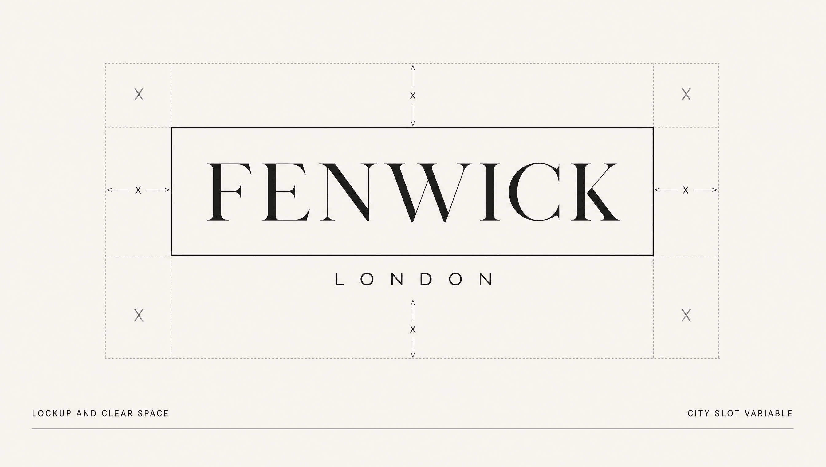
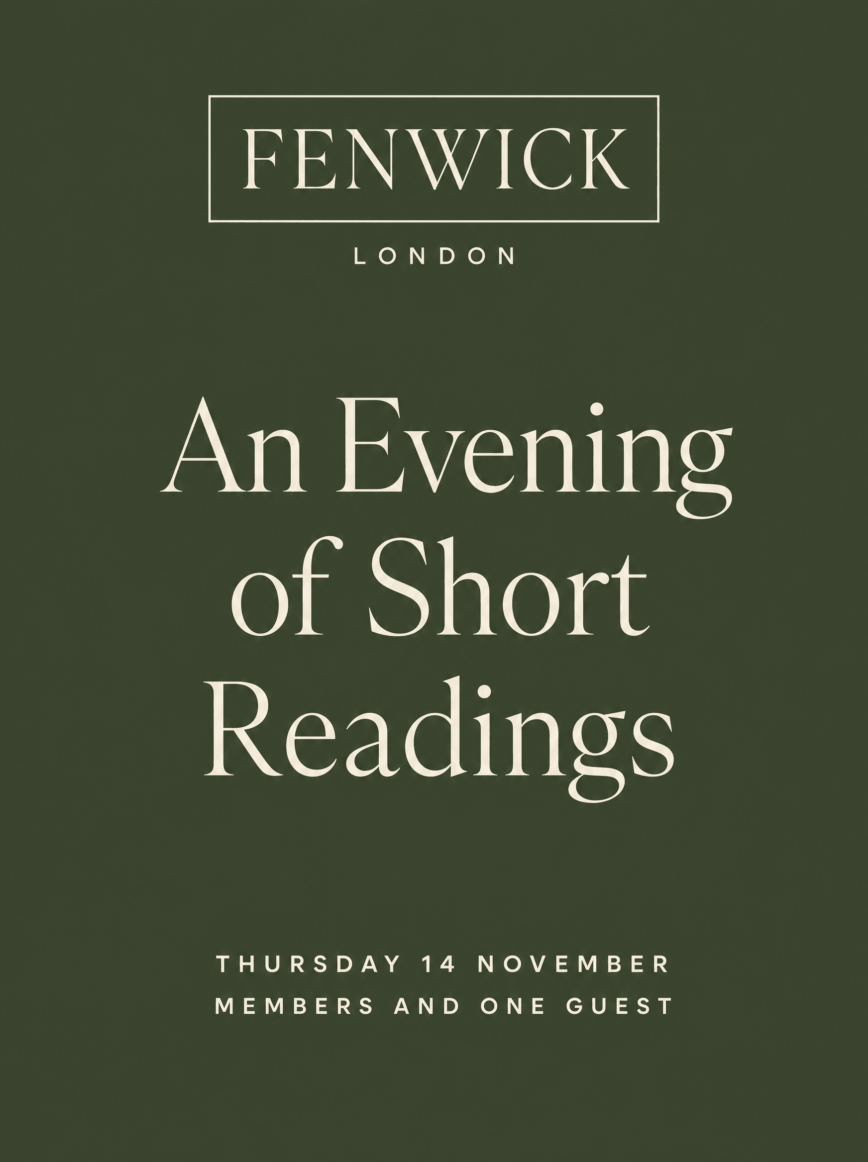
The identity is a fixed rule-drawn frame with one variable slot. The frame, the typeface, and the proportions never change. The city name inside it and the accent colour around it always do. It is a small idea that makes the strategy legible in about a second, which is the test a lockup has to pass.
Colour
One accent per city, drawn from that city
Ink and bone are constant. Each location contributes one accent sourced from its own material history: moss from London's park railings, azulejo blue from Lisbon tile, oxide from Mexico City volcanic stone. A new city cannot be opened without doing that research, which is the point. The colour system enforces the positioning.
Typography
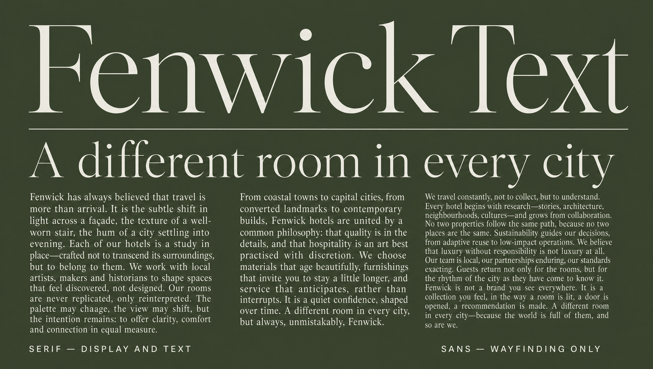
Serif leads, sans does the plumbing
The serif carries display at large sizes and does almost all the talking. The sans is restricted to wayfinding, membership terms, and small print. Inverting the usual ratio is what makes the club read as an institution with a house voice rather than a hospitality brand with a marketing department.
Application
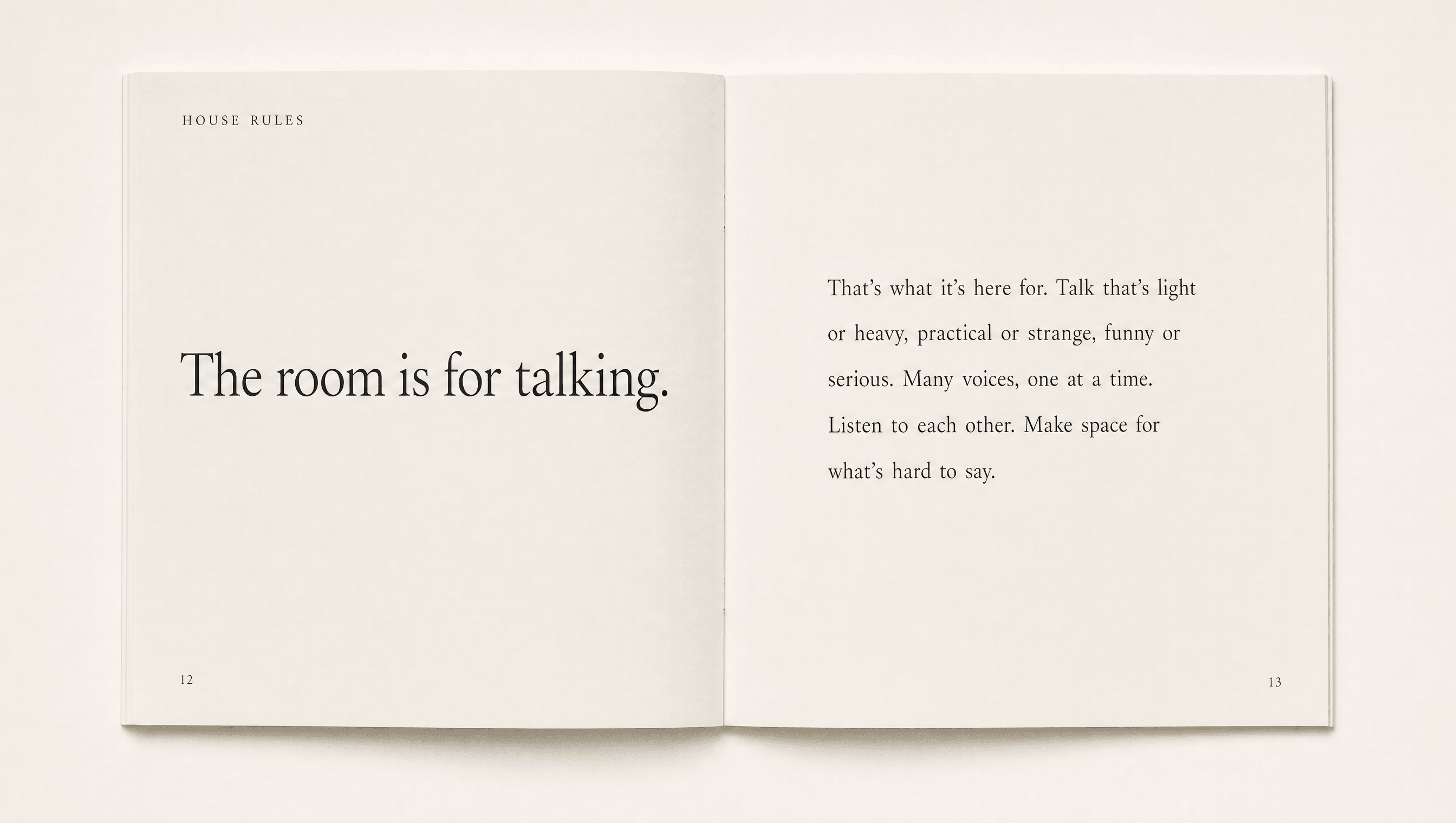
House rules written as a position, not a policy
The membership kit is printed locally in each city, on stock chosen there, by printers briefed rather than templated. The house rules document was rewritten from a list of prohibitions into a statement of what the room is for. Members read it once and can repeat it, which is the only test a governing document has to pass.
Palette
Ink
#1A1A18
Bone
#F2EFE9
London Moss
#3F4A32
Lisbon Azulejo
#2E5A78
Mexico City Oxide
#9A3B24
Voice
Members and their guests.
The dining room closes at eleven.
Jackets in the upper rooms.
Telephones are not used in the reading room.
The rules are posted at the stair.
An institutional notice with the wit removed. It states hours, permissions and prohibitions in the flattest possible register and never explains itself, because explaining is a form of asking. This is the only voice in the portfolio with no personality at all, and that is the personality.
Typefaces
Portrait Text
Display, leading voice
Graphik
Structure, wayfinding, small print
Credits
Kyle C., Brendan Forbes
Strategy, identity and art direction
Next
Dunnage