Concept work · Brand Creation
Advance
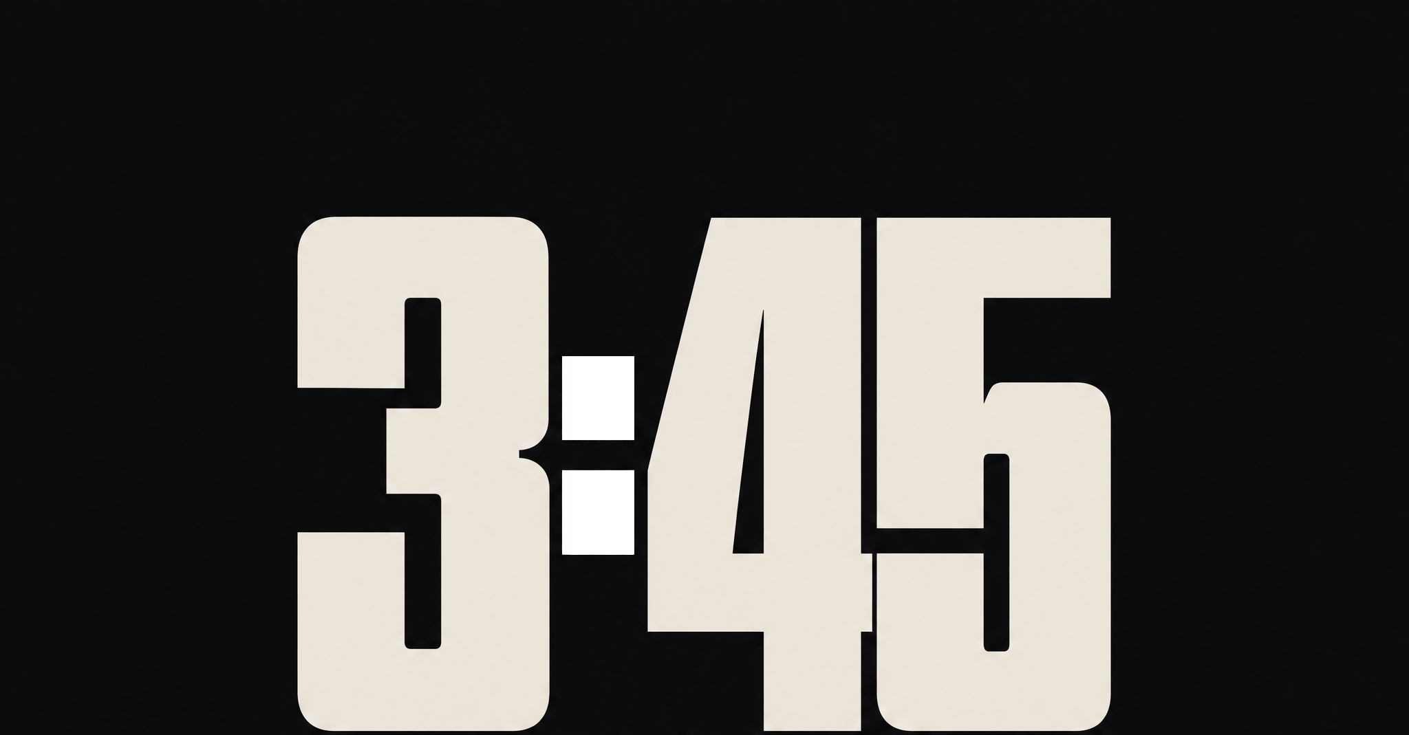
$38 on the poster. $38 on the card.
- Category
- Venue and ticketing platform
- Scope
- Naming, identity, product interface, venue
- Room
- Four hundred capacity
The situation
Good room, good booking. They lose people at the last screen.
An independent venue that also sells its own tickets. The room is good, the booking is good, and the thing standing between the two is a checkout experience the audience has been trained to distrust by every other ticket they have ever bought. The venue was losing people at the last screen, and it was losing them to a feeling rather than to a price.
The enemy
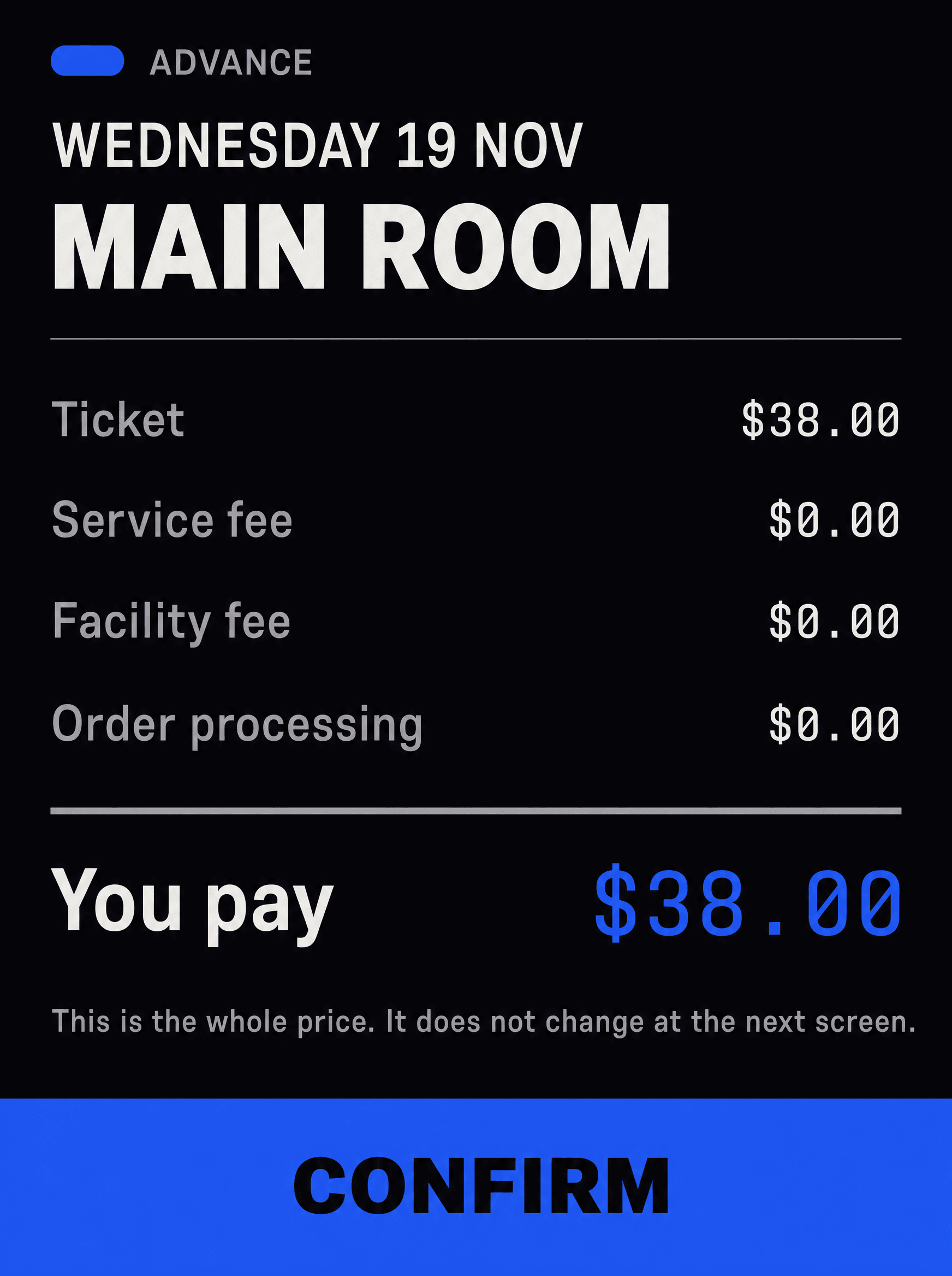
Thirty-eight dollars at the door. Sixty-one at the last screen.
A thirty-eight dollar ticket that becomes sixty-one at the final screen, split across a service fee, a facility fee and an order processing fee, none of which describe a service, a facility, or any processing. It is the single most resented interaction in live music, and every competitor performs it.
The position
The only venue where the number on the ticket is the number you pay.
Identity
A progress bar that is already full
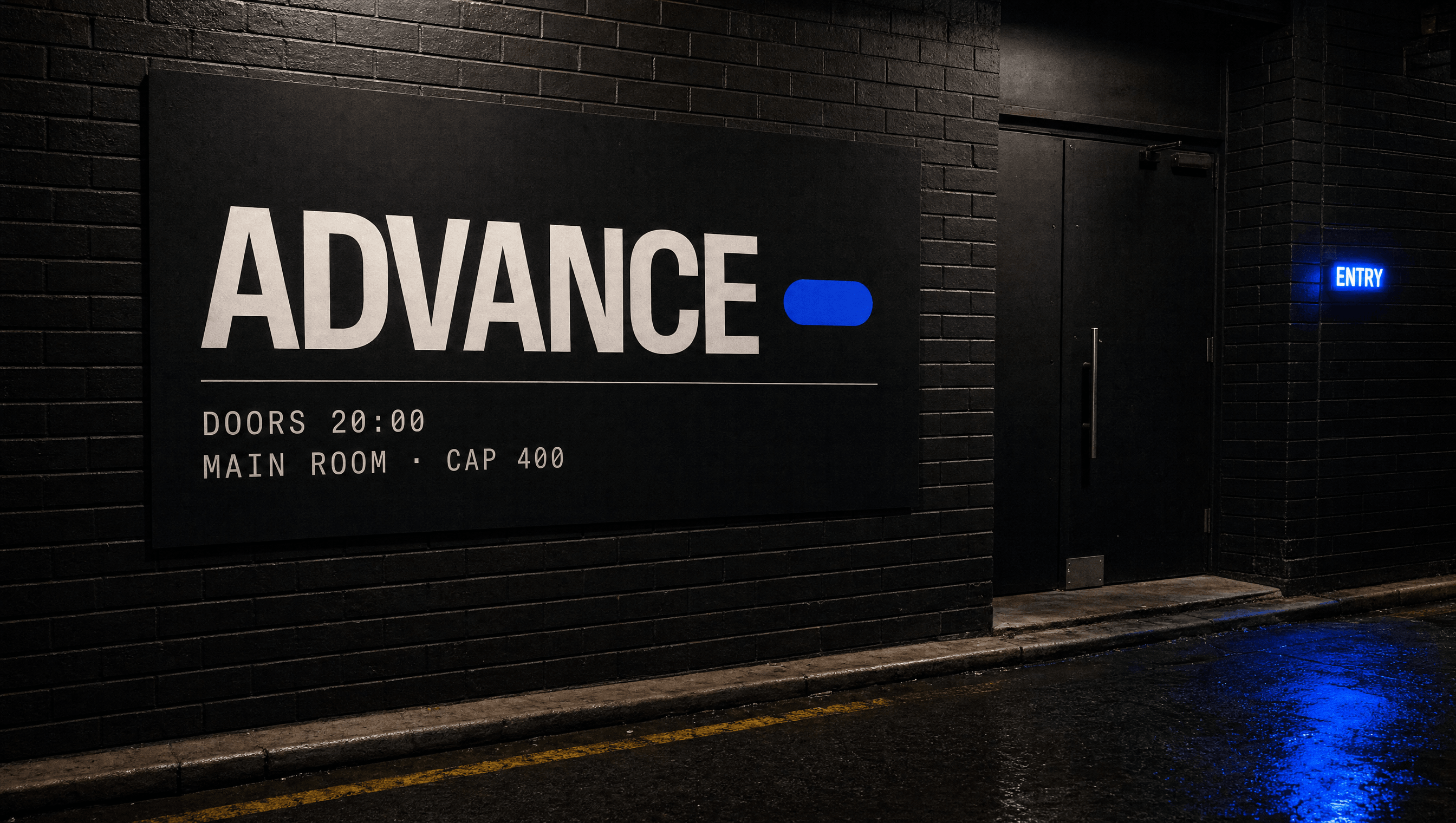
The mark is a filled pill, which is a progress bar with nothing left to load. It means there is no next step, no reveal, no adjustment waiting. It is drawn once, works at sixteen pixels as a favicon and at two metres as a wall panel, and it is the only piece of decoration in the entire system.
Colour
One blue, used only where money is
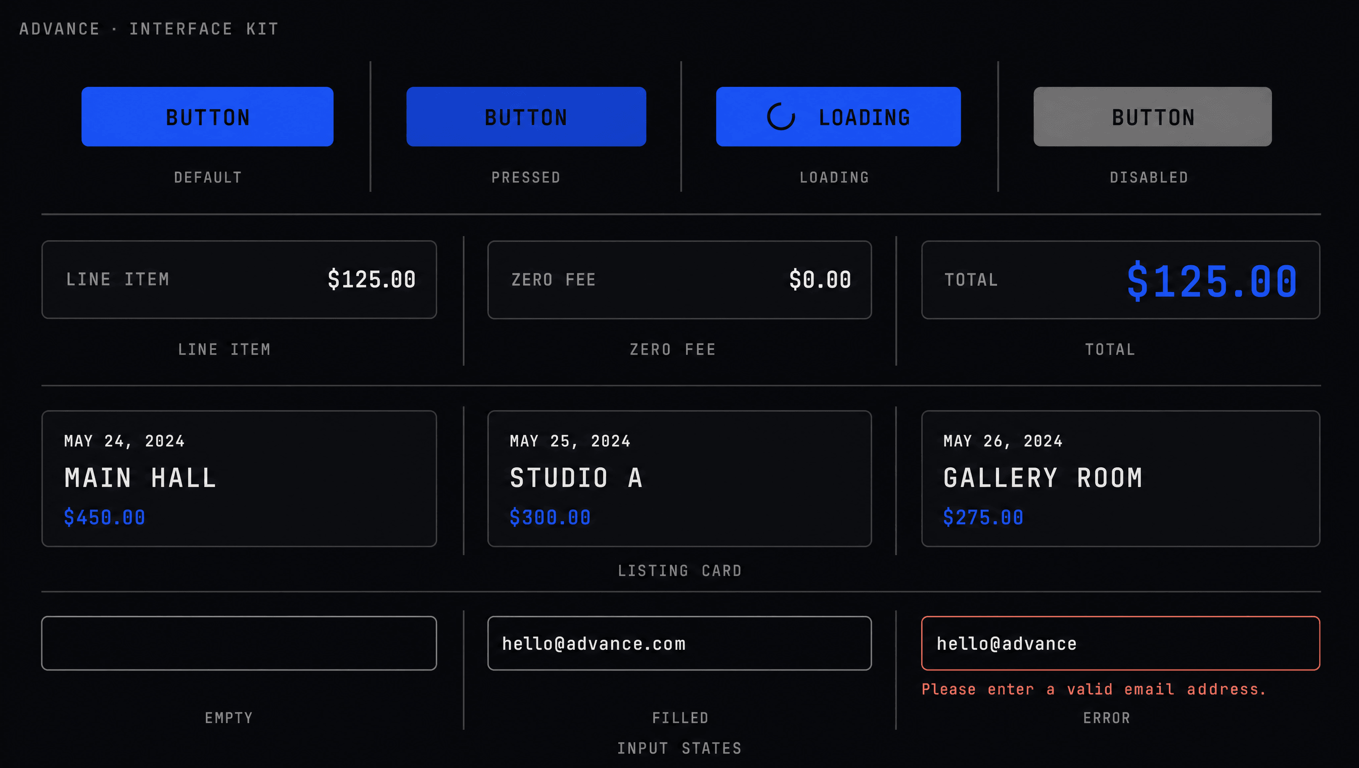
Near-black, paper white, grey, and a single electric blue. The blue is rationed to exactly two jobs: the total you will pay, and the button that commits you to it. Nothing decorative is ever blue, which means the eye learns within one screen that blue marks the moment of truth.
Typography
The interface typeface, on purpose
No commissioned display face. A clean interface grotesque, the kind screens are genuinely good at rendering, with a mono for every number. Choosing the honest screen typeface rather than a bespoke one is an argument the brand can make out loud: the budget went into not charging fees rather than into a wordmark.
Palette
Stage
#0B0B0F
Beam
#2B4CFF
Paper
#F0EDE6
Grey
#6E7180
Voice
The fees are inside the $38. We pay them.
Advance and door are the same number.
No fee at the next screen.
Doors 20:00.
Four hundred fit. Four hundred sold.
A ledger, not a pitch. Every line is a figure you can check on the next screen, and the brand never says transparent or honest, because a checkout that calls itself honest is doing the same job as one that hides a fee.
Typefaces
Interface Grotesque
Everything on screen and on the wall
Mono
Every number: price, time, capacity
Credits
Kyle C., Brendan Forbes
Strategy, identity and art direction
Next
Notice