Concept work · Brand Creation
Notice
Thirty-six colours. None match you.
- Category
- Skincare and patches
- Scope
- Naming, identity, packaging, campaign
- Buyer
- Treats it as an accessory
The situation
The category sells concealment. The customer stopped concealing years ago.
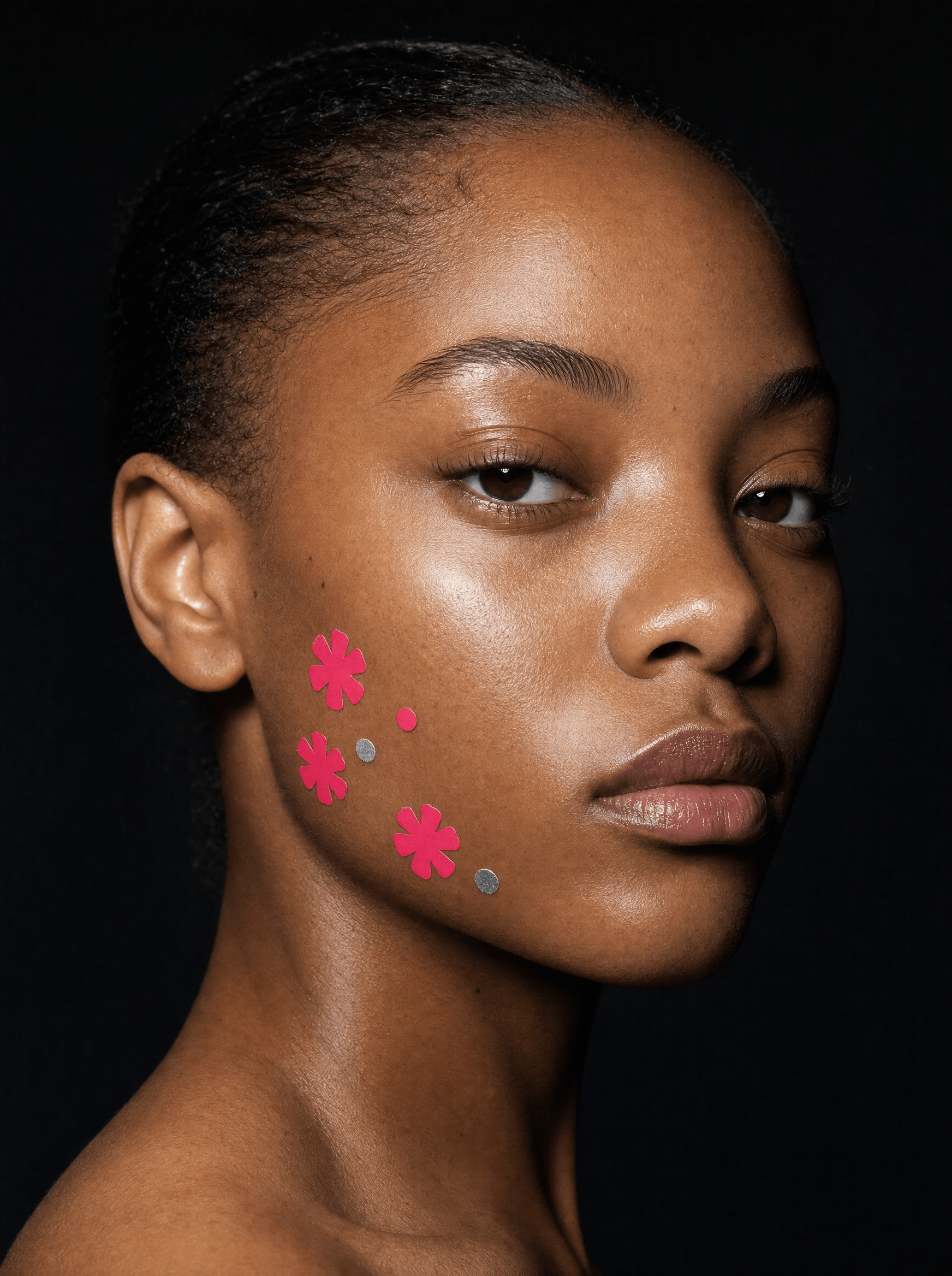
Hydrocolloid patches work, cost little to make, and are sold on a single promise: nobody will know. Meanwhile the actual customer has been wearing them to school, to work and on camera for years, in shapes chosen to be seen. The category was still selling concealment to people who had already decided to stop concealing.
The enemy
A beige circle that matches nobody, in a white box, sold as overnight.
A beige circle that matches no real skin, sold in a white box with a thin sans-serif and the word overnight. Its entire proposition is that the product, and the thing it is treating, should go unnoticed. It is a brand built on the assumption that the customer is embarrassed, and it keeps them that way in order to sell to them again.
The position
The only skincare designed to be seen on your face instead of designed to disappear into it.
Identity
The mark is an asterisk, and so is the product
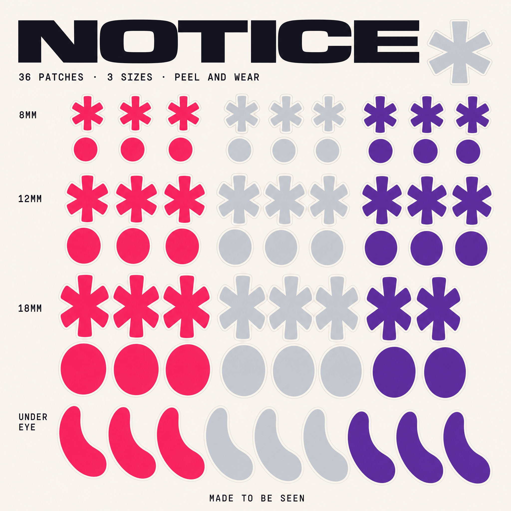
An asterisk is the typographic symbol for look at this, there is more here. It is also, drawn at product scale, one of the shapes the patch is die-cut into. Mark and product are the same object, which means the brand appears on the customer's face without a logo ever being printed on anything they wear.
Colour
Reclaimed pink, at full strength
The category owns dusty pink, so this takes pink back at full saturation and puts chrome next to it. Ultra is loud enough to read across a room on a small piece of film stuck to a cheekbone, which is the only performance requirement that matters. Nothing here is muted, because muted is what the enemy sounds like.
Typography
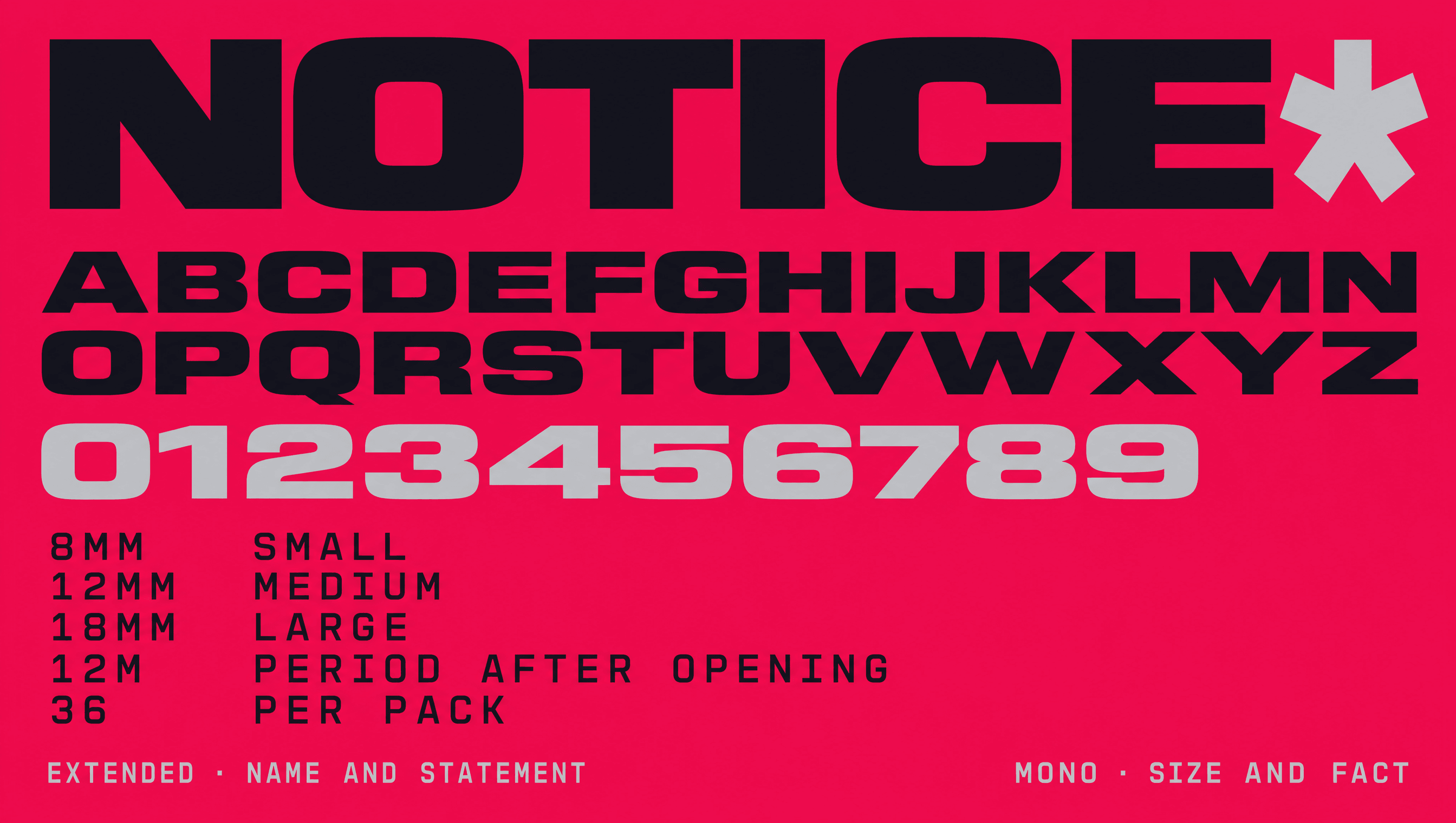
Wide enough to be read from the back
An extended grotesque for the name and every statement, because the brand is not whispering. A mono for size, count, and anything a customer needs to check before buying. The split keeps the confident voice and the honest information in separate registers so neither one has to soften the other.
Application
The legal copy is not hidden either
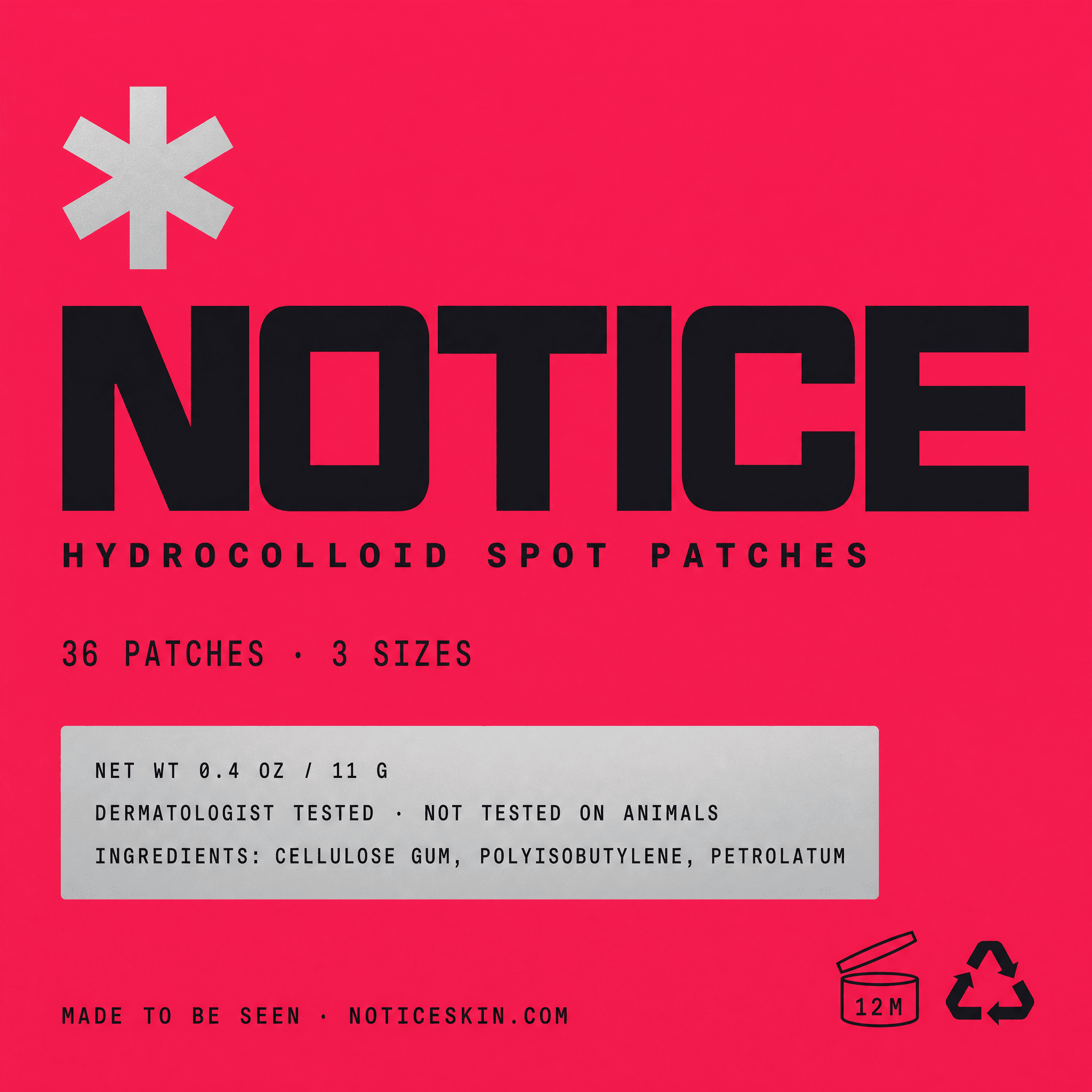
Count, net weight, ingredients, period after opening, and the animal testing position all sit on the front of the sachet in a chrome panel rather than buried on the reverse in six point. A brand whose entire argument is about not hiding things cannot make an exception for the small print.
Channel
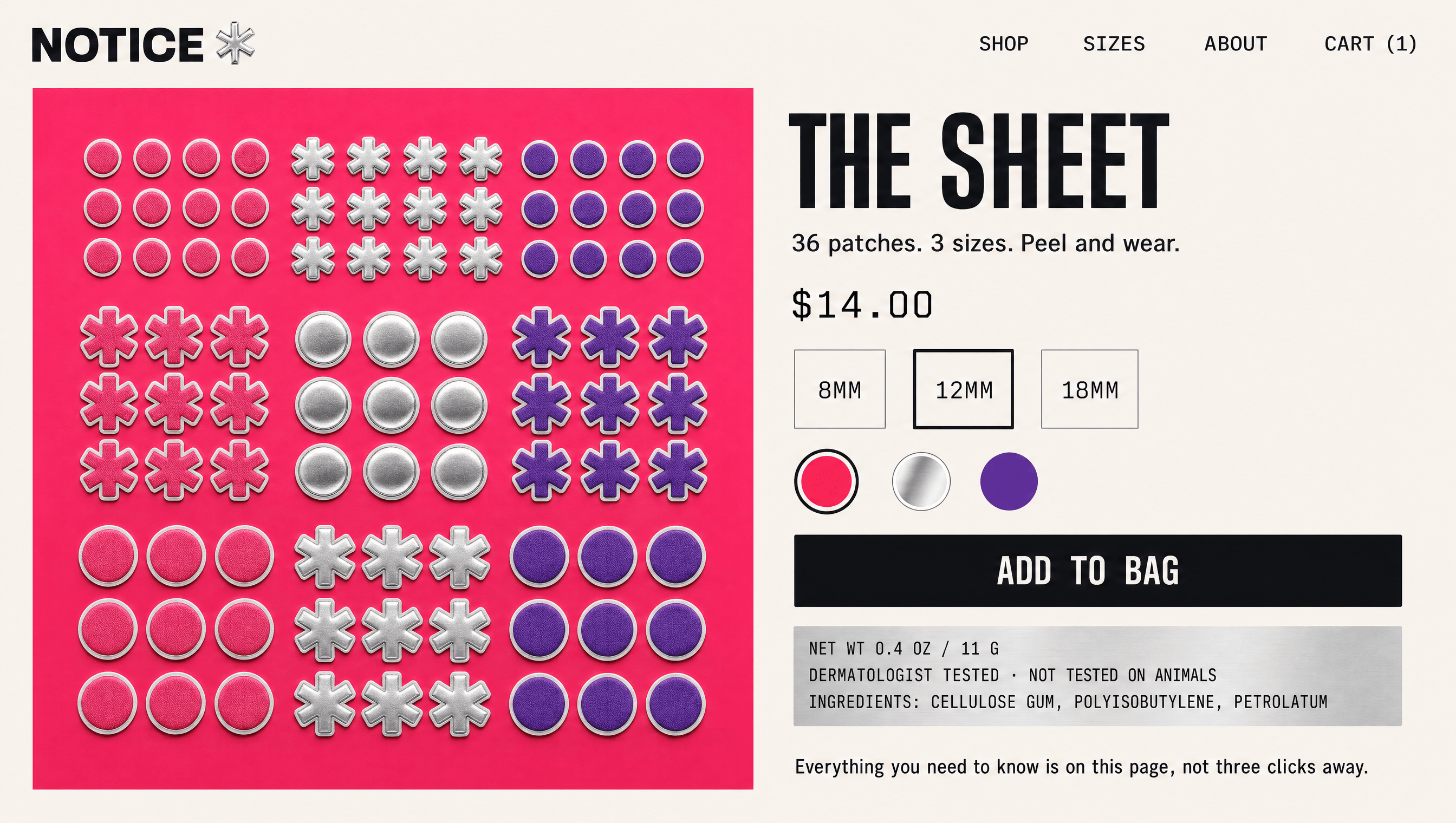
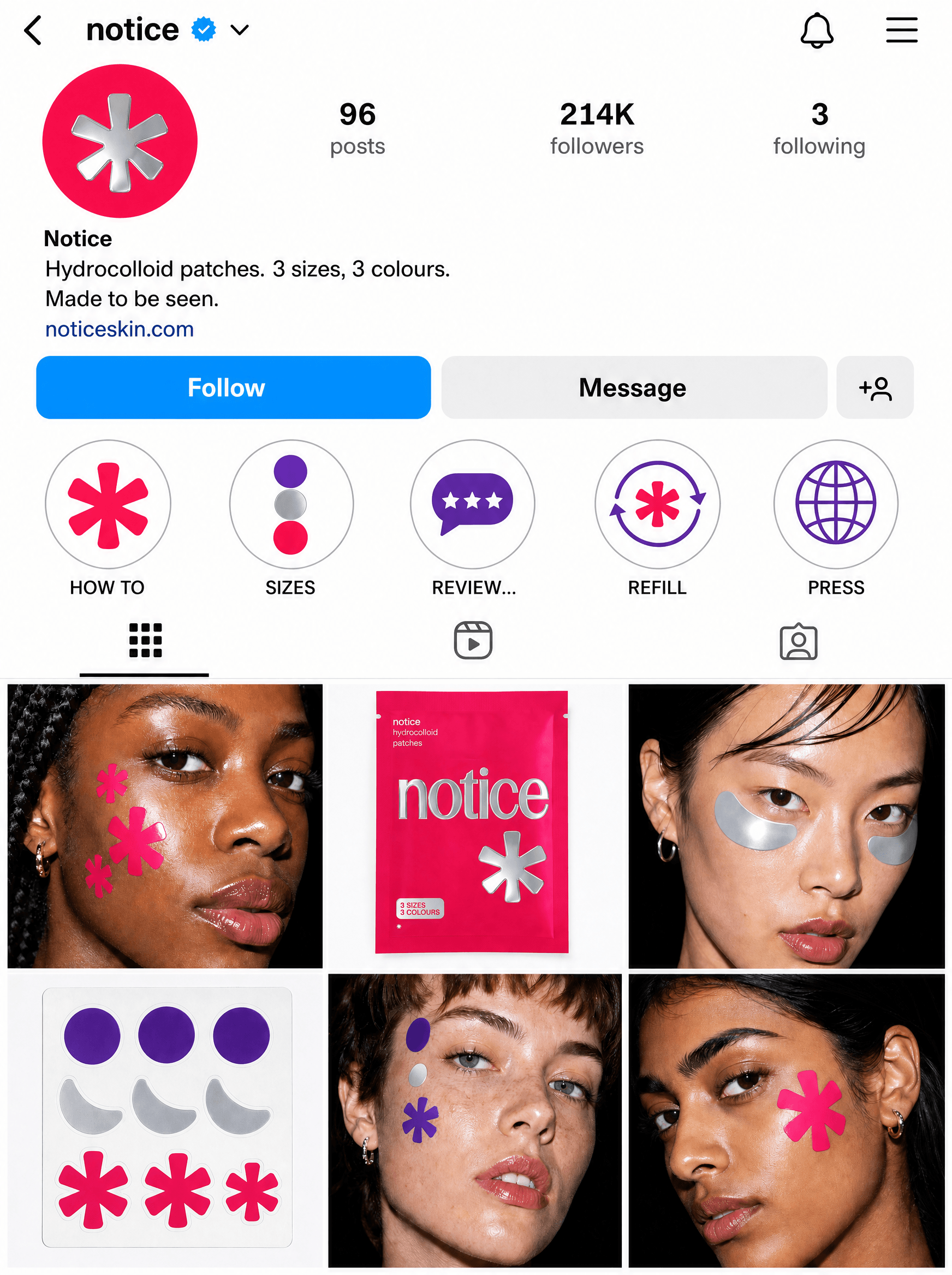
The grid is the shop, and the customers are the campaign
For a brand this size the profile is the first storefront, so it was designed before the website was. The grid alternates a face and a product, never two faces in a row, and every face is a different person wearing the patches somewhere obvious. Nothing is retouched into evenness. The proposition only holds if the people in the grid look like they genuinely left the house that way, which means casting is a brand decision here rather than a production one.
Palette
Ultra
#FF2D6F
Chrome
#C8CCD4
Bruise
#6B2FA8
Ink
#14121A
Wash
#F6F1EC
Voice
It sits on top. That's the point.
Nobody asked you to match your skin tone.
Use them badly.
It's a sticker. Act like it.
Wear it to the thing.
Short, flat, and completely unapologetic. The category writes in reassurance, which is a tell that it thinks the customer is embarrassed. This brand never comforts them, because there is nothing here to be comforted about.
Typefaces
Extended Grotesque
Name and statement
Mono
Size, count, and anything factual
Credits
Kyle C., Brendan Forbes
Strategy, identity and art direction
Next
Still