Concept work · Brand Creation
Ponza
Each print is drawn in this house, and when it is retired the book is closed on it.
- Category
- Resort swimwear and cover-ups
- Scope
- Identity, print archive system, nomenclature, packaging
- Range
- One-pieces, kaftans, towels. $280 to $650
The situation
The prints are original artwork and nobody knows it
A resort swimwear house in Miami. One-pieces, kaftans and towels, $280 to $650 a piece. The prints are drawn and colour-separated in-house, which is genuinely unusual in a category that mostly buys artwork off a textile library and prints whatever sold last season. In a feed, at a pool, across a lobby, the print is the only part of the garment legible at distance. It is the product. None of the existing language says so.
The enemy
Quiet-luxury neutrals on one side, a drone over turquoise on the other. Neither shows the print.
The category runs quiet-luxury swim on one side, neutral and unprinted, sand and linen and a beige flat-lay, interchangeable by design. On the other it runs Miami influencer swim, the same triangle bikini at golden hour, wet hair, palm shadow, a drone over turquoise. A competitor's version of this brand writes itself: a bronzed model walking into the sea shot from behind, wordmark in a light modern sans. Every element of that is banned here, including the word effortless.
The position
The only swim house that numbers every print and keeps the archive open, so a suit can still be identified twenty years after it sold.
The print
Judged as artwork, before it is ever cut
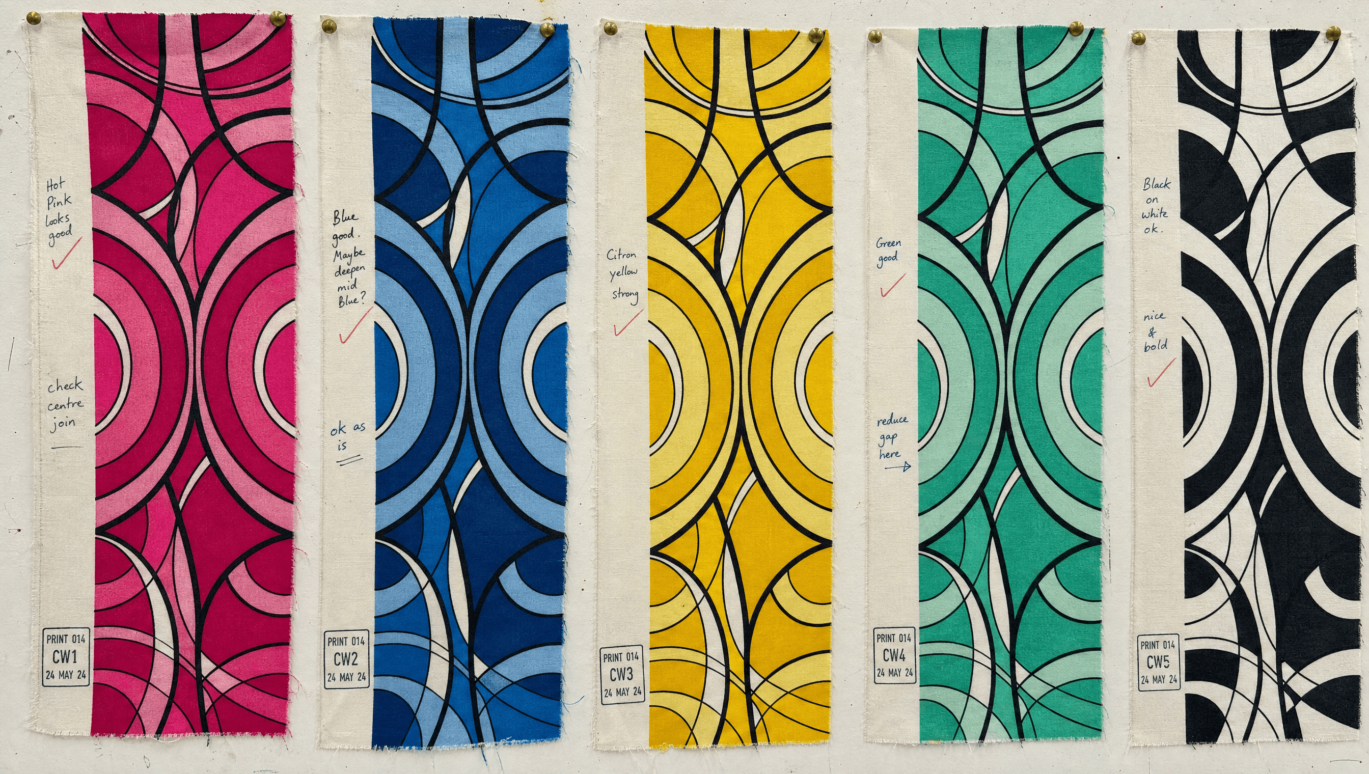
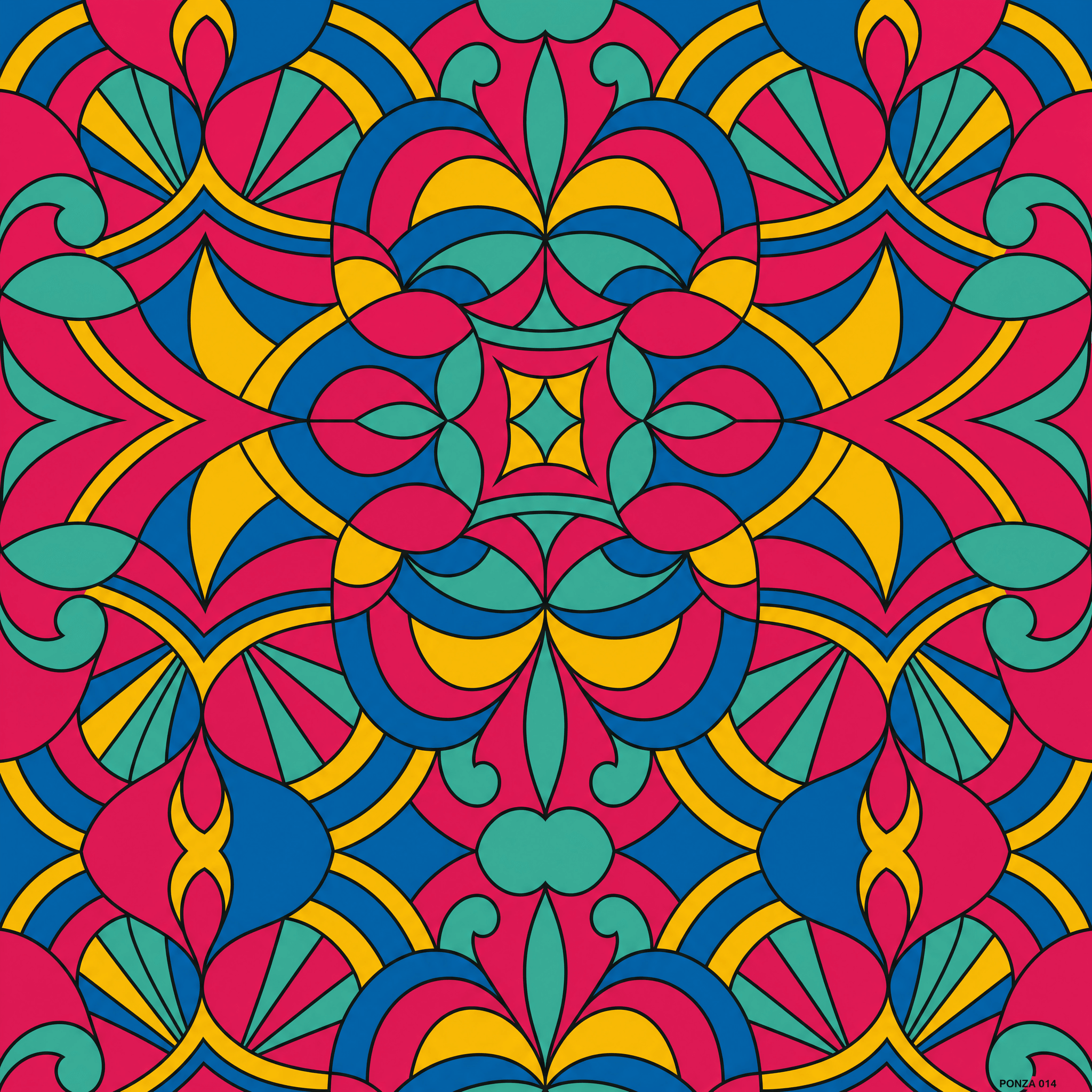
The print is shown flat, at full repeat, edge to edge, with no garment and no body anywhere near it. This is the first decision and it sets every other one. A print photographed on a hip is being sold as a swimsuit. The same print shown at repeat is being presented as a drawing that took someone a month, which is what it actually is. Pucci's real contribution was never the swirls. It was treating prints as a numbered, signed archive, and that is the half of the idea nobody copied.
Identity
The mark is the selvedge stamp, and it was already there
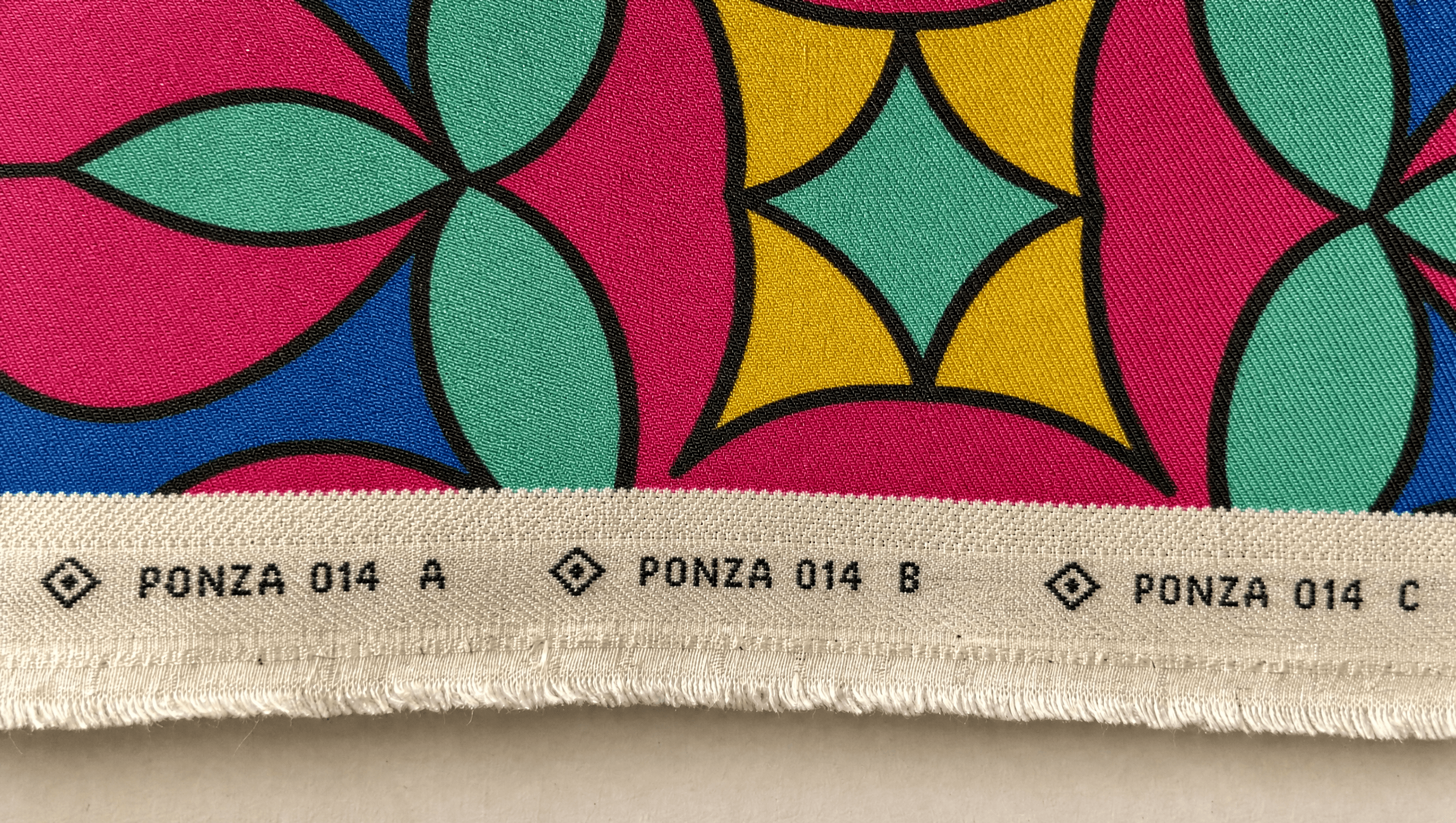
Not a monogram. Every mill prints a small repeating mark along the uncut edge of the cloth carrying the print number, so the roll can be identified after it leaves the floor. That stamp is the mark. It is a working instrument of the trade rather than a symbol invented to stand for one, it already contains the print number the position depends on, and on a finished suit it survives as a woven tab at the hip. The customer ends up wearing the filing system.
Colour
Five colours, no neutral, and the absence is the argument
Bougainvillea from the flower that grows over every wall on the island. Tyrrhenian from the water on the west side, deeper than Caribbean blue. Citron from lemon rind. Sea glass from worn bottle glass on the shingle. Ink from the outline every print is drawn with first. Every colour is sampled from the prints themselves and named for the thing it came from. Four of the five are fully saturated and there is no neutral base anywhere in the system, which is the entire quiet-luxury half of the category refused in pigment rather than in a sentence.
Typography
A display serif for the name, a mono for everything recorded
High-contrast wide serif in the sixties Italian fashion-house register, used for the name and for absolutely nothing else. Mono for every print reference, colourway code, repeat size and date. The split keeps glamour and record from borrowing each other's authority. The serif is allowed to be beautiful because it never has to be believed, and the mono is believed because it never tries to be beautiful.
The record
Approved on paper before it is approved on cloth
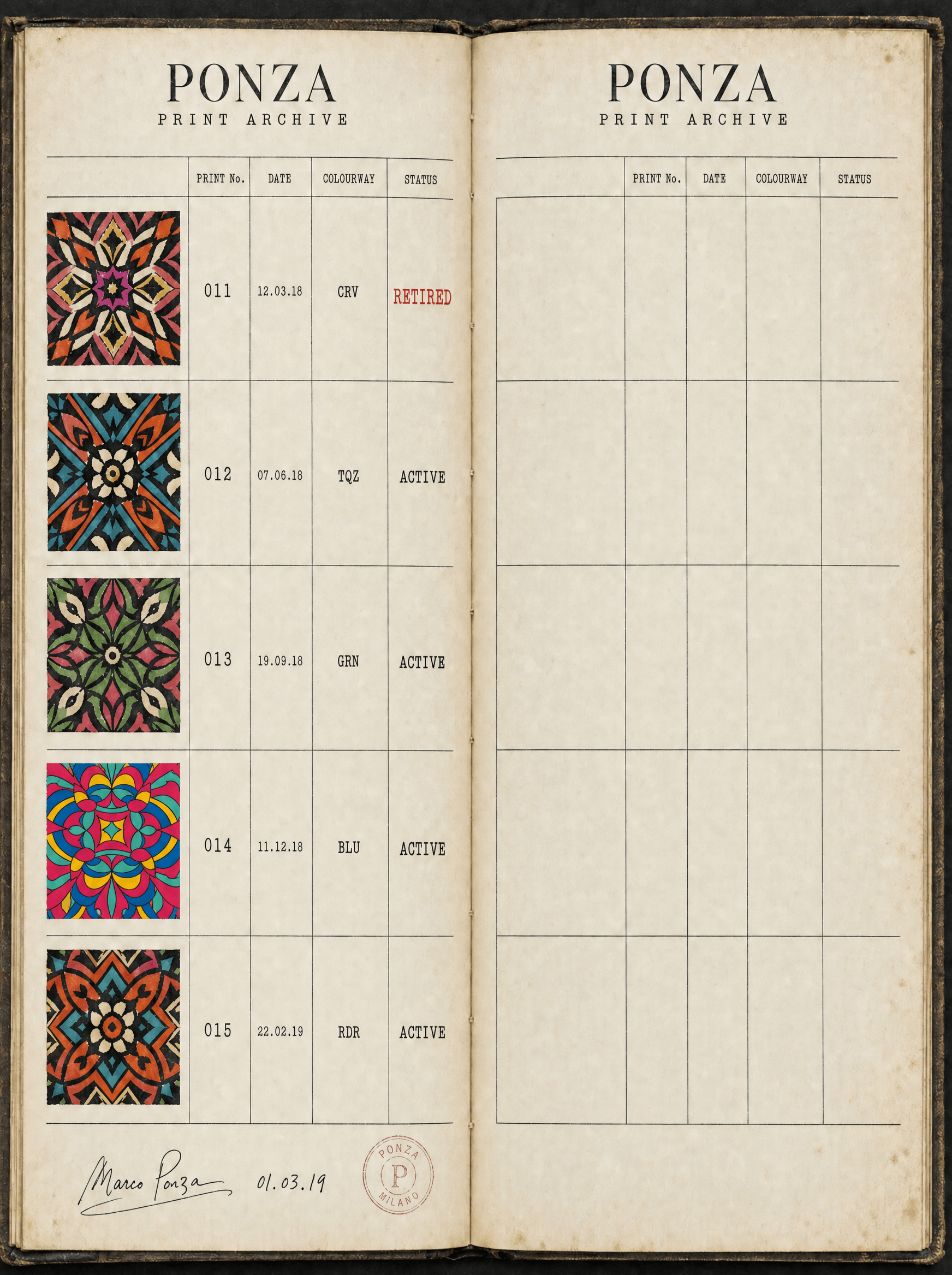
The archive ledger is the position made physical. Every print in the house, numbered and dated, with its colourway codes and its status. Retired prints stay in the book. That is the part competitors cannot copy without changing how they run the business, because influencer swim reprints whatever sells and destroys the record on purpose, since scarcity is easier to fake than to document. A ledger that lists what will never be made again is a promise with a cost attached to it.
Application
Different print every time, same four walls
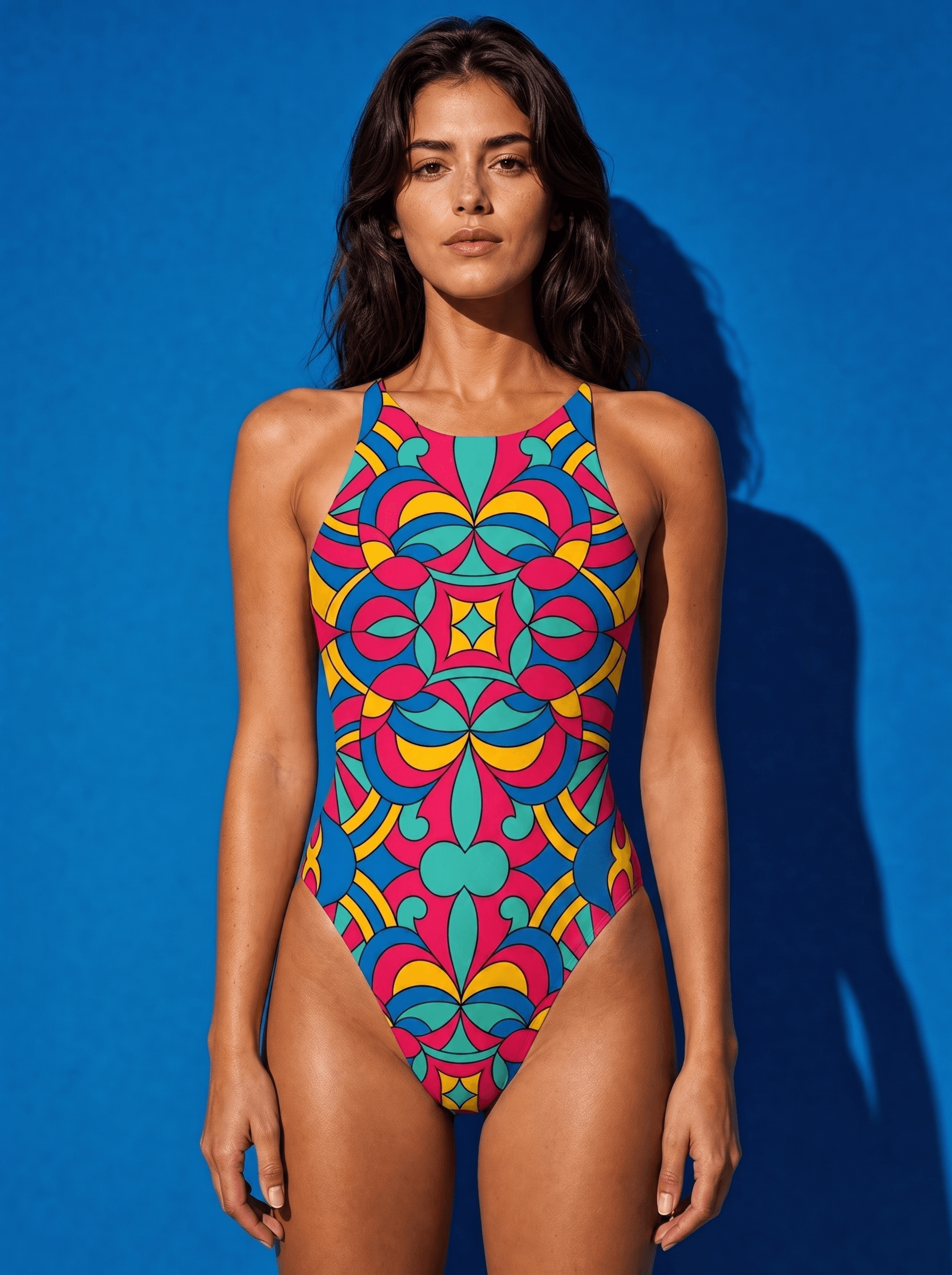
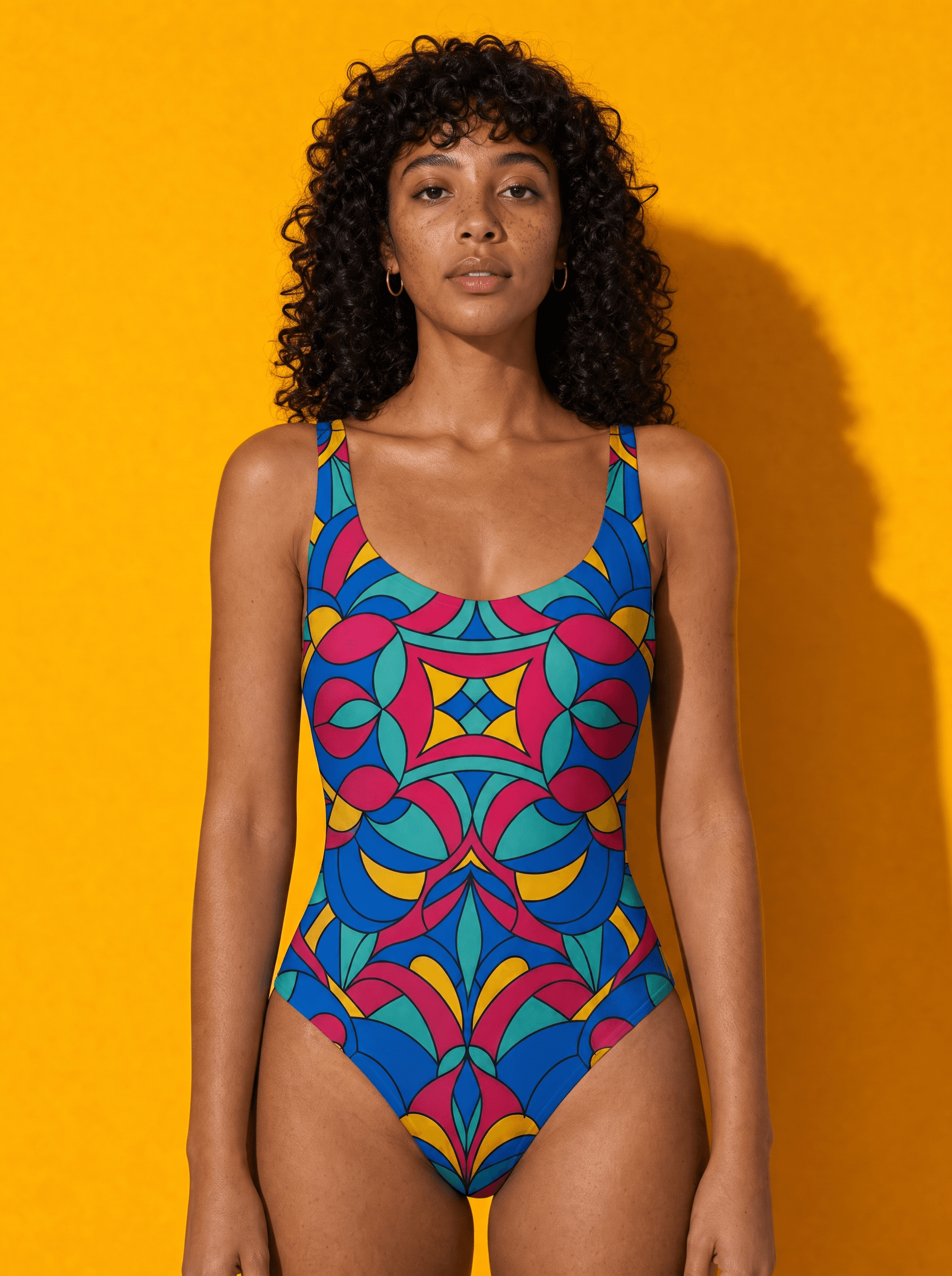
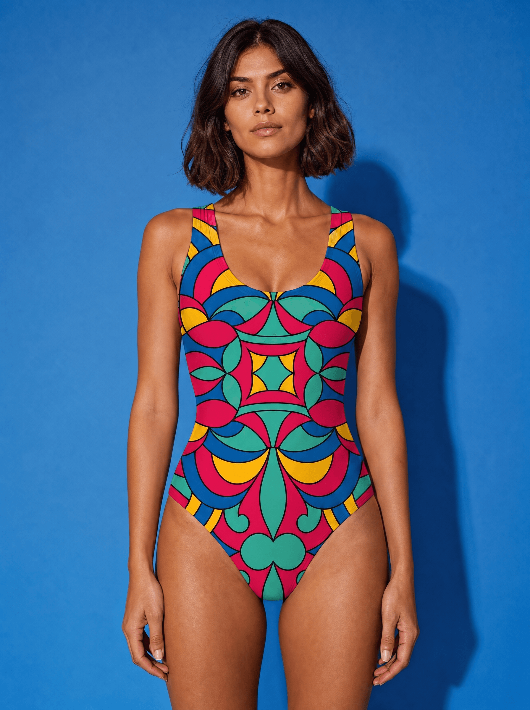
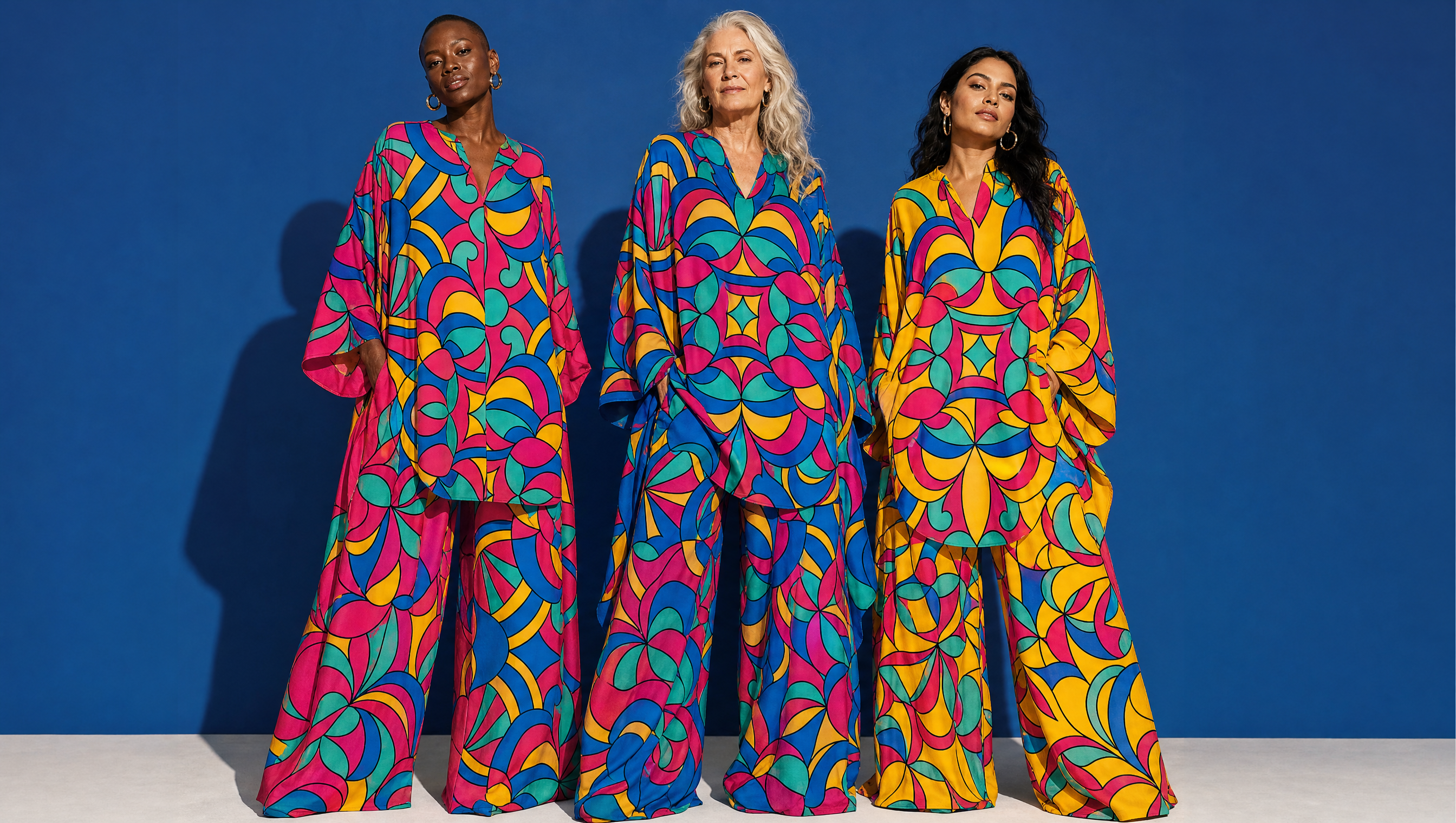
Every garment is photographed indoors, front-on, against a single flat ground pulled straight out of the palette, under hard directional light that leaves the shadow on the wall. No sand, no water, no golden hour, no drone. Holding the room and the silhouette steady leaves the drawing as the only thing changing between frames, which is the correct hierarchy for a house whose product is the artwork. Swimwear is one-piece throughout, because an uninterrupted panel gives a repeat the room to resolve and a two-piece cuts the drawing in half.
Palette
Bougainvillea
#E5195F
Tyrrhenian
#0E6FA8
Citron
#F5C518
Sea Glass
#39B7A0
Ink
#181A1C
Voice
Print 014. Five colourways. Drawn here.
The number on the tab is the number in the book.
The mill runs it once. We keep the strike-offs.
Every colourway was approved on paper before it was approved on cloth.
Write to us with the number and we will tell you the year, the mill, and the five colourways it was drawn in.
Italian house formality, warm and certain and a little imperious, and strictly factual about textile process. It speaks about the print and never about the wearer's body or their holiday, which is the single habit that separates it from every other brand in the category. The certainty comes from having a record to point at rather than from adjectives.
Typefaces
High-contrast Display Serif
The name, and nothing else
Mono
Print reference, colourway code, repeat size, date
Credits
Kyle C., Brendan Forbes
Strategy, identity and art direction
Next
Split