Concept work · Brand Creation
Split
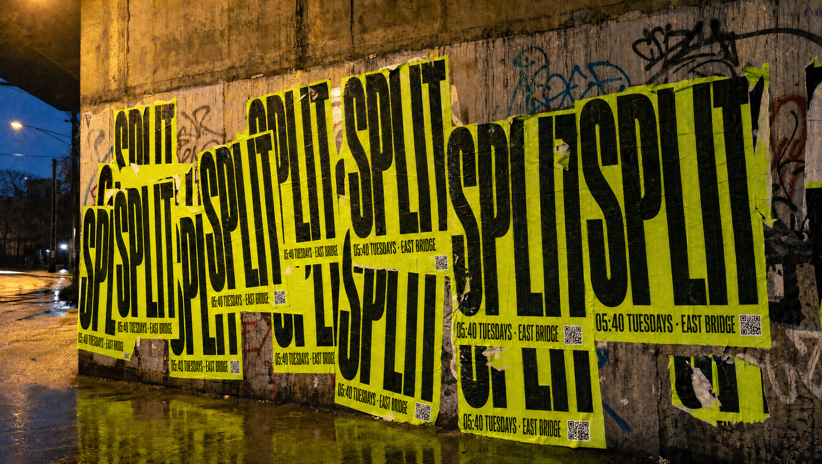
Put one up on your way home.
- Category
- Running club
- Scope
- Naming, identity, art direction, kit
- Members
- Free, no membership
The situation
Nobody pays for any of it. The posters said otherwise.
Two hundred people run at 05:40 on a Tuesday for free, in the dark, in the rain, and have done for four years. But the club's own posters and kit borrowed the visual language of the shoe brands that sponsor running, which made a genuinely independent thing look like somebody's marketing budget.
The enemy
A sunrise gradient, a swoosh, and the word community four times.
Gradient meshes, aspirational sunrise stock, a swoosh in the corner, and the word community used four times. The category's design is owned by companies selling shoes. A club that takes no money from anyone should not look like one that does.
The position
The only running club in the city whose brand is made the night before, by the people running in it.
Identity
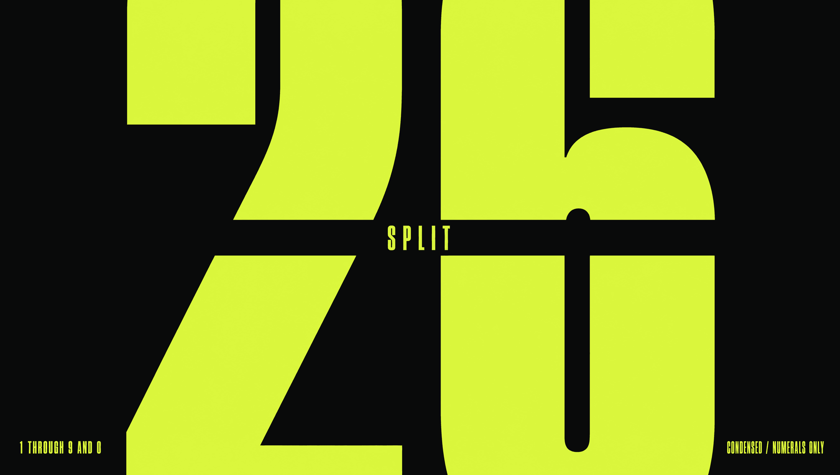
The number is the whole system
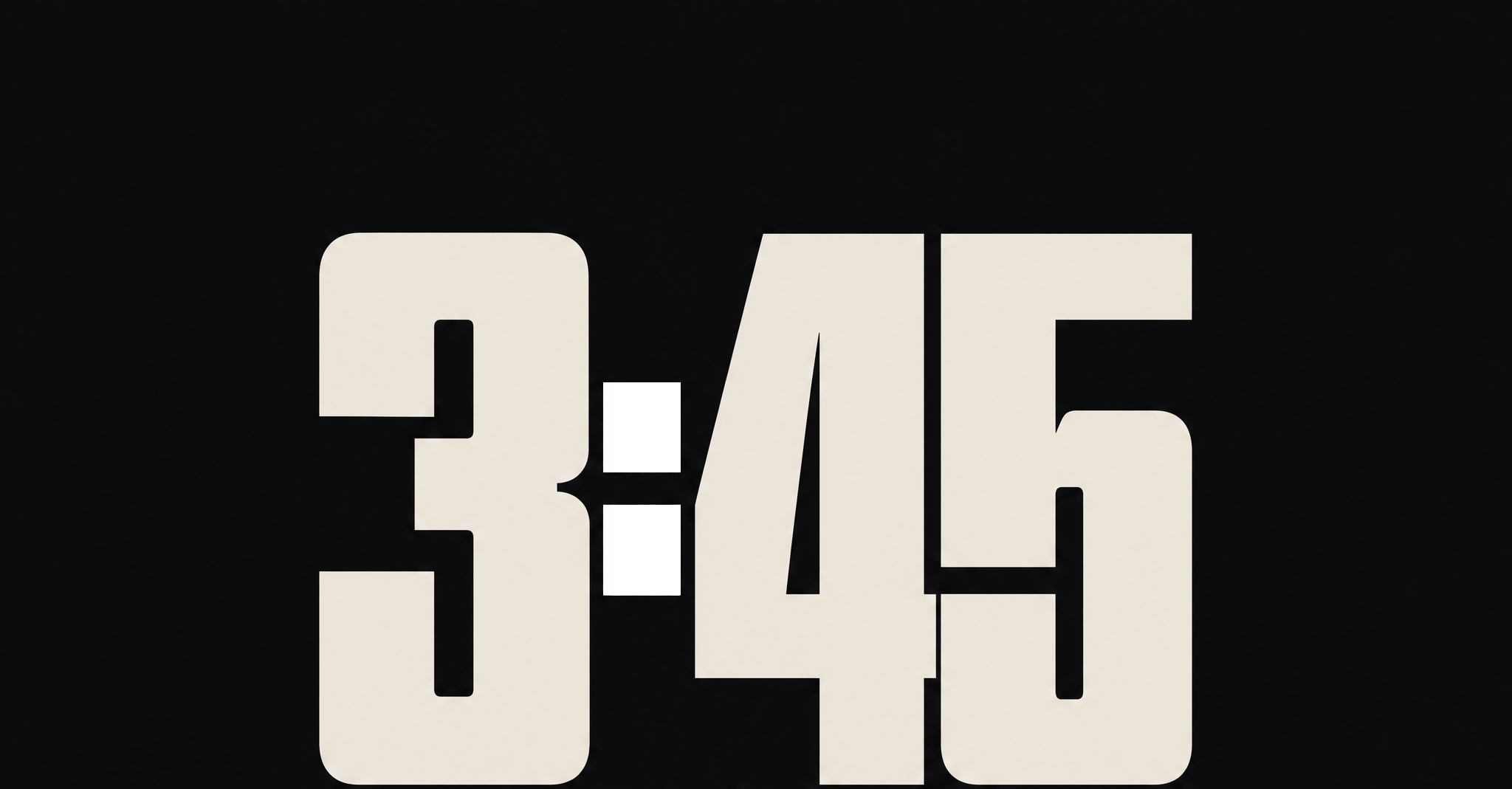
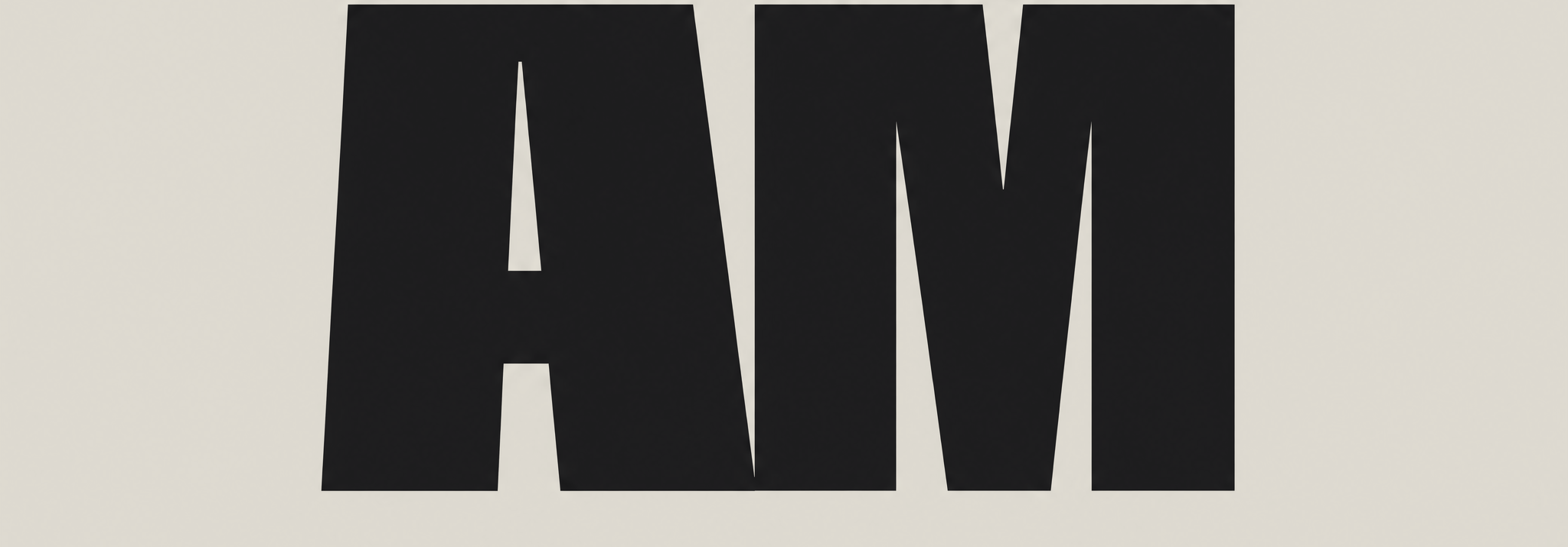
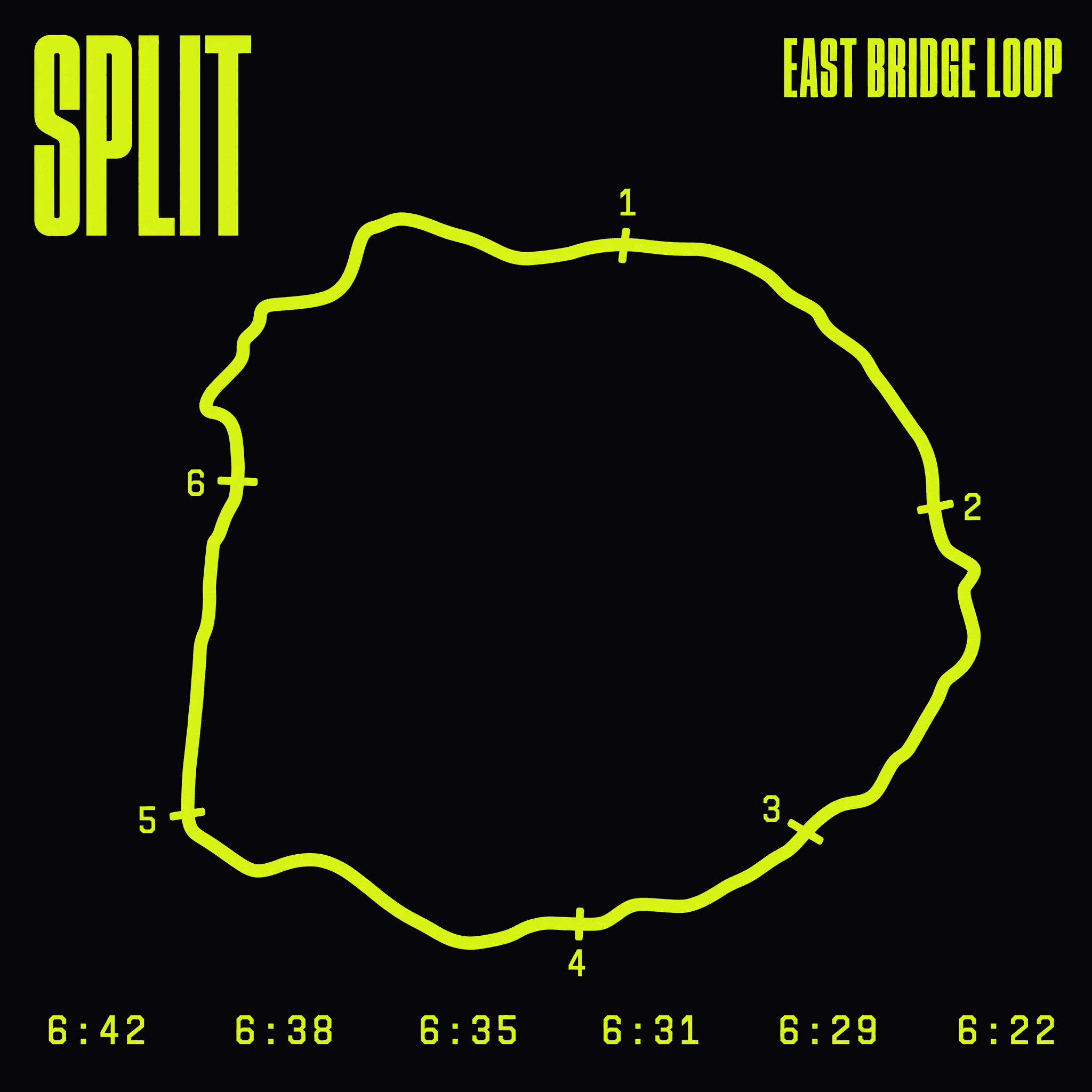
No mark. No logo. The identity is a number set enormous in a condensed face, cut through by a single rule, which is what a split is. Every artifact is a number and a time: the bib, the kit, the route card, the poster. It costs nothing to produce and it cannot be mistaken for a shoe advert.
Photography
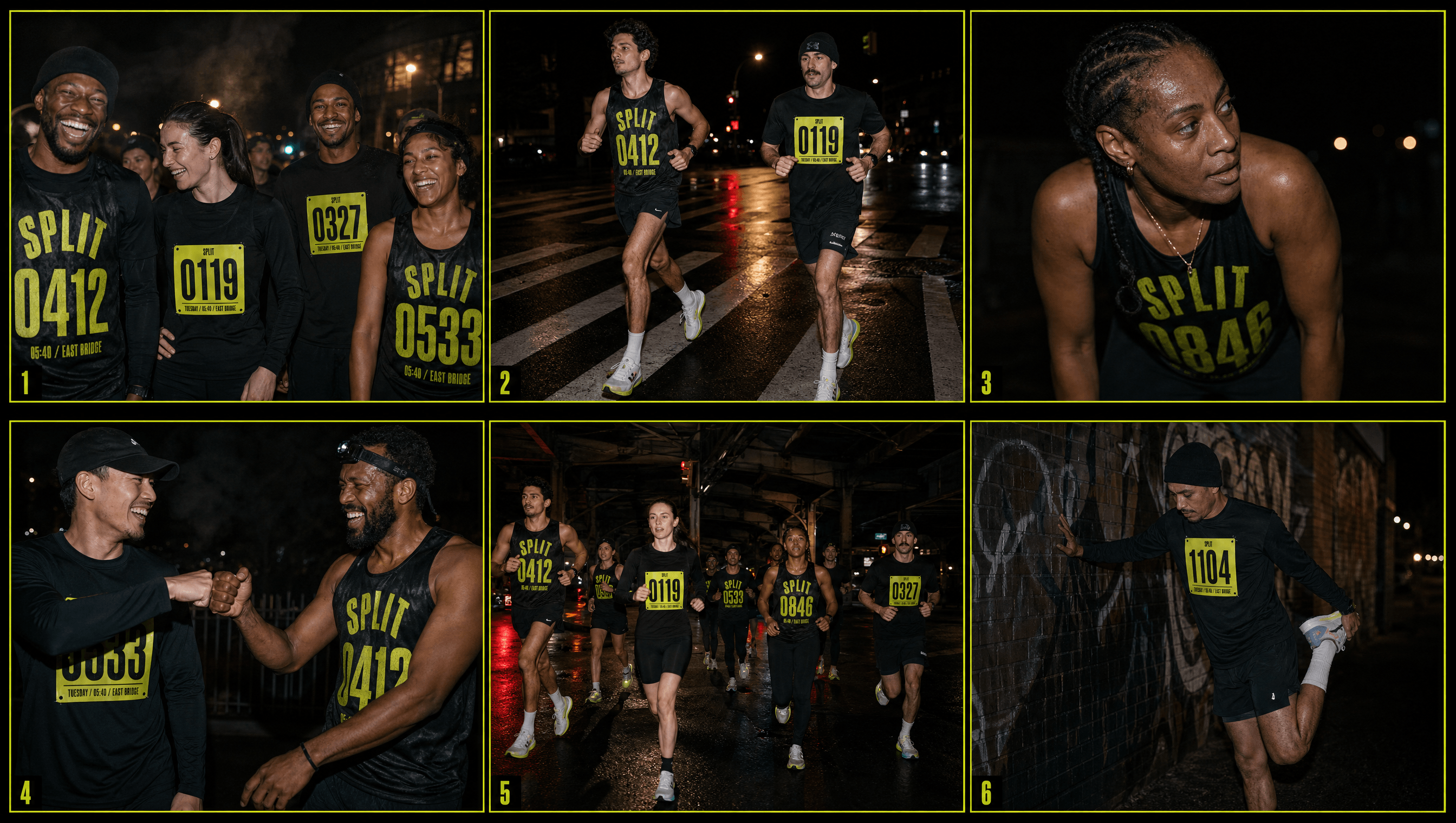
Direct flash, wet streets, everybody in kit
On-camera flash, at the hour the club actually runs, and every person in frame is in kit. Kit means one of exactly two things: the paper bib pinned to a plain black shirt, or the printed singlet. Never both, because a bib pinned over the singlet is the number said twice. That single rule is what turns a photograph into brand collateral, since the hi-vis reads before any face does and the number makes the runner a member rather than a model.
Colour
Safety yellow, because that is what you wear at 05:40
Hi-vis is not a design choice here, it is what is already on every runner's jacket at that hour for the reason it exists. Taking the brand colour straight off the safety gear means the identity is legible in the dark, which is the actual operating condition, and it costs nothing to explain.
Application
Everything is printable on a home printer
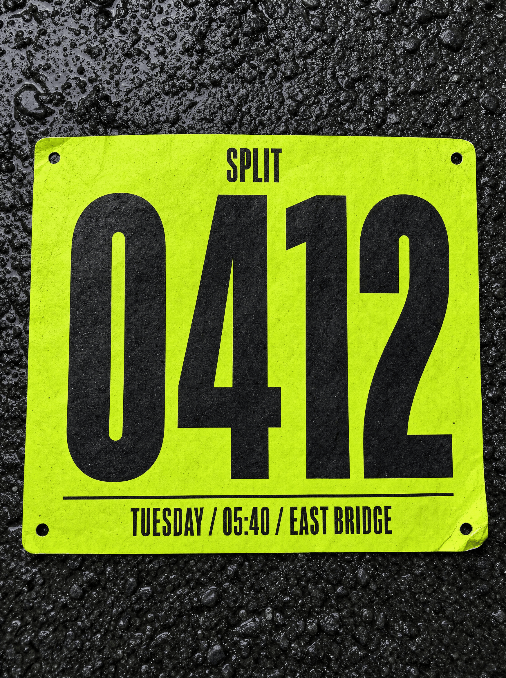
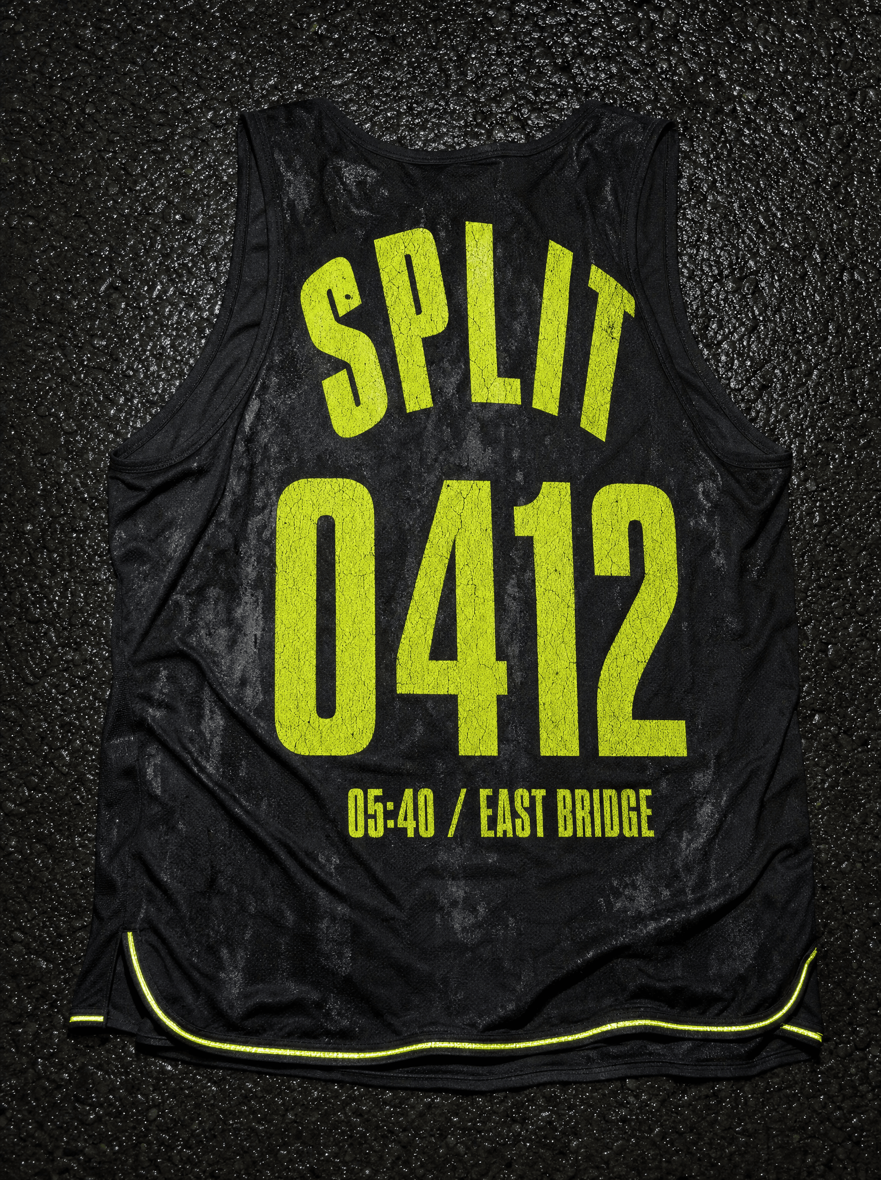
The full kit is a Tyvek bib, a screen-printed singlet, a square route card, and a poster. All of it is one colour on one substrate, which means any member can produce it. A brand that requires the studio to make it would have died the week the engagement ended.
Palette
Hi-Vis
#D6FF3F
Asphalt
#16171A
Chalk
#FFFFFF
Flare
#FF3B1F
Voice
05:40 / EAST BRIDGE / TUES
Go.
Rain is not a reason.
Slow still counts. Absent doesn't.
Bring a light or don't come.
Bib data first, then an order. The format is lifted straight off a race number: time, place, day, stacked and stripped of everything else. What follows is never an invitation, it is an instruction, because a club that asks nicely is a club you can skip.
Typefaces
Druk X Condensed
Everything loud
Söhne Mono
Splits and times only
Credits
Kyle C., Brendan Forbes
Strategy, identity and art direction
Next
High Sun