Concept work · Brand Creation
Ama
The boat decides.
- Category
- Sushi counter
- Scope
- Naming, identity, menu system, tableware
- Room
- Eighteen seats, two seatings
The situation
The chef can get the fish. Miami sells the room instead.
A chef with a real sourcing network opening a small counter in Miami. Two seatings a night, no à la carte, whatever arrived that morning. The problem was that Miami's high-end Japanese category is loud, enormous and sold on spectacle, and a serious eighteen-seat room in that context either gets read as a nightclub or disappears entirely.
The enemy
Black walls and one orchid. Or gold foil and a DJ.
One is the dark minimal Japanese restaurant: black walls, dim light, a single orchid, a brush-stroke logo. The other is Miami's own: gold, marble, a DJ, a menu with a gold foil dragon on it. The first is quiet and imported, the second is loud and generic. The third option is bright, hot, and specific to this city.
The position
The only sushi counter in Miami whose menu is a dated list of where each fish landed, printed the morning it arrives.
Identity
One circle, and it is not a sun
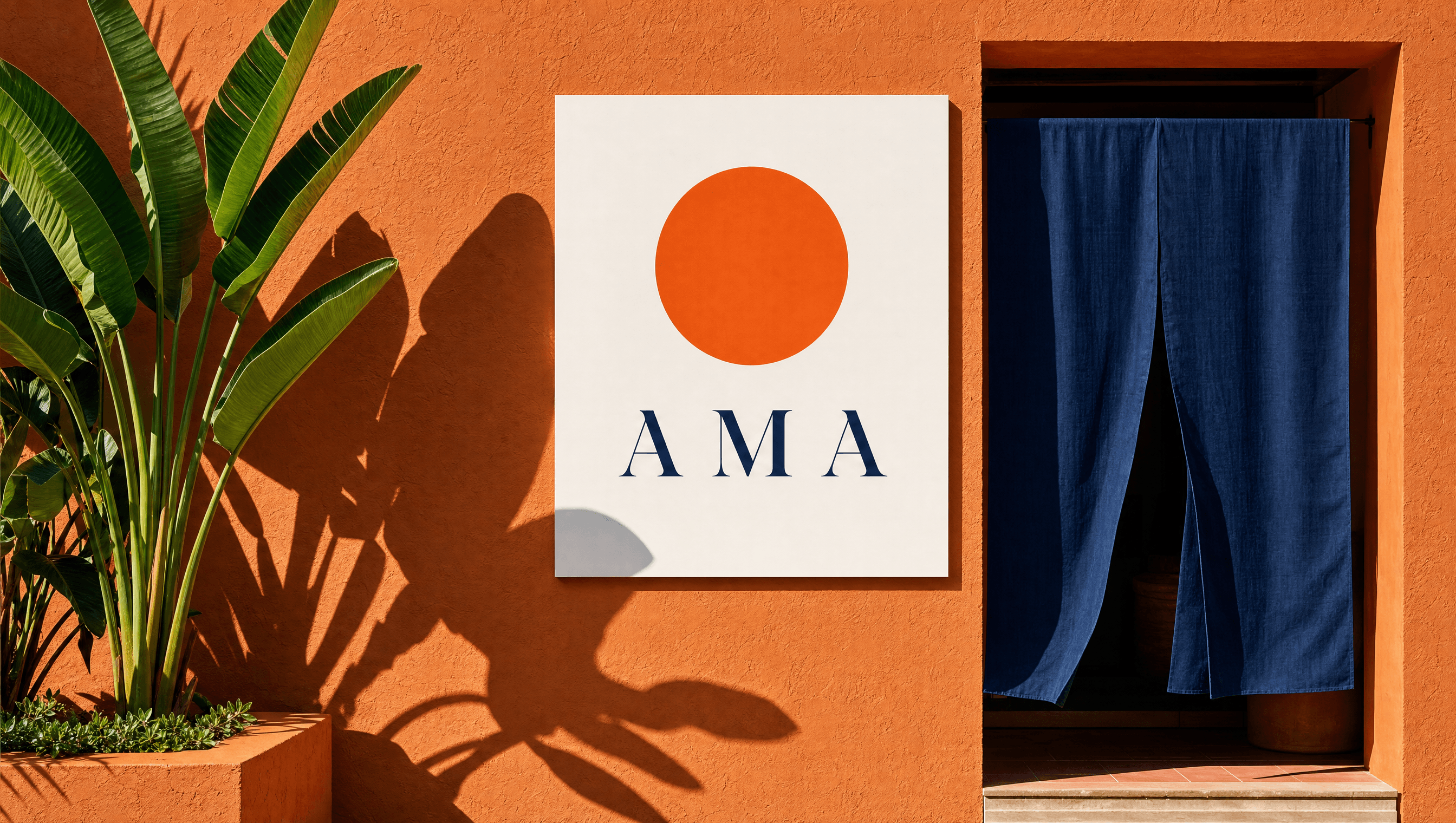
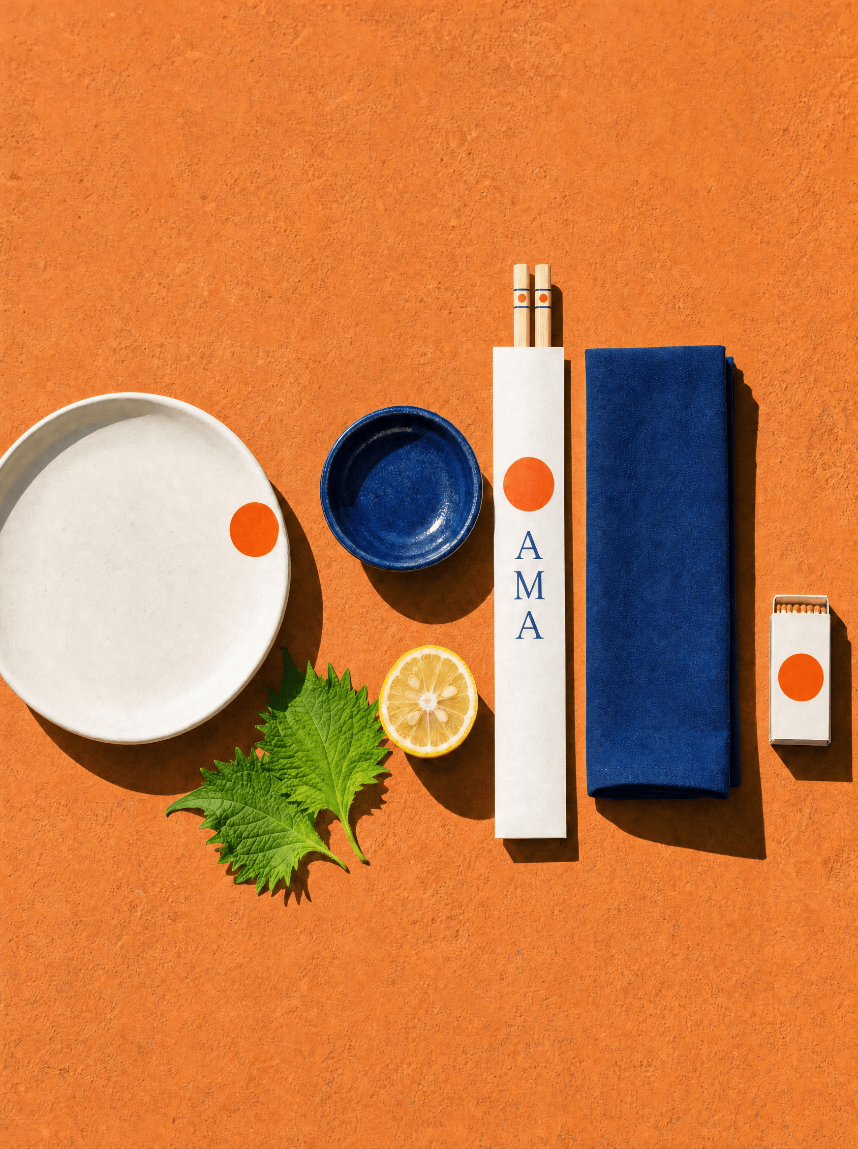
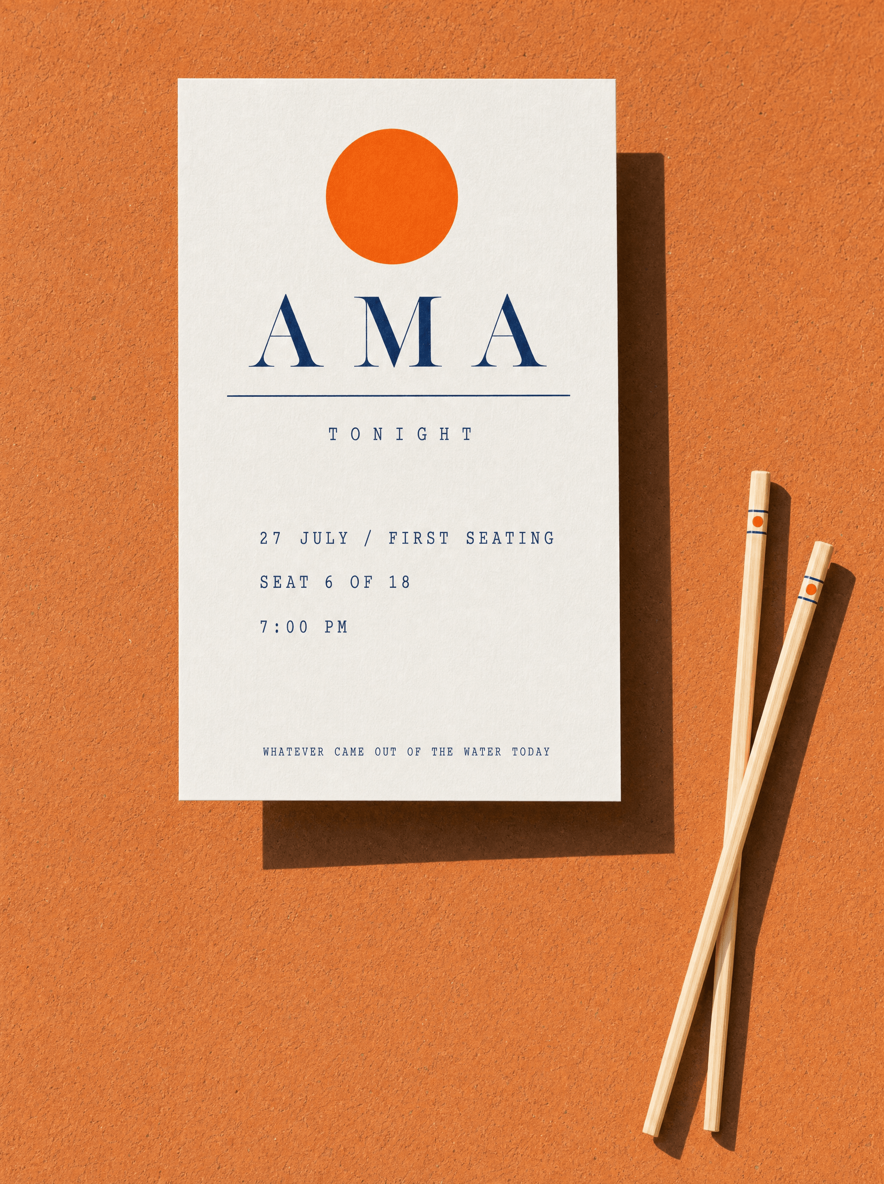
The mark is a single filled circle in uni orange. It reads as a plate, a piece of roe, a diver's float, and yes a sun, and it is deliberately never explained. What matters is that it is one shape, reproducible by anyone at any size, and that it is the exact orange of the most expensive thing on the menu. It appears alone far more often than it appears with the wordmark.
The menu
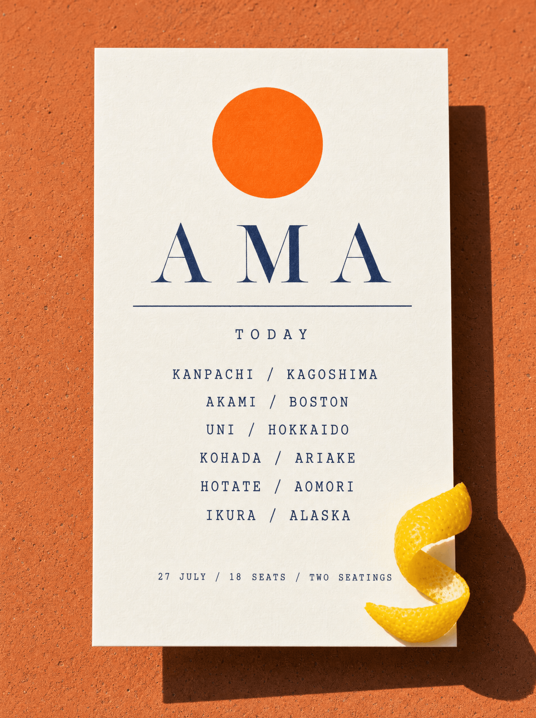
A new card every morning, and it names the port
The menu is not a menu, it is a dated manifest. Each line is a fish and the water it came from, set in mono so it reads as a record rather than a sales document. It is printed each morning on a small press in the back. It proves the sourcing claim the entire restaurant rests on.
Photography
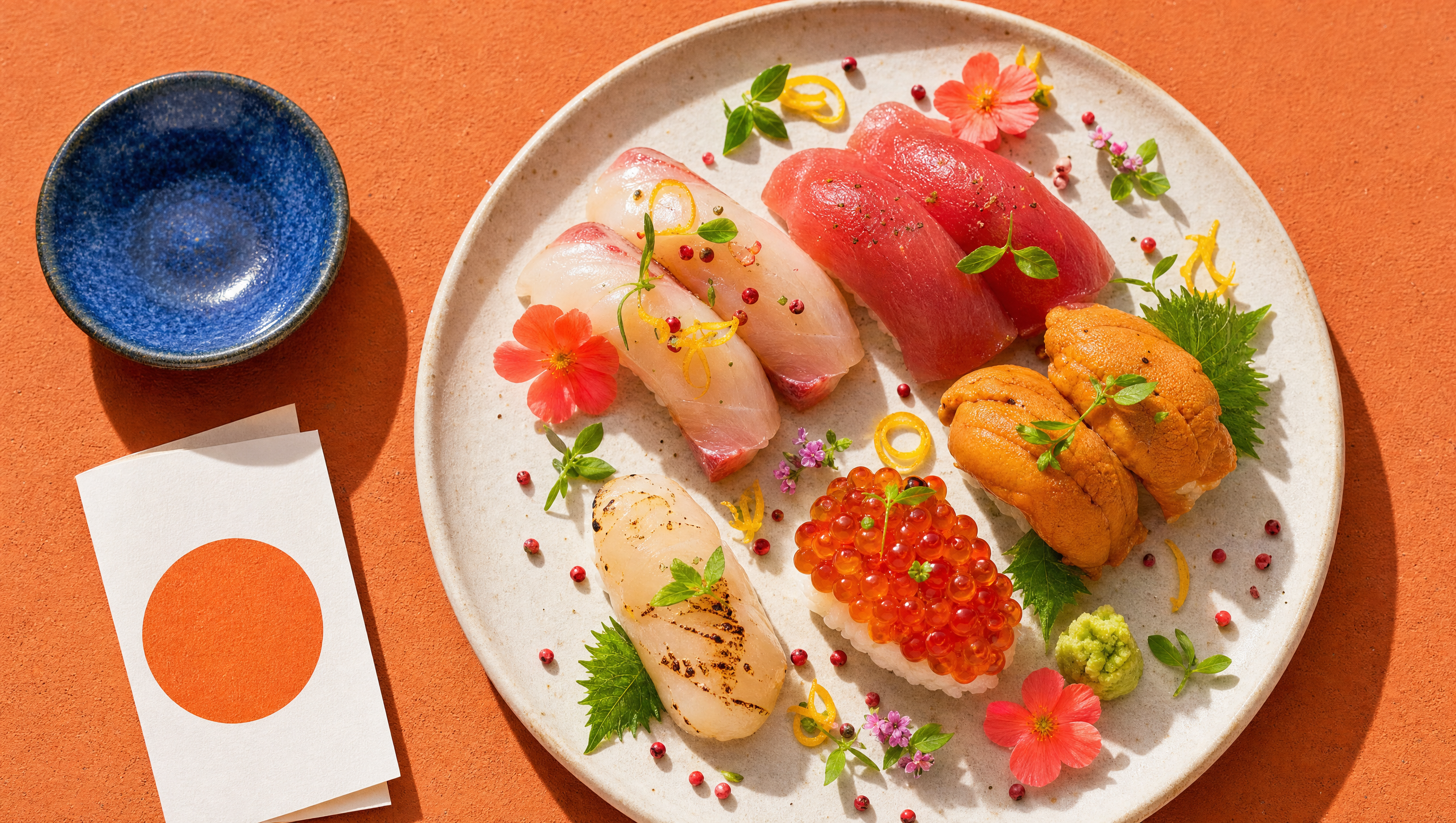
Shot at noon, on terracotta, in full sun
The category shoots food dark: black slate, moody side light, steam. This is shot in hard overhead daylight on warm terracotta, because that is what the colour of the fish actually deserves, and because the light here is hard at noon and nobody in the category uses it. The garnish is not styling, it is the citrus and shiso already on the plate, photographed honestly and very close.
Typography
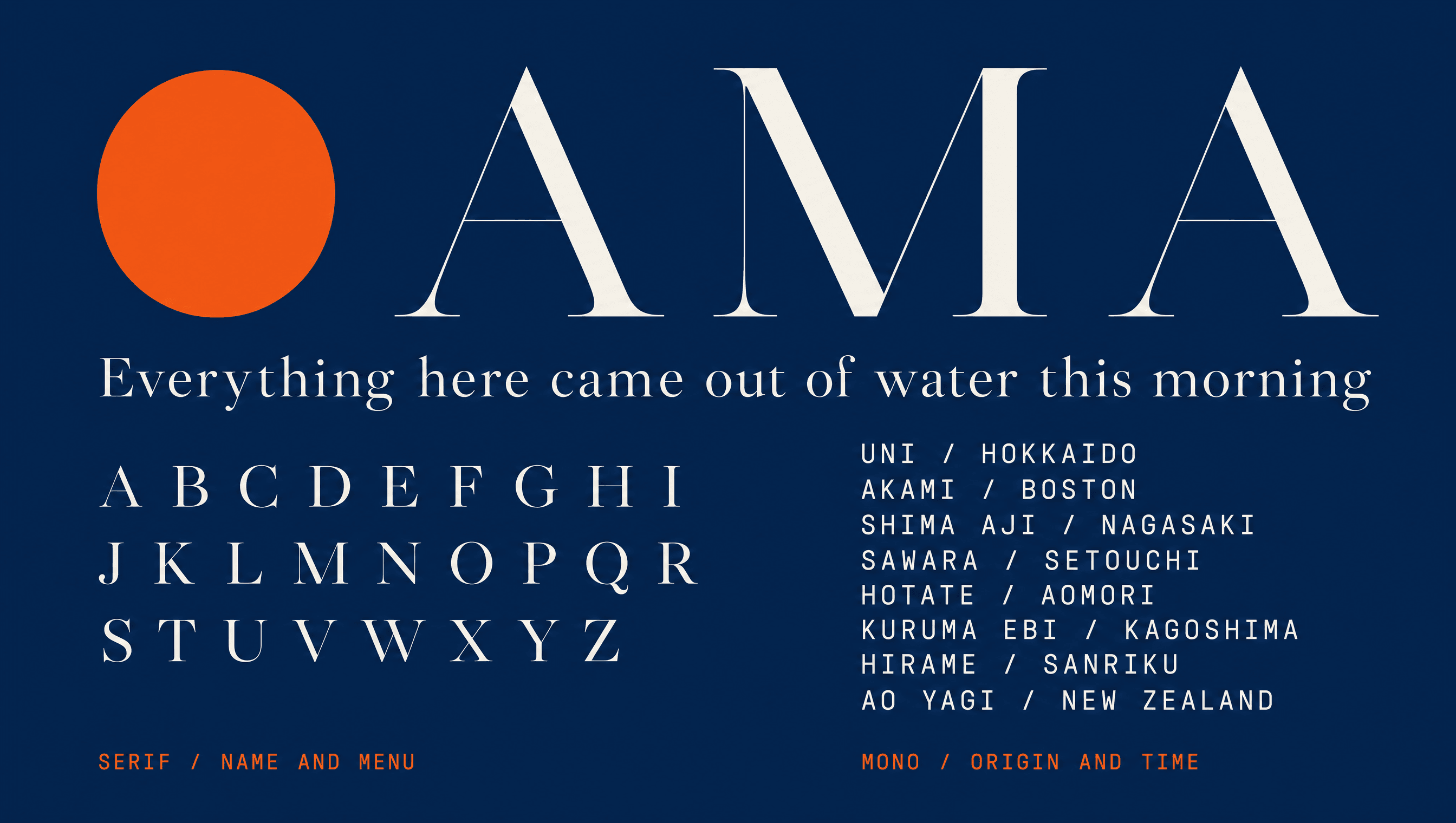
A serif for the name, a mono for the water
The serif is high-contrast and wide, used only for the name and the dish. Everything factual, meaning the port, the date, the seat count and the time, sits in mono. The split is the same argument the restaurant makes out loud: the cooking is a matter of taste and the sourcing is a matter of record, and the typography should not confuse the two.
Application
The sign says nothing. The card at your seat says the rest.
The frontage carries one word and one circle, on purpose, because a counter with two seatings a night does not need to explain itself to someone walking past. The context arrives later, printed, at the seat itself: your seating, your seat number out of eighteen, and the only line about the food the restaurant is willing to commit to in advance. Same stock and same press as the morning menu, mono for anything factual, and nothing about the chef.
Palette
Uni
#F26B21
Indigo
#1B2E52
Rice
#F7F3EA
Terracotta
#B4502E
Shiso
#3F7A4E
Voice
Printed at six. Changed by tomorrow.
Uni. Hokkaido. This morning.
Eighteen seats.
No menu until you sit.
Ask the port, not us.
Two words shorter than it wants to be, always. The fish already did the talking, so the copy's only job is to get out of the way of it. Nothing here is a full sentence unless the fact genuinely needed one.
Typefaces
Canela Deck
Name and menu
Söhne Mono
Origin, date, seat count
Credits
Kyle C., Brendan Forbes
Strategy, identity and art direction
Next
Howler