Concept work · Reposition
Howler
There are three in the deck, and the one you are holding was chosen before you reached for it.
- Category
- Hot sauce
- Scope
- Repositioning, identity, packaging
- Move
- Farmers market to national retail
The situation
At a market stall the label worked. Under supermarket light it gets one second.
Six years of a stall, a loyal following, and sauce made in small batches. Then a national grocery listing, which meant sitting on a shelf beside forty other bottles under hard retail lighting with roughly one second to be chosen. The kraft-paper-and-chilli-drawing label that felt handmade at a stall reads as generic under fluorescents.
The enemy
Kraft paper, a hand-drawn chilli, and somebody's first name.
Kraft paper, a hand-drawn chilli, a tiny farmhouse, and a name with the word artisan or a founder's first name in it. It signalled care in 2014. Now every one of the forty bottles is wearing it, which means it signals nothing and competes only on price.
The position
The only hot sauce you buy the whole set of, because each bottle is a card and nobody stops at one card.
Identity
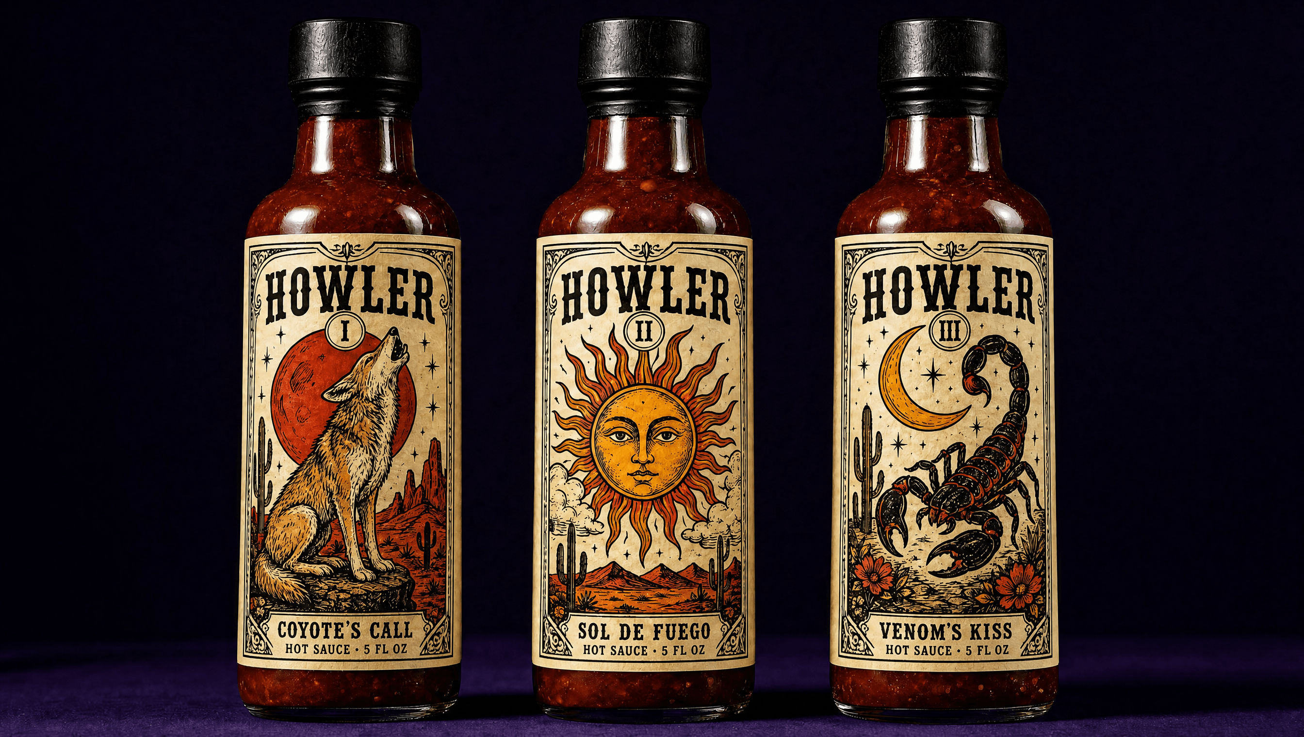
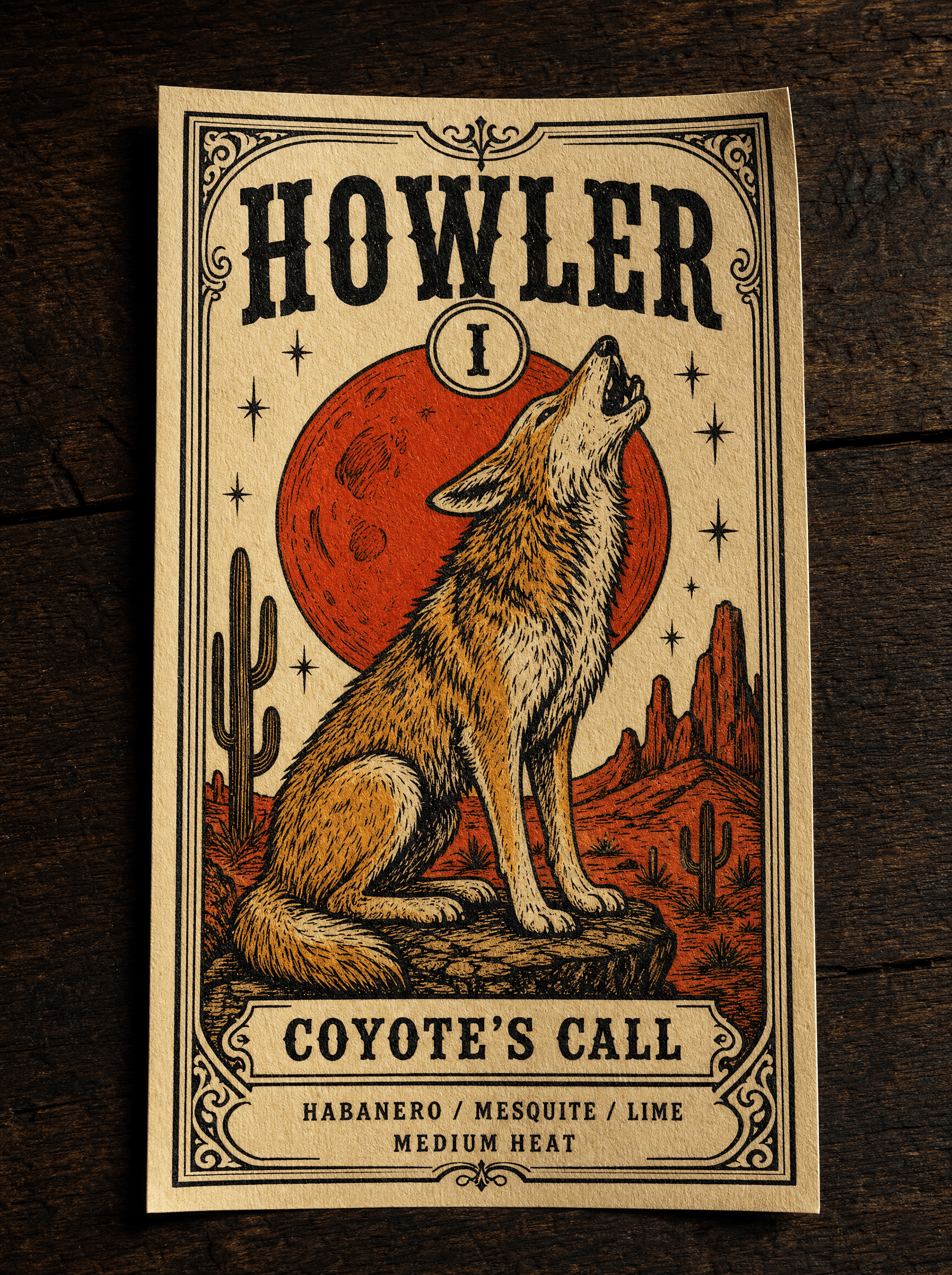
Every heat level is a tarot card
The range stopped being a lineup of strengths and became a deck. Each sauce gets a roman numeral, a name, and its own full-bleed illustration in the language of a vintage tarot card. It solves the shelf problem and the range problem at once: the labels are impossible to confuse with a competitor, and collecting the set is a behaviour the format invites rather than a discount we had to fund.
Character
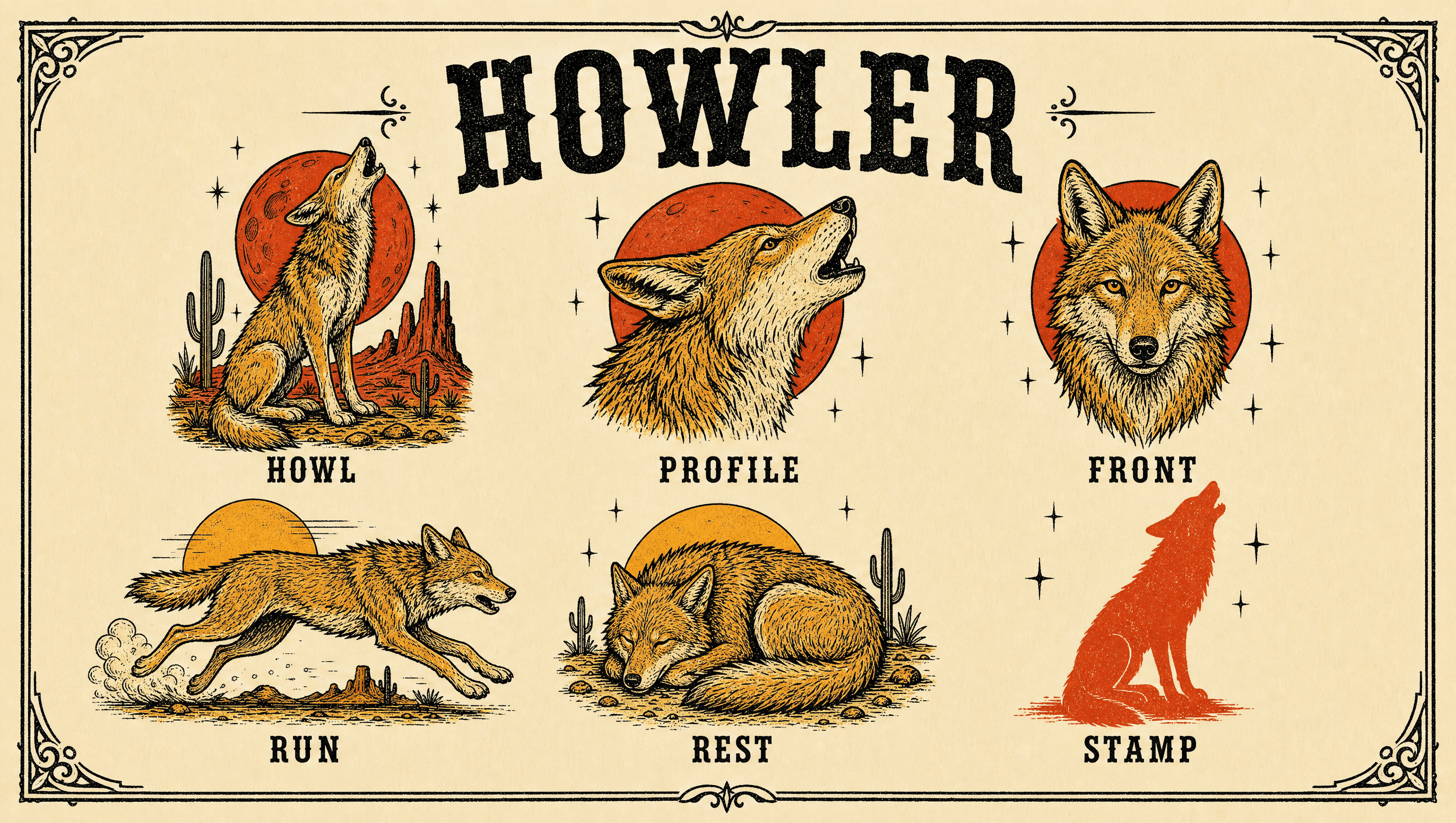
A coyote drawn once, used everywhere
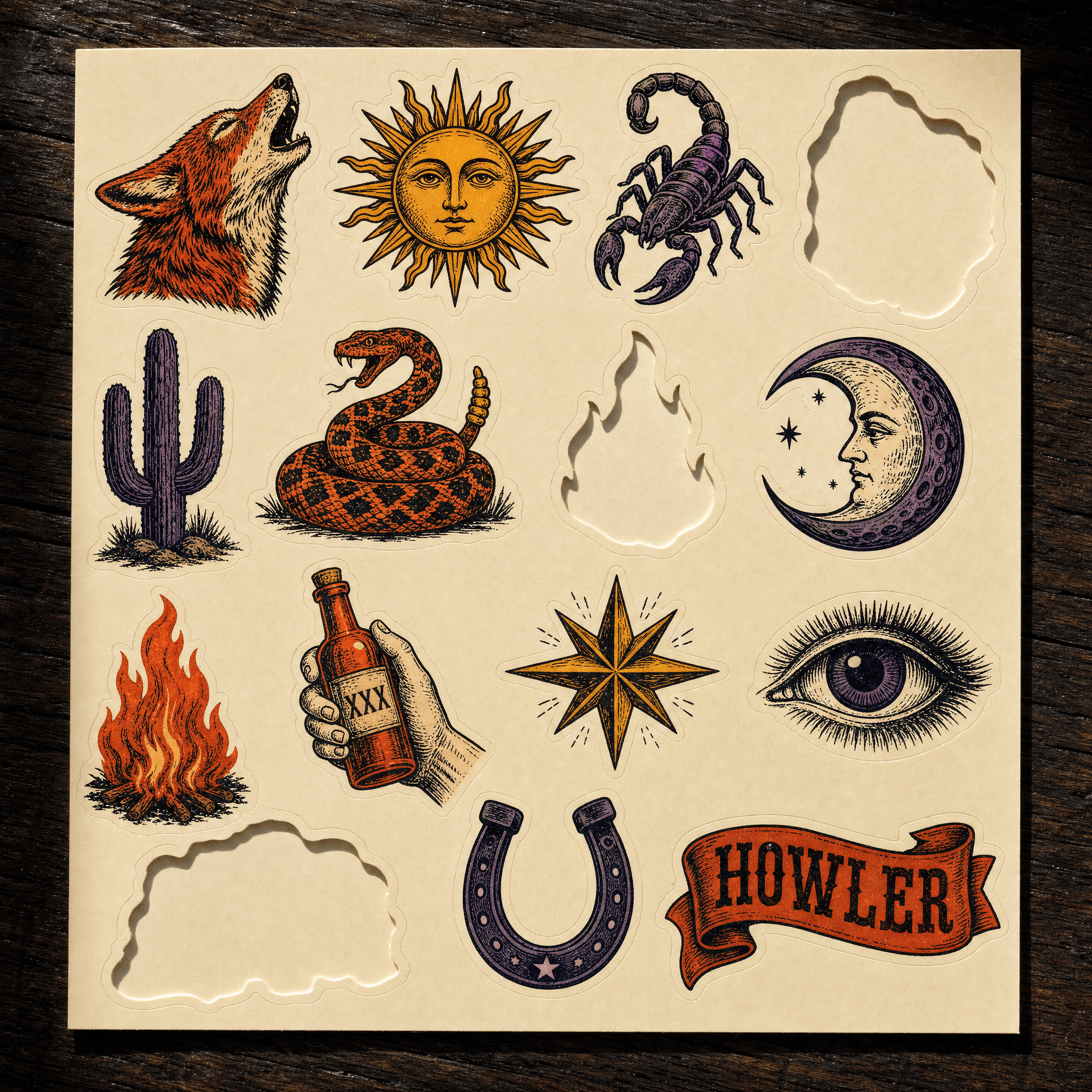
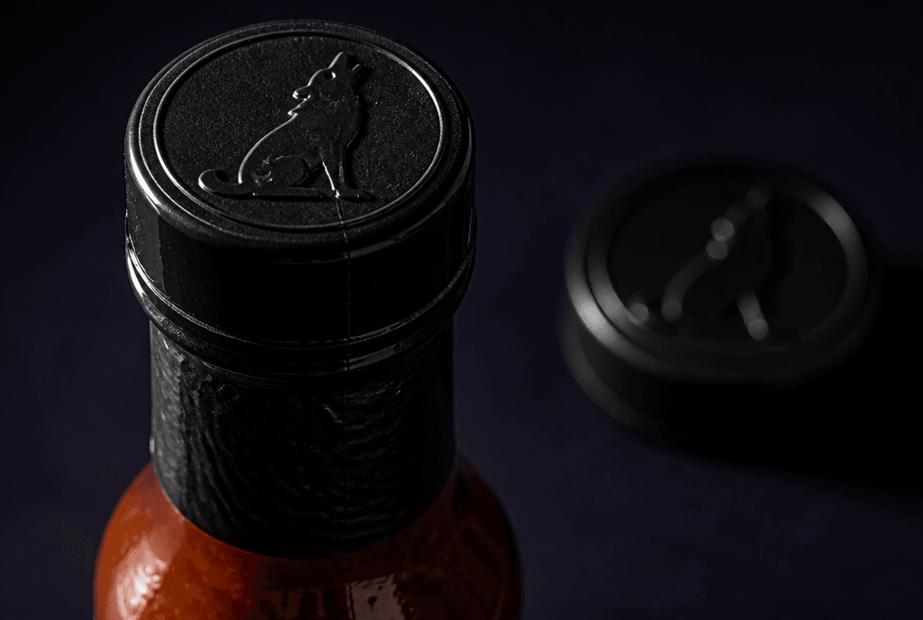
The coyote is the house character rather than a mascot, which is a real distinction: it never speaks, never holds the product, and never has a name. It appears as an engraving, a silhouette stamp, a bottle-cap emboss, and a sticker. Drawing it once in six positions meant the brand could stretch to new products without commissioning new artwork every time.
Colour
Desert night, not desert daylight
The category is red, orange and yellow, which is why the field here is a deep midnight purple. It buys separation on a shelf where everything else is warm, and the ember and marigold read hotter against it than they ever would against kraft. Bone carries the label so the illustration has somewhere quiet to sit.
Typography
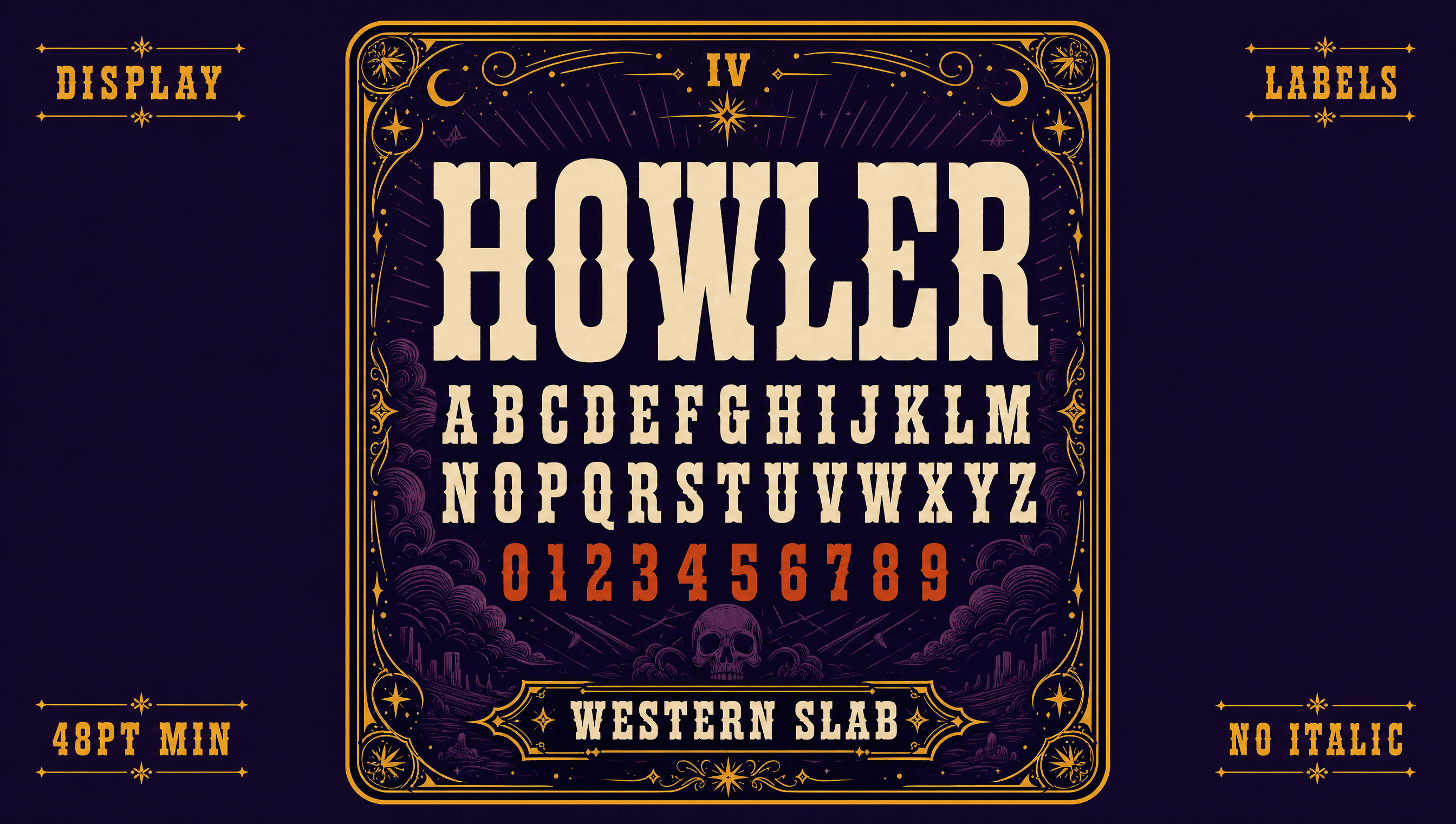
A wedge serif with a hundred years on it
The display face is a nineteenth-century antique wedge serif, chosen because it predates the craft-label look entirely and cannot be read as part of it. A plain grotesque carries ingredients and legal copy, deliberately unstyled, because the one thing that should never be decorative is what is actually in the bottle.
Application
The test is whether it survives being manufactured
A cap is the hardest surface in the system. No colour, no line weight, no cream field to sit on, and one strike to get it right. The coyote is struck into moulded plastic at the size of a coin, black on black, and a drawing that only holds up with its ink and its background behind it fails here. This one holds because it was built as a shape first and decorated second, which is also why it can be an engraving, a stamp and a sticker without being redrawn.
Palette
Midnight
#1B1035
Ember
#E03A1F
Marigold
#FFB020
Bone
#F5E9D0
Cactus
#3F7D5A
Voice
The deck runs to three. You are holding the first.
You have drawn the Sun, which shows no mercy and asks for none.
Some who reach for the third bottle do not reach for a fourth, and they will tell you afterwards that they chose to stop.
The coyote has seen worse than you, and was not impressed then either.
What is opened cannot be closed.
Prophecy rather than product copy. Archaic, ornate, and comfortable running a sentence far past the point any other brand here would have stopped, because the tarot format asked for that before the studio did. It never once says the word hot.
Typefaces
Antique Wedge
Wordmark and heat names
Founders Grotesk
Ingredients and legal
Credits
Kyle C., Brendan Forbes
Strategy, identity and art direction
Next
FRANK