Concept work · Brand Creation
High Sun
IT'S A HUNDRED AND FOUR OUT THERE AND WE ARE DELIGHTED.
- Category
- Canned hard seltzer
- Scope
- Naming, identity, packaging, environment
- Market
- Los Angeles first
The situation
The drink was never the problem. The chiller was.
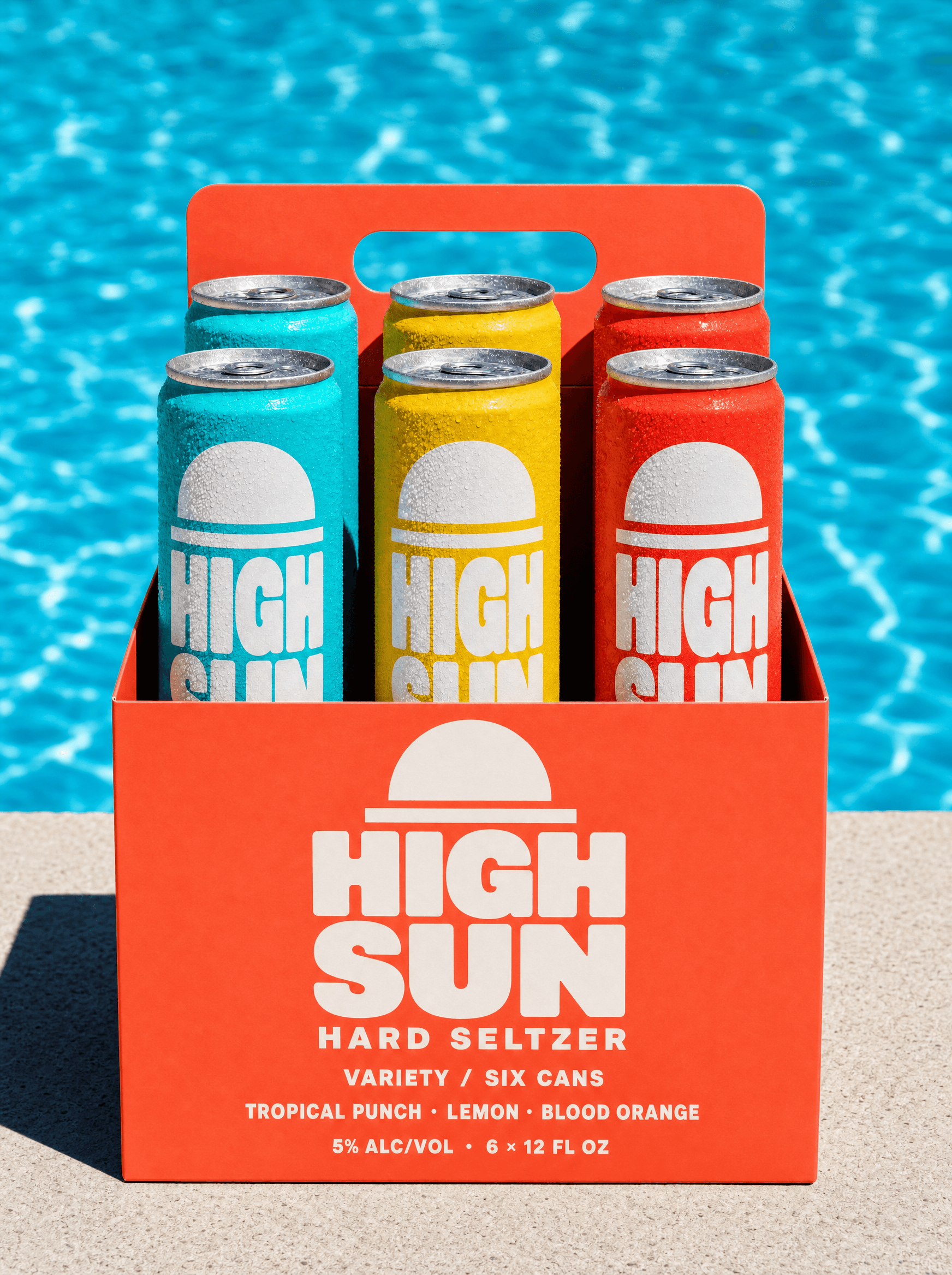
Three flavours, made properly, no sweetener, entering a category that added roughly four hundred products in five years. The drink was never the problem. The problem was that every can in the chiller had converged on the same look, which meant the only remaining question at the shelf was price, and this one was not the cheapest.
The enemy
Forty labels in the chiller. At arm's length, one product.
A soft two-colour gradient, a thin geometric sans in lowercase, a wisp of botanical line art, and a name that sounds like a mineral. It arrived around 2019 and now every brand in the chiller is wearing it. At arm's length through a fogged glass door they are one product with forty labels.
The position
The only seltzer that looks like the hour it is for, instead of the wellness aisle it is sold in.
Identity
A half sun sitting on a rule
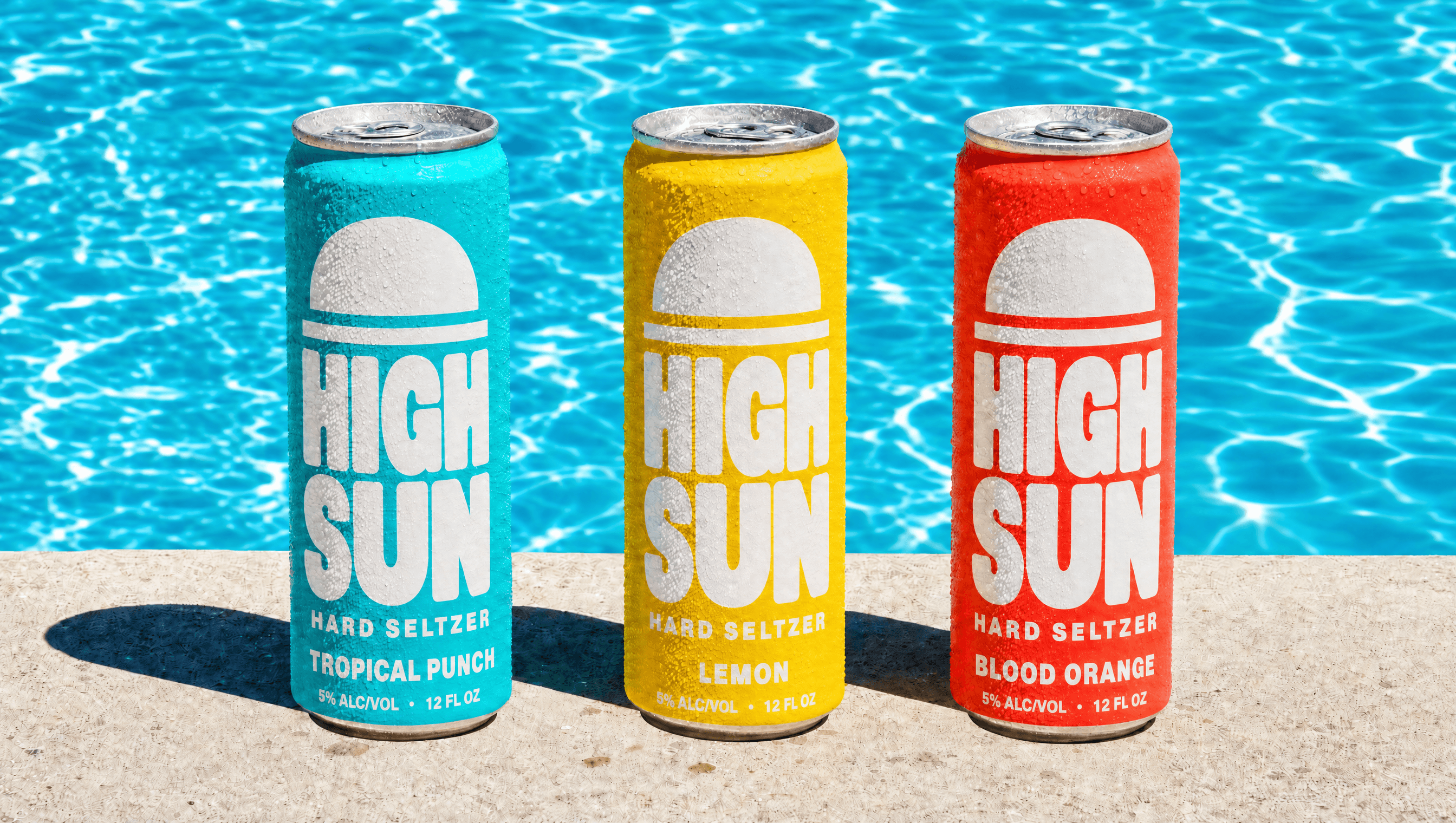
The mark is the sun at its highest point, drawn as a flat half circle resting on a horizontal line. It reads as noon, as a pool edge, and as a horizon, and it is simple enough to be painted by hand on a wall by someone who is not a designer. It sits above the wordmark on every surface and never appears outlined, shaded or in gradient.
Colour
Chlorine, sun and coral, all at full strength
Three saturated colours taken from a pool deck at midday: the turquoise of treated water, the yellow of hard light on white stucco, and the coral of a sunburn. Every one is used flat and at full strength, because the single most differentiating decision available in this category is refusing the gradient everybody else uses.
Typography
One rounded face, painted rather than set
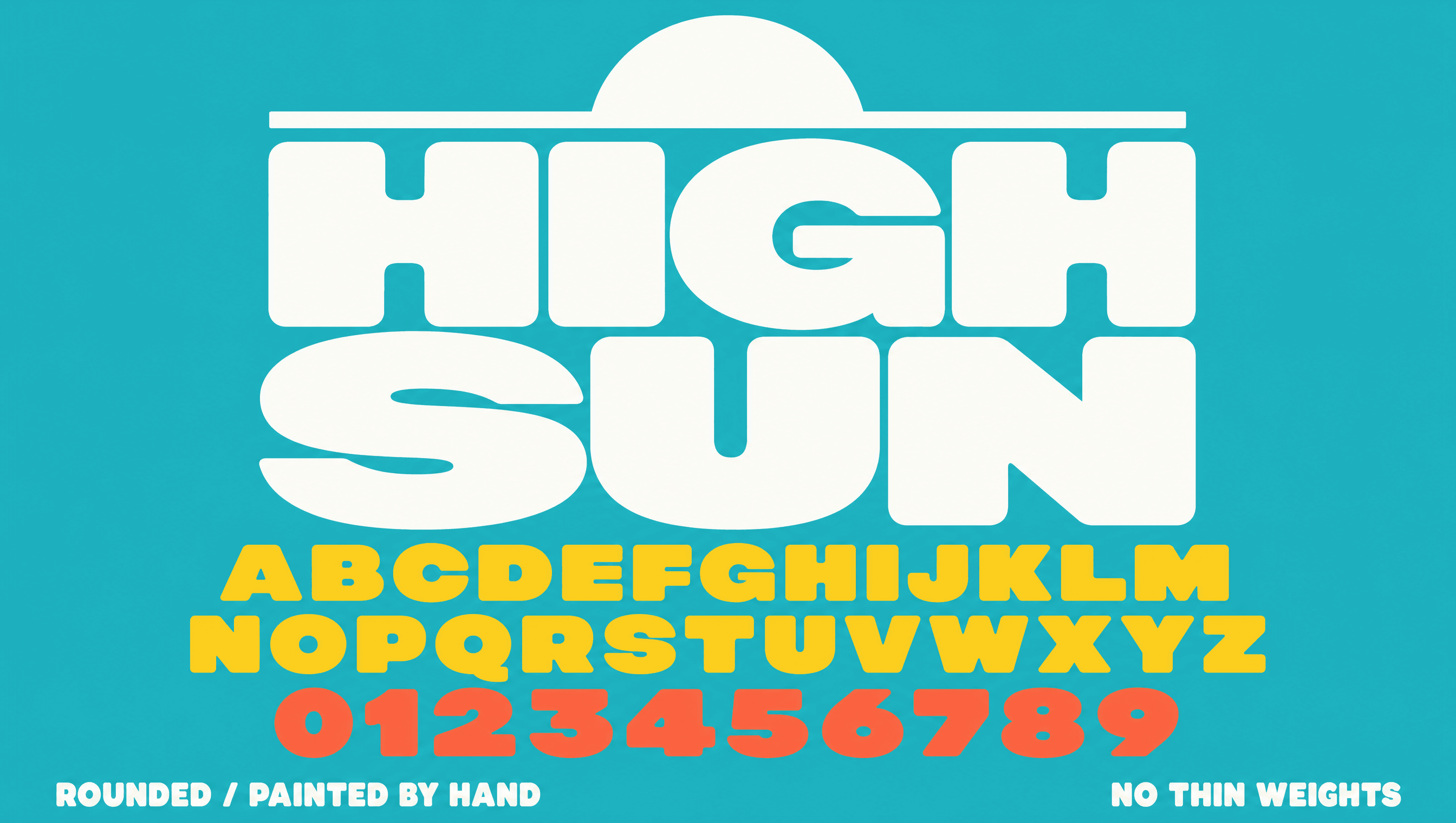
A single very heavy rounded display sans, drawn in the spirit of hand-painted motel and pool signage from the 1970s. There is no second typeface and no light weight, which is a deliberate constraint: it means every piece of the system can be reproduced by a sign painter, a screen printer or a stencil, and none of it depends on a licence.
Application
The brand goes where the drink is drunk
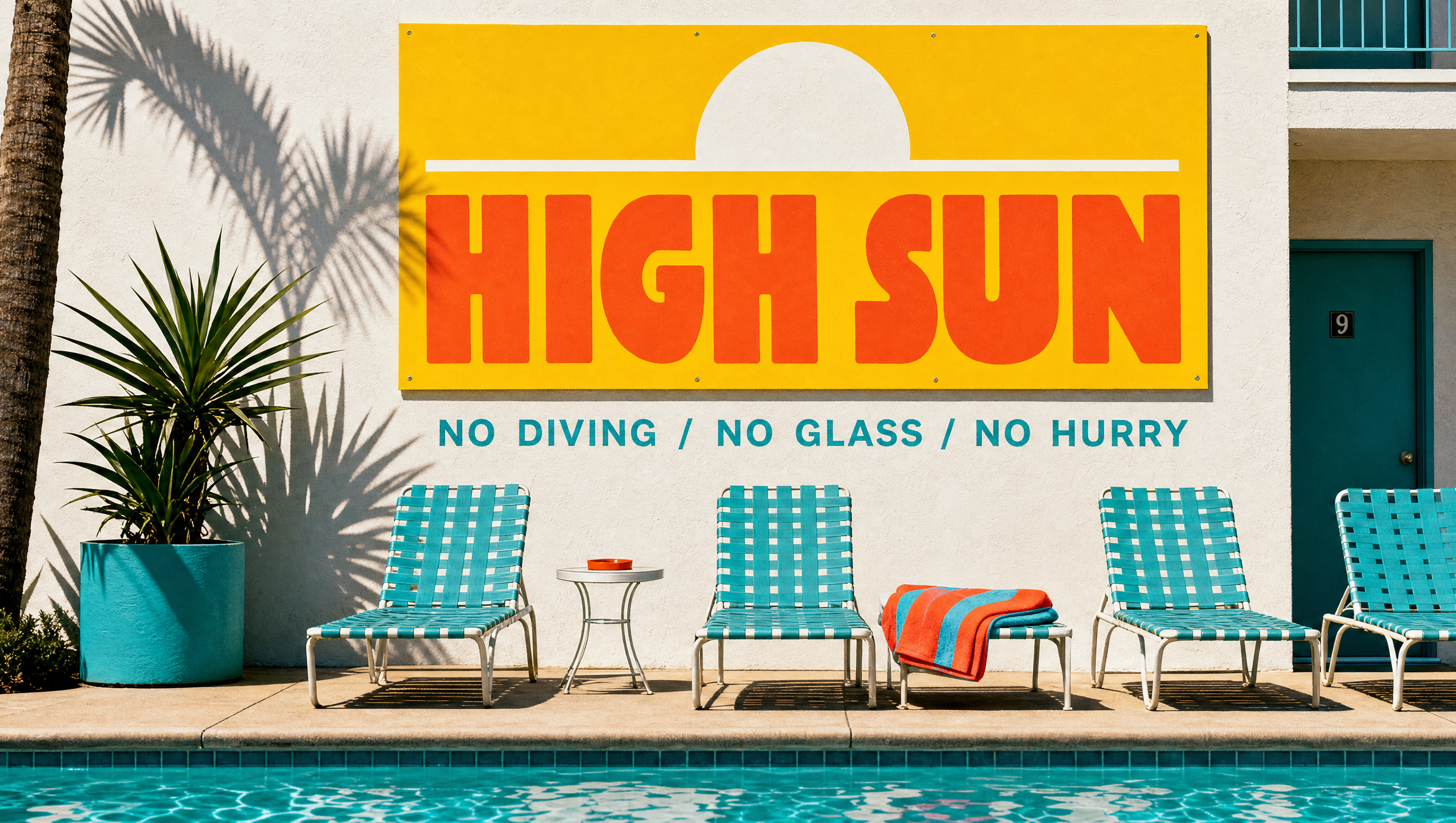
The system was built for walls, towels and pool decks before it was built for a website, because the product is consumed in bright outdoor places and that is where it should be seen. Hand-painted signage, striped textiles and stencilled pool rules all use the same three colours and the one face, so anything can be made locally without the studio.
Palette
Chlorine
#2BB3C0
Sun
#FFD029
Coral
#FF6B4A
Bleach
#FFFDF6
Deck
#C9BFAA
Voice
Ice machine's round the back. Help yourself.
Cold one. Right now. Go on.
Pool's open. Pool's always open.
Nobody ever finished one slow!
See you at the shallow end!
A sun-drunk motel sign that has been out in the heat too long and is delighted about it. Cheerful to the point of being a bit much, talks directly to you, and would rather be friendly than clever. The only voice in the portfolio that waves goodbye.
Typefaces
Sign Painter Rounded
Everything. There is no second face
Credits
Kyle C., Brendan Forbes
Strategy, identity and art direction
Next
Ama