Concept work · Brand Creation
Dunnage
Condition on arrival: unchanged.
- Category
- Fine art logistics
- Scope
- Naming, identity, fleet livery, crew, documentation
- Clients
- Collections, galleries, estates
The situation
Do the job perfectly and nobody sees it happen. They cannot photograph the artwork either.
Fine art logistics is crating, transport, climate-controlled storage and installation for collections, galleries and estates. The work is genuinely difficult and almost entirely invisible: if the client ever notices it happening, something has gone wrong. The firm was excellent at the job and had no way of showing it, because the one thing it cannot photograph is the artwork itself.
The enemy
A gloved hand, a gilt frame, and the word bespoke.
The category advertises with a gloved hand hovering near a gilt frame, the word bespoke, and a stock image of a gallery nobody works in. It is a promise of care made entirely through adjectives, from firms that all use the same three. None of it survives contact with a client who has actually had something damaged.
The position
The only fine art logistics firm whose brand is the paperwork, because the paperwork is the only part of the job the client is ever allowed to see.
Identity
The reference number is set larger than the name
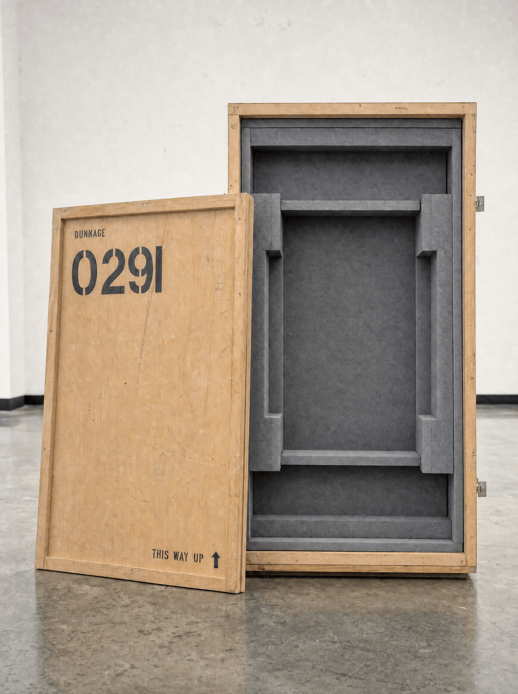
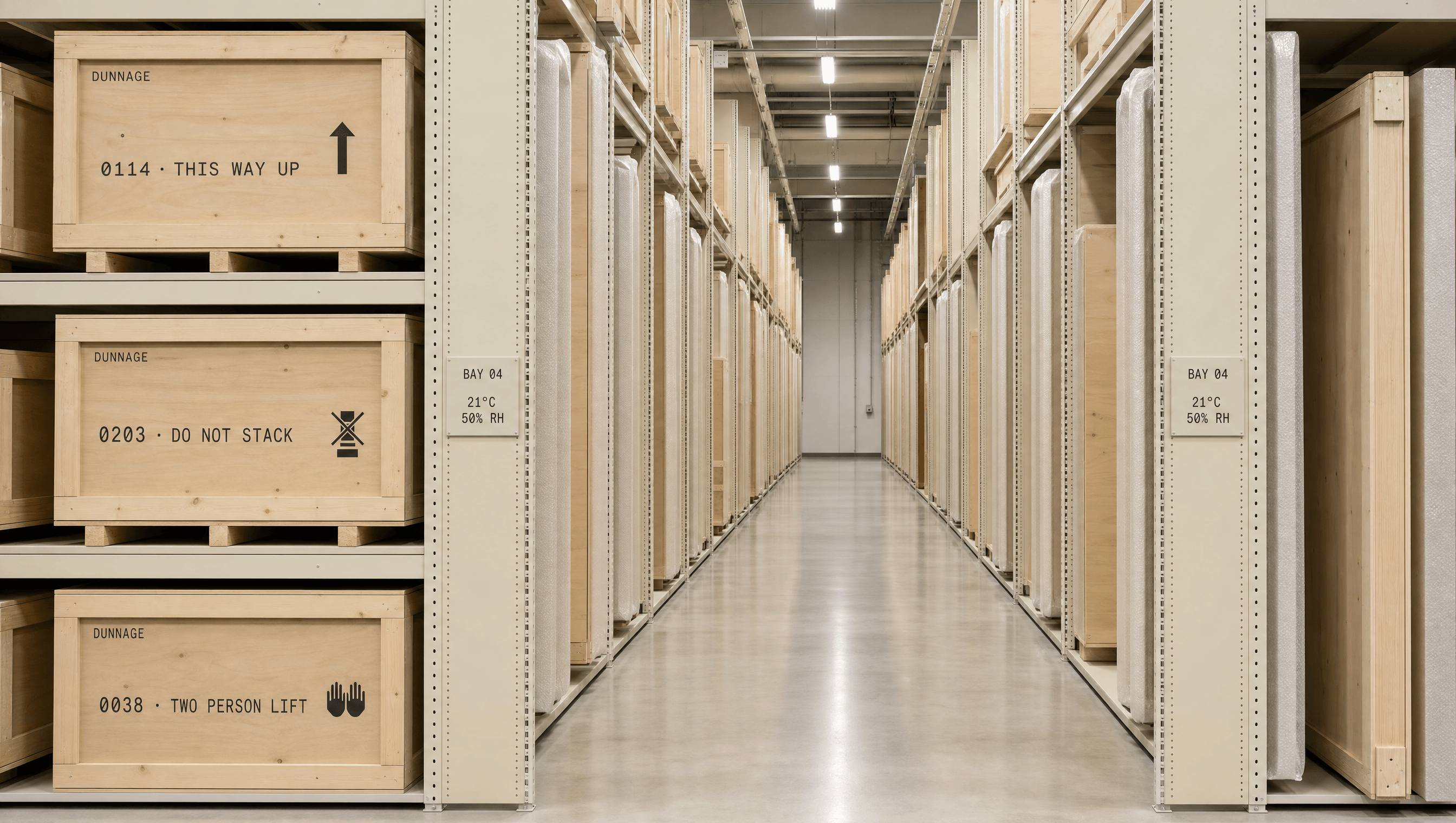
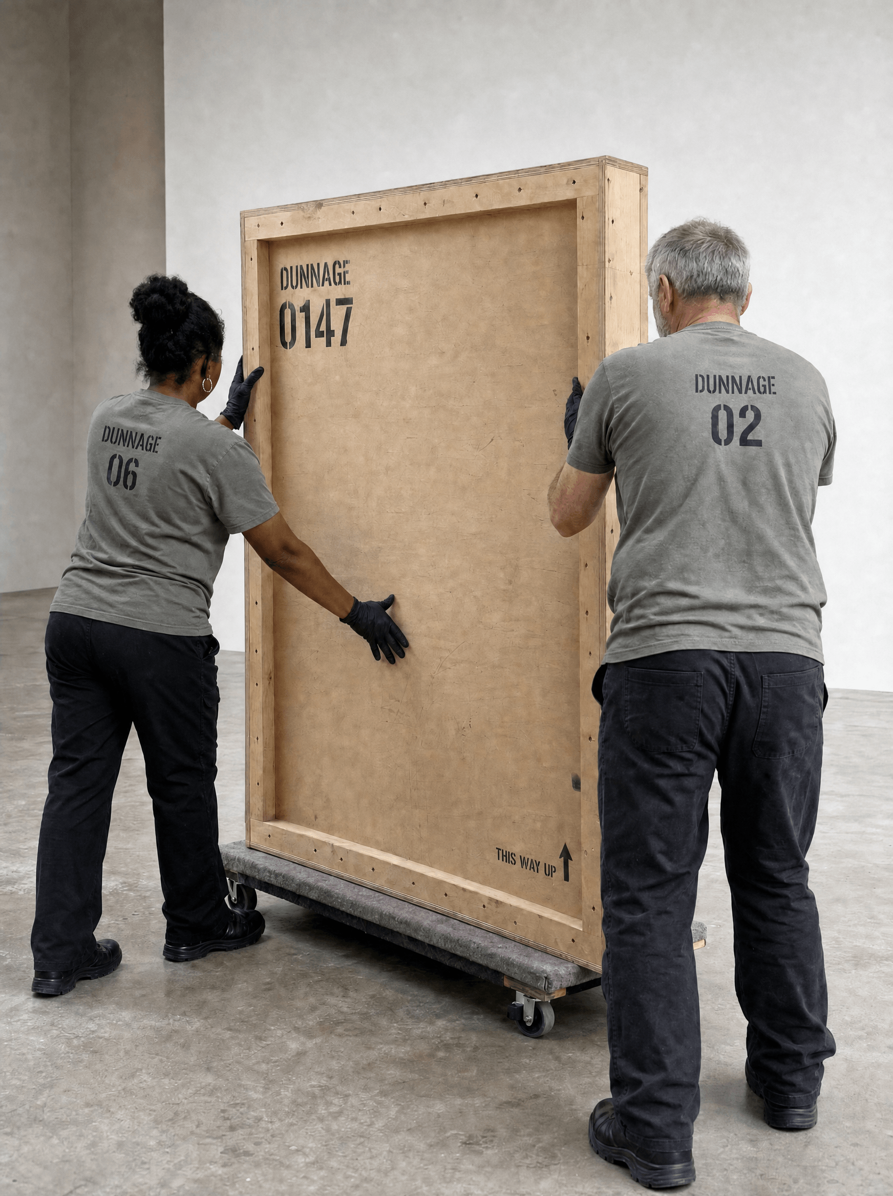
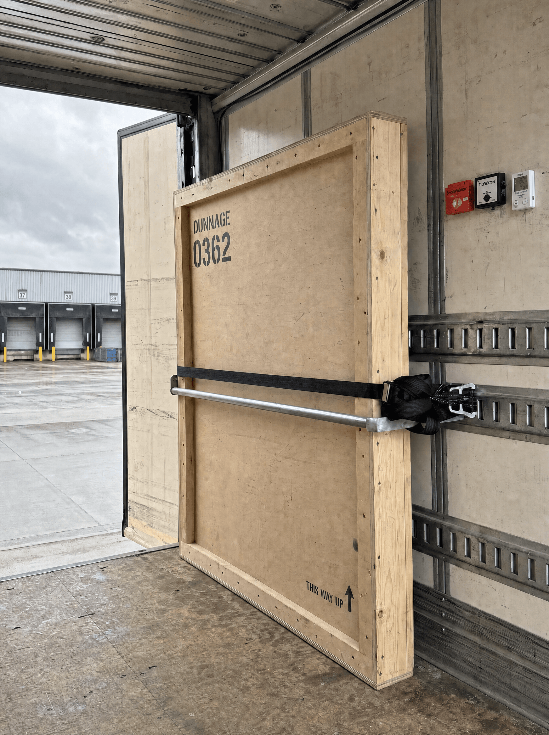
Every crate, every truck panel, every document leads with a reference and a handling instruction, and the wordmark sits small above it. That hierarchy is the argument: a firm that sets its own name larger than the number identifying the object it is carrying has misunderstood what it was hired to do. The mark is never applied to anything the client keeps, only to things the crew handles.
Colour
Bone, graphite, and the colour of the crew
Off-white for the fleet and the documents, graphite for every mark, and a soft grey-green reserved entirely for what the crew wear. Plywood is the fourth colour and it was not chosen, it is simply what a crate is. Nothing here is branded in a colour, because a truck that announces itself outside a private residence is a security problem before it is a design one.
Typography
No display face anywhere in the system
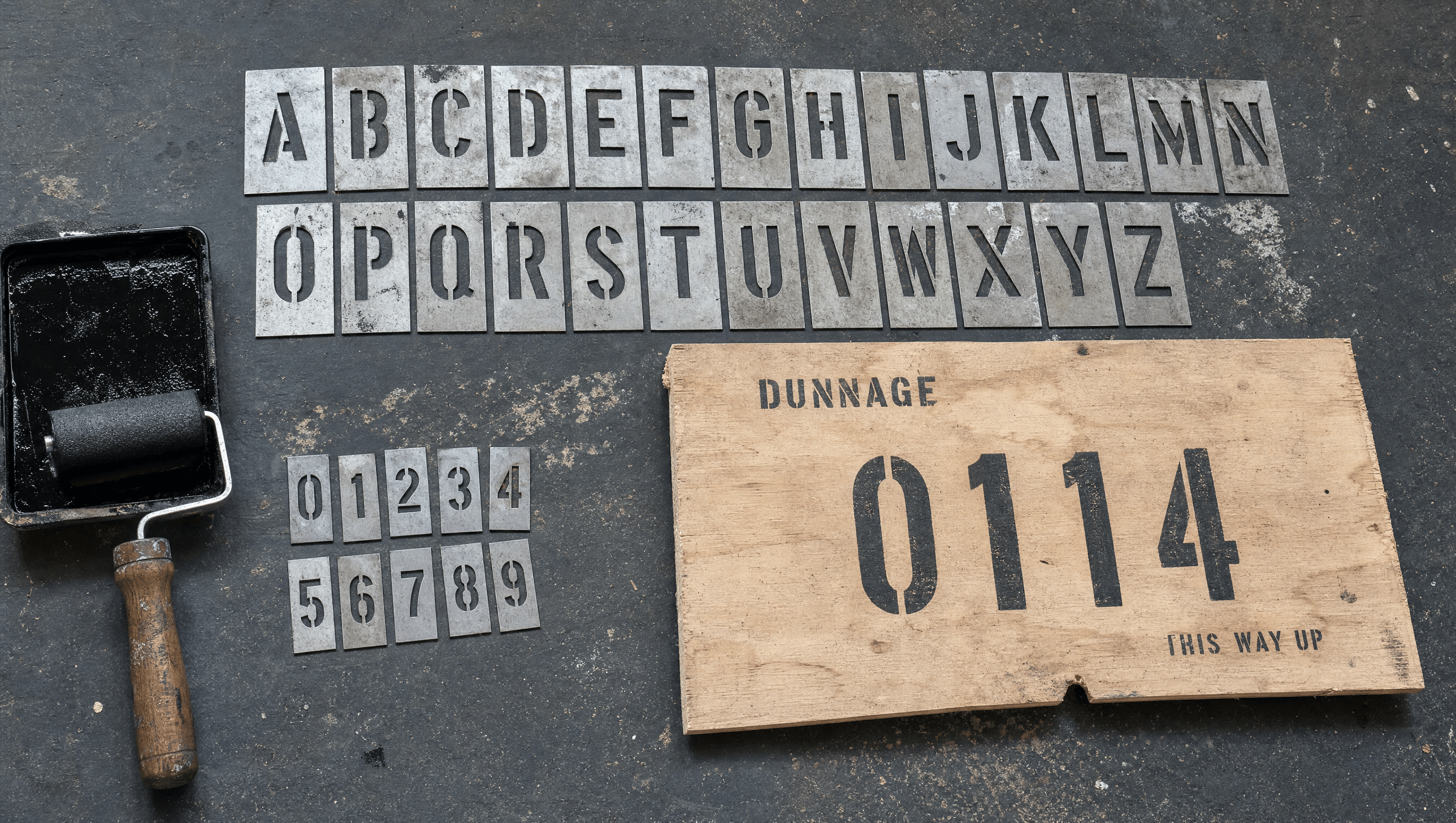
A plain functional grotesque for anything the firm says, a mono for anything it logs. There is no third cut and no display weight, because a display face is a firm performing confidence, and this one demonstrates it by writing down times. The mono is doing the actual persuading: a client reads eleven hours twenty and understands the care without being told about it.
Application
The condition report is the deliverable
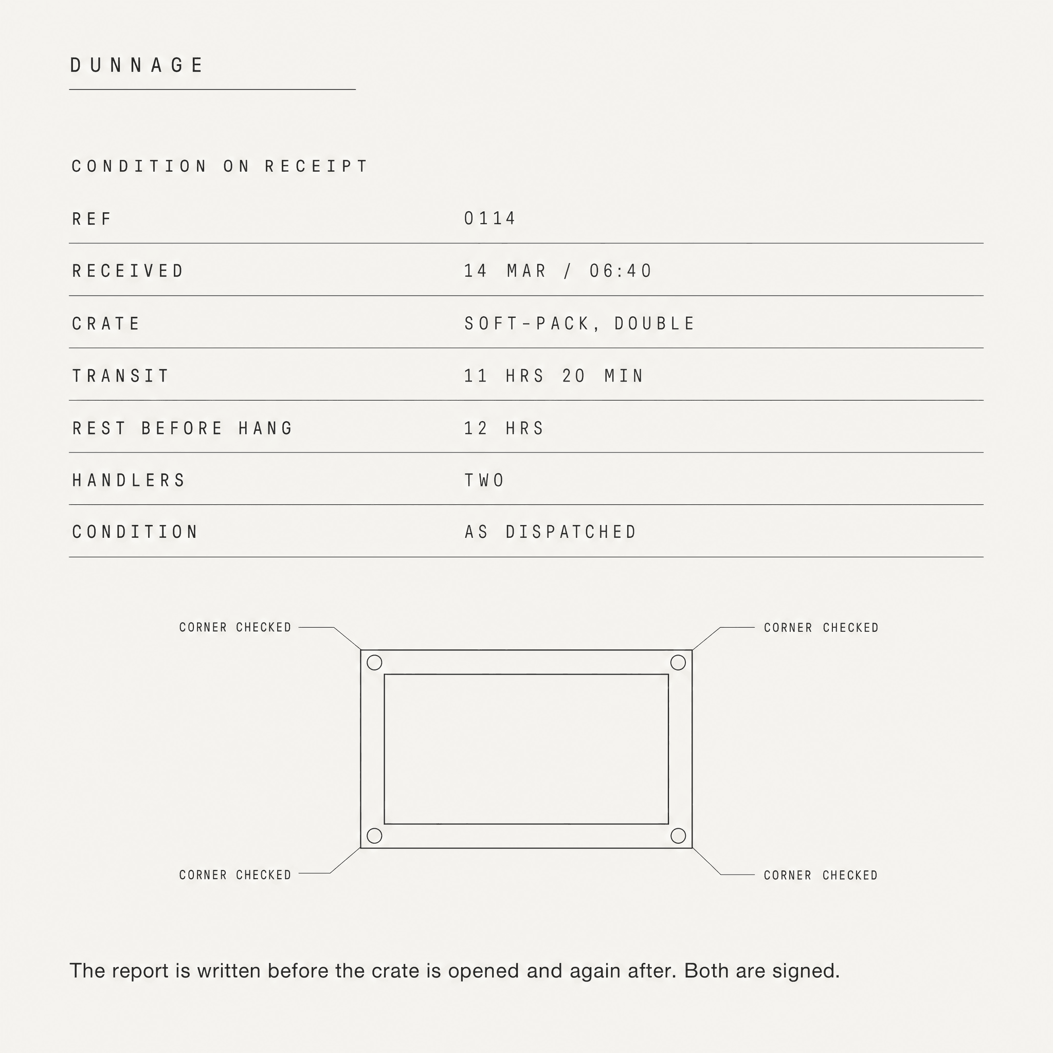
It is written before the crate is opened and again after, and both versions are signed. That document is the only thing most clients ever hold, so it was designed first and everything else was made to match it. It records transit time, rest time before hanging, crate type, handler count and condition, which together say more about competence than any photograph of a gloved hand could.
Palette
Bone
#F2F0EA
Graphite
#23262B
Crew
#7E8578
Ply
#C9A87C
Voice
Collected 06:40. Sealed 07:10. Signed for at both ends.
Crated to the millimetre. Uncrated the same way.
The work has been in transit eleven hours. It will rest twelve before it hangs.
You will not meet most of the people who moved it.
The report is written before the crate is opened, and again after.
Discreet to the point of self-erasure, and precise because precision is the only reassurance available to someone handing over something irreplaceable. It never uses the words careful, trusted or white-glove. It states what was done, in what order, and how long it took.
Typefaces
Functional Grotesque
Everything spoken
Mono
Everything logged: ref, transit, hold, condition
Credits
Kyle C., Brendan Forbes
Strategy, identity and art direction
Next
Larder