Concept work · Brand Creation
Wobble
I MADE THIS.
- Category
- Children's art supplies
- Scope
- Naming, identity, packaging, character
- Buyer
- Parents and schools
The situation
Built for a four-year-old. Sold to the parent holding the basket.
A new range of crayons, markers and poster paint for children under seven. The products were built properly for small hands. The category they were entering was not: it is designed almost entirely to reassure the adult holding the basket, with tidy layouts, tasteful muted palettes, and photographs of immaculate children producing immaculate pictures.
The enemy
Dusty sage, a wooden toy on linen, and nothing a child can grab.
Dusty sage, soft terracotta, a thin geometric sans, and a wooden toy shot on linen. It is beautiful and it is aimed squarely at a parent's living room. The child, who is the actual user and cannot read, is given nothing to grab hold of.
The position
The only art supplies brand that looks like what a four-year-old actually makes, instead of what an adult wishes they made.
Identity
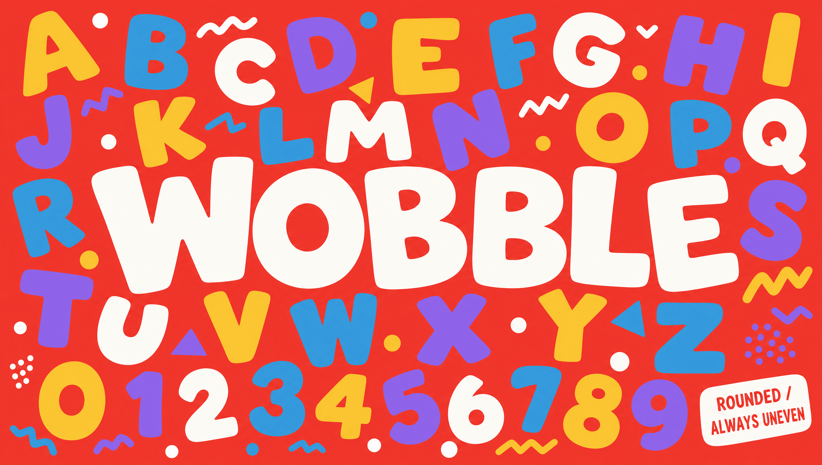
The wordmark is drawn wrong on purpose
Every letter is slightly uneven, differently weighted, and tilted a degree or two off. It is the single decision the whole brand rests on. A child recognises it as their own handwriting rather than an adult's, and a competitor cannot copy it without looking like a mistake, because to anyone outside the brand it is one.
Character
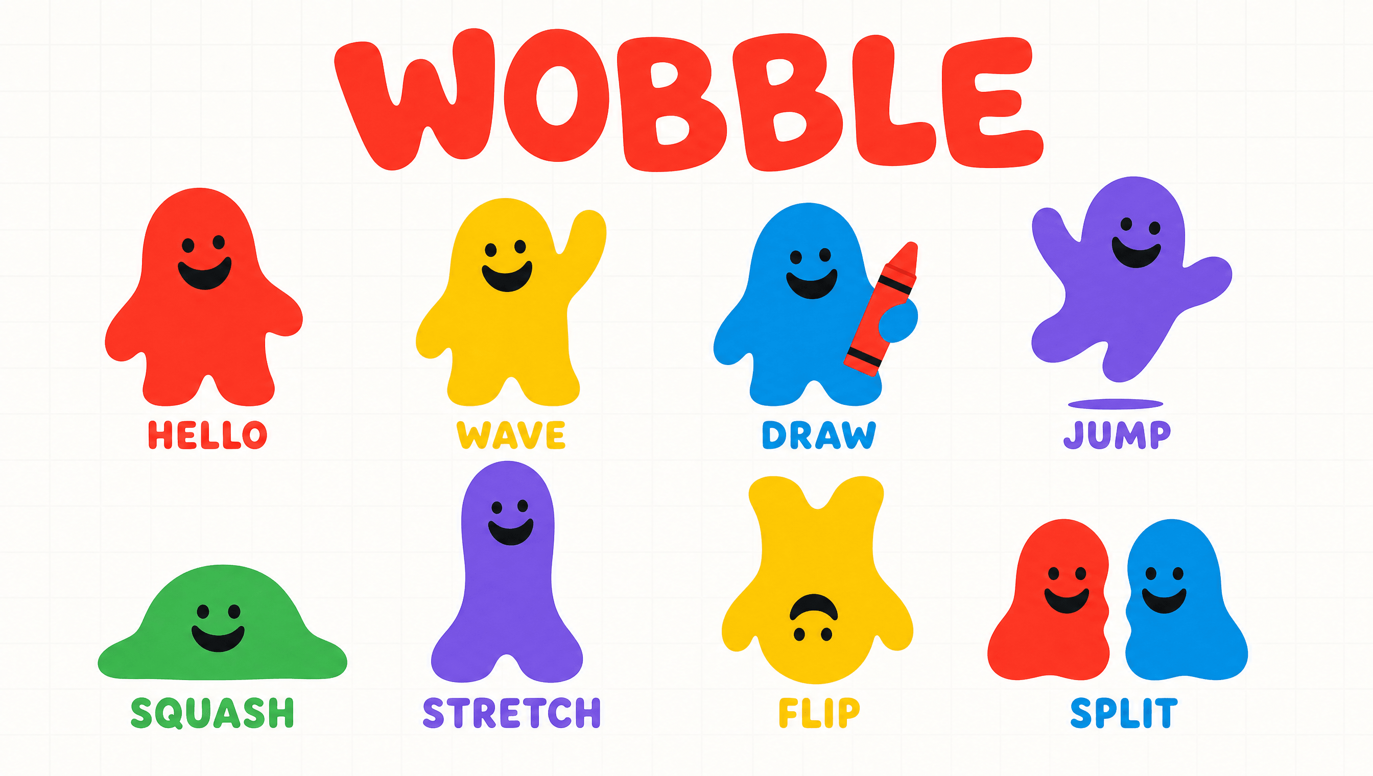
A blob that squashes, stretches and splits
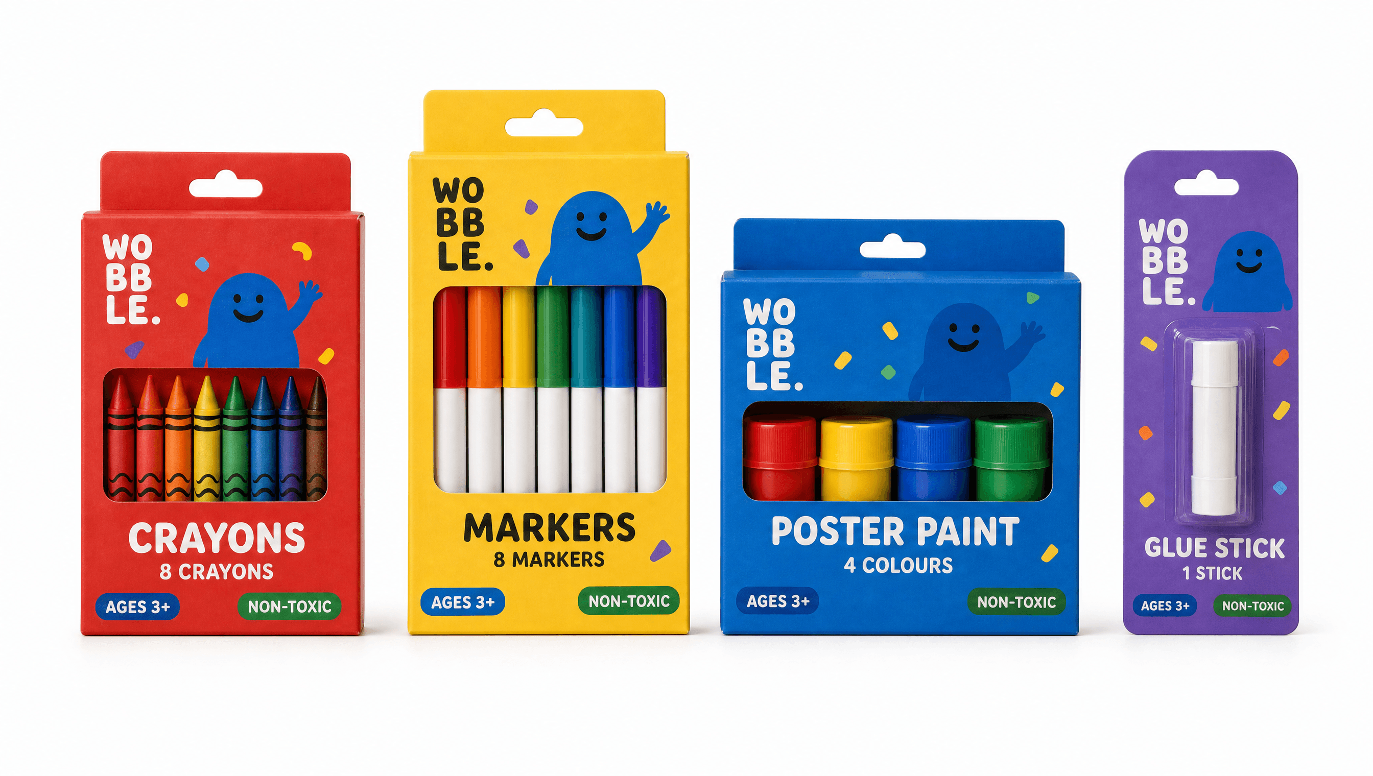
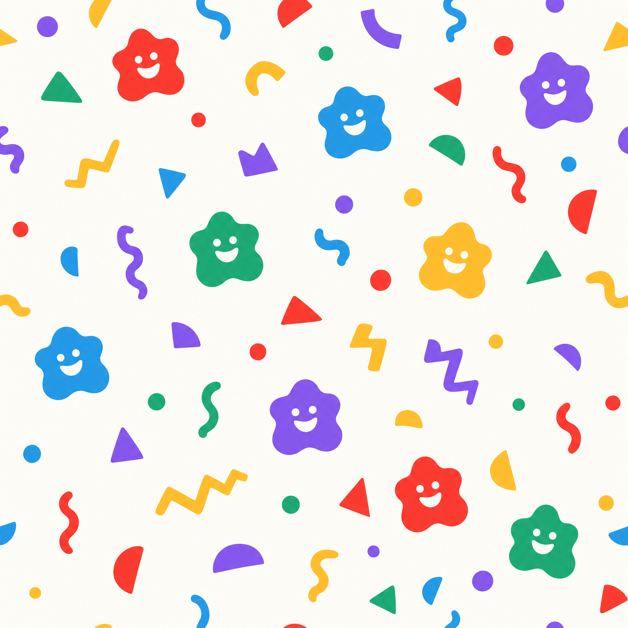
The character is a shape rather than a creature: no species, no gender, no name, two dots and a smile. That was deliberate, because a shape can squash, stretch, split in two and change colour without ever being off-model, and a child can draw it themselves in one stroke. Most kids' mascots cannot survive being redrawn by a four-year-old. This one is improved by it.
Colour
Primary, because that is what they reach for
Four saturated primaries and white, chosen for recognition rather than taste. A child selects by colour long before they can read a product name, so the colour is the navigation. It also happens to be the loudest possible thing on a shelf full of sage and terracotta, which was a useful accident rather than the reason.
Application
Designed to be reached for, not admired
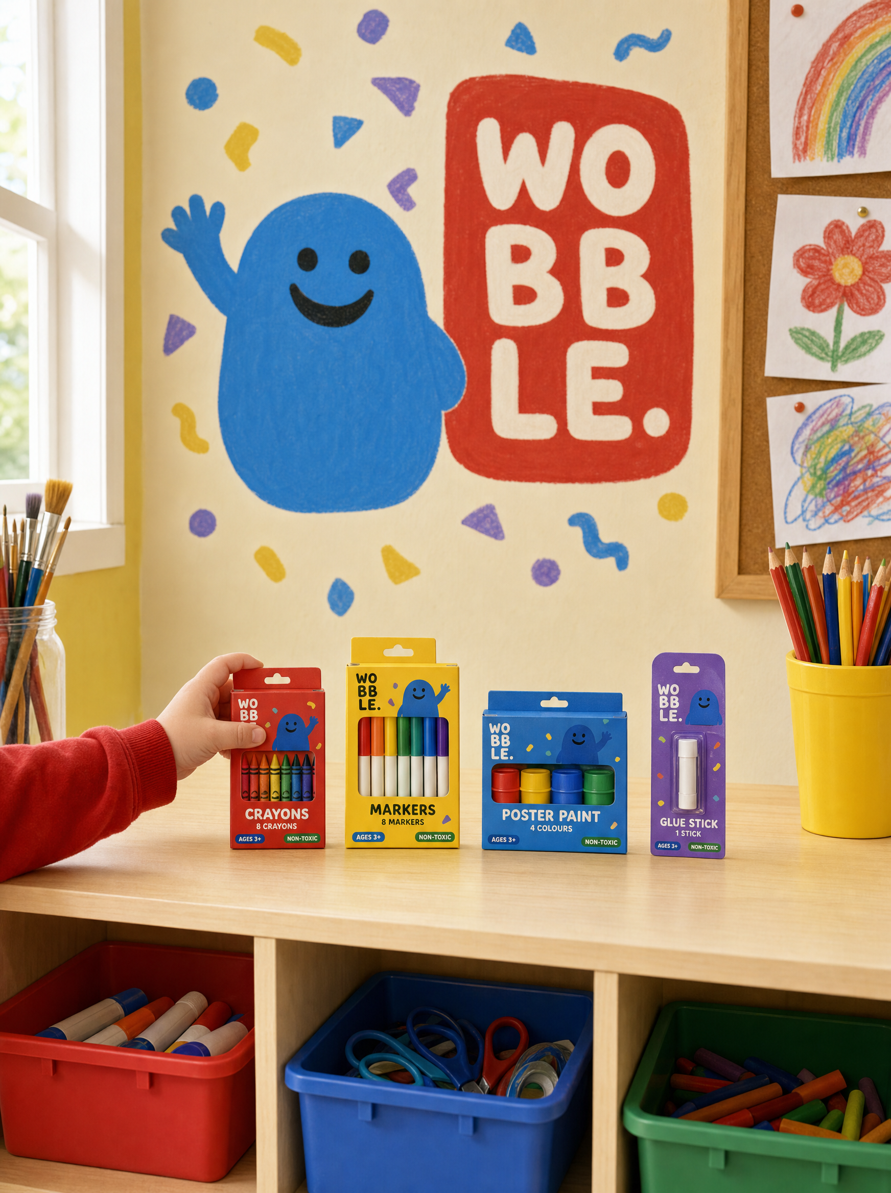
Packs are sized and weighted for a child to pull off a low shelf without help, with the window low so the actual crayons are visible at a metre off the ground. The classroom system extends to wall vinyl and storage labels in the same four colours, so a room can be organised by colour before anyone in it can read.
Palette
Tomato
#FF4B3E
Sun
#FFC93C
Sky
#2D9CDB
Grape
#8B5CF6
Chalk
#FFFDF7
Voice
WOBBLE WOBBLE WOBBLE!
Squish it. Squash it. AGAIN.
Oops! Allowed.
Red goes with green. ESPECIALLY green.
It got on the floor. It gets on the floor!
Written the way a four year old actually talks, not the way an adult writes about one. Repetition, shouting, sound effects, and grammar that gives up halfway. It is allowed every single thing the rest of the portfolio bans, because a children's brand that cannot use an exclamation mark is not a children's brand.
Typefaces
Wobble Rounded
Everything, drawn uneven on purpose
Credits
Kyle C., Brendan Forbes
Strategy, identity and art direction
Next
26 North