Concept work · Brand Creation
FRANK
Same time tomorrow, whether you like it or not.
- Category
- Coffee
- Scope
- Naming, identity, packaging, merch
- Move
- Wholesale to retail shelf
The situation
A good roaster wearing the same uniform as forty others.
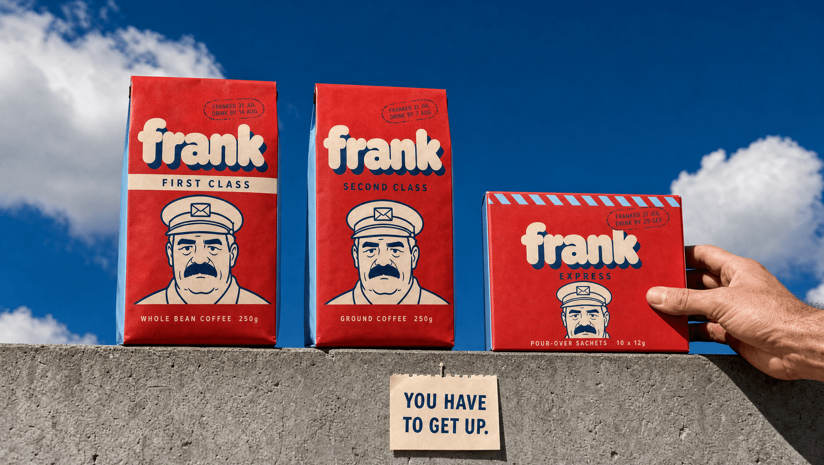
Five years of steady wholesale into cafés and a product people came back for. Then a retail listing, which meant standing on a shelf beside forty other specialty bags and being picked in about a second. The coffee was never the problem. The bag was indistinguishable from every bag either side of it.
The enemy
A place you will never go.
A farm, an altitude in metres, a washing station, and three flavour words in a row. The whole category romanticises somewhere the buyer will never stand, described by people who mostly have not stood there either. It signalled care in 2015 and now four hundred roasters wear it, which means it signals nothing and competes only on price.
The position
The only coffee built around the person who brings it, not the place it came from.
Identity
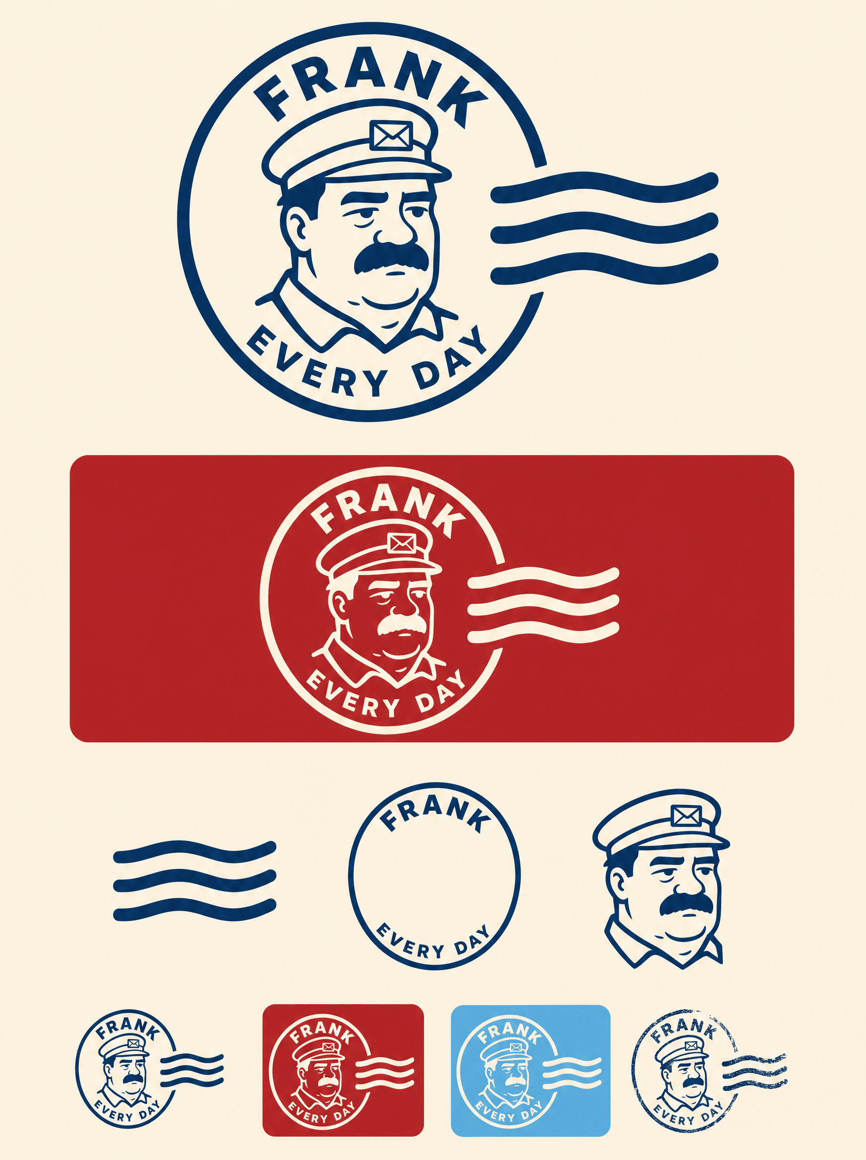
The whole postal vocabulary, not one borrowed edge
To frank is the postal act of marking something as paid and dated, so the name is the argument and the system follows from it. Airmail chevrons, a struck cancel, a day number instead of a date, and postal classes instead of tiers. Borrowing a whole vocabulary is harder to copy than borrowing a palette, which is the point of taking all of it rather than a stripe.
Character
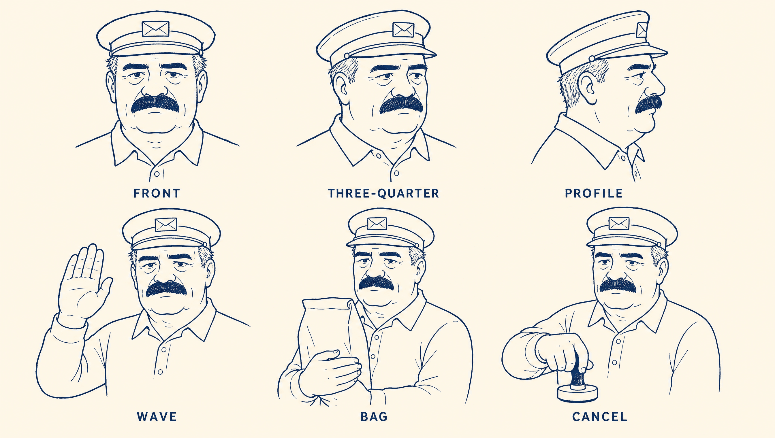
He is not on the brand. He is the brand.
Coffee is the one thing people do every single day, and the postman is the one person who turns up every single day, so the character is not decoration sitting on a pack, he is the argument. He was drawn as a model sheet before anything else existed and every other asset was grounded to it, which is why he is the same man on the bag, the mark and the mug. Late fifties and faintly unimpressed, because a man who has worked the same counter for thirty years is not going to pretend your parcel arrives Thursday. The bible runs to about eighty strokes and the mark reduces him to fifteen, a different drawing doing a different job.
Colour
Loud in pattern, disciplined in application
Four colours and no black anywhere, because the darkest thing in the system is a deep ink navy. Red and sky do the shouting, cream carries the type. The restraint is the cost signal: the chevrons never become a filled panel, and the moment either colour turns into a background the whole thing drops a price bracket.
Application
The proof is the one thing that cannot be faked
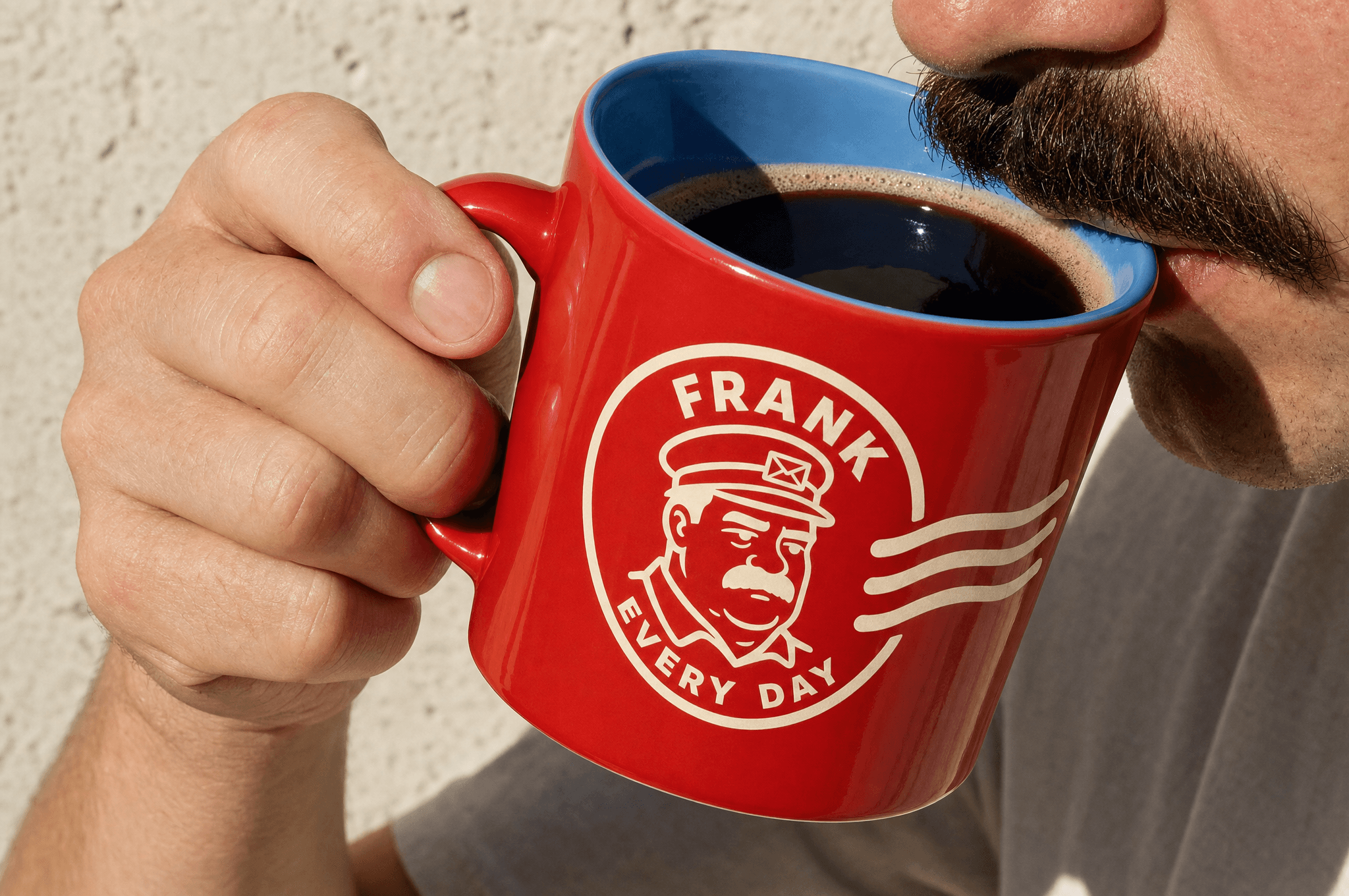
Every bag is struck by hand across the seal with the day it was franked and the day to drink it by. Crooked, ink-starved, never twice the same. The date is not the pitch, it is the receipt: if he really does turn up every day, the coffee in your hand was roasted days ago rather than months ago, and the seal is where you go to check. Putting that on the only hand-made element on the pack is the whole point, because a claim you can be caught out on is worth more than a claim you shout. The mug puts the sky blue on the inside, where you only get to see it once the coffee is going.
Palette
Pillar Box
#EB4B40
Sky
#67AFE1
Cream
#E6D3BC
Ink
#1B3A6B
Voice
You have to get up.
Monday came back.
You have bills. I have bills.
Second class is still coffee.
Fourteen days. After that it is just brown.
The farm is fine. I am the one who turns up.
A postal clerk who has worked the same counter for thirty years, and who is frank in both senses. He states the record and he says the unwelcome true thing, flat, at the hour you least want to hear it. Deliberately the shortest voice in the portfolio, most lines under six words. Two rules hold it together: he never says anything he is not also doing, and he never once motivates you. A motivator wants something. He wants nothing, and that is what makes him warm.
Typefaces
Rounded bubble sans
Wordmark and day number
Grotesque, tight caps
Class, category and legal
Credits
Kyle C., Brendan Forbes
Strategy, identity and art direction
Next
Wobble