Concept work · Reposition
Larder
It's brill with brown butter and capers. What else do you want me to call it?
- Category
- Restaurant and bar
- Scope
- Positioning, brand language, print
- Age
- Ten years trading
The situation
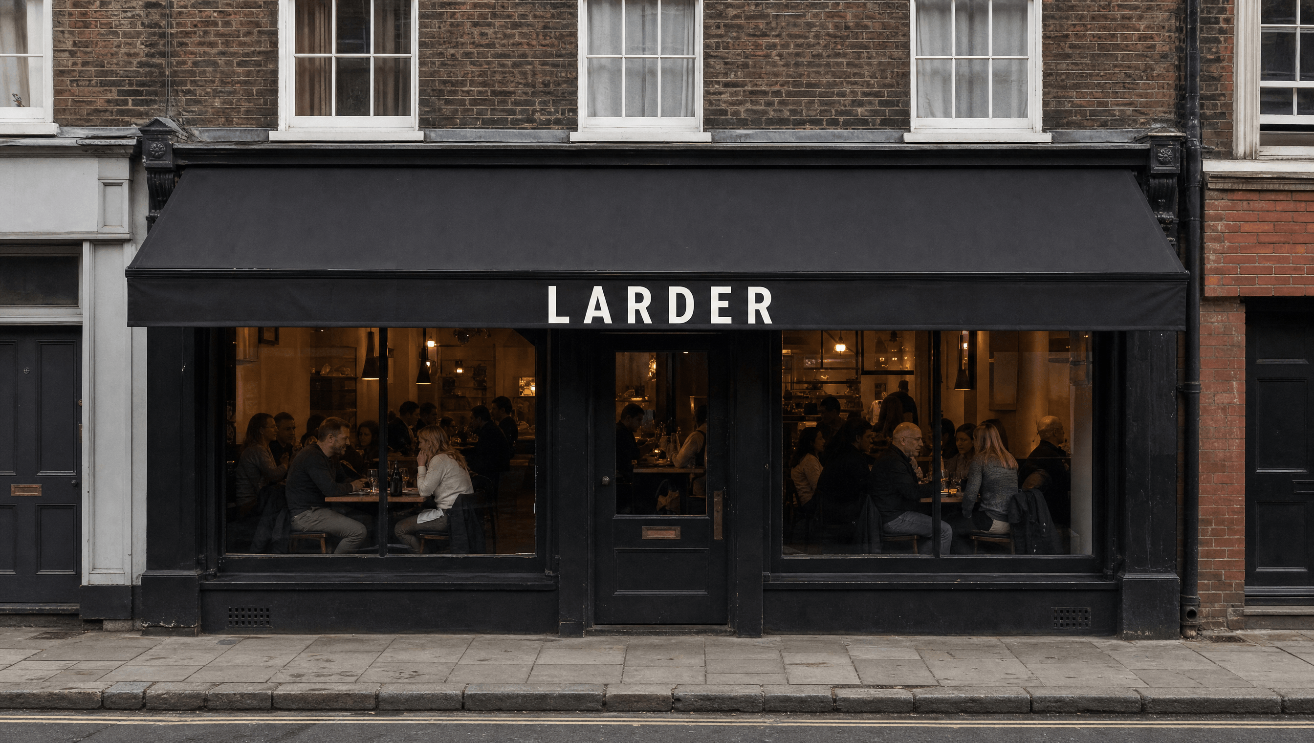
The kitchen moved on ten years ago. The room did not.
Ten years trading, a kitchen the regulars keep coming back for, one of the city's better cocktail programmes, and a loyal set of regulars. But the room and the menu still speak reclaimed wood and filament bulb, the shorthand every restaurant borrowed a decade ago. Newer places with half the food were taking the younger customer.
The enemy
Chalkboard specials, Edison bulbs, and the word seasonal doing all the work.
Chalkboard specials, Edison bulbs, mason jars, and the word seasonal used as a placeholder for effort. It was a signal once. Now every operator owns it, which means it distinguishes nobody and quietly caps what a plate can be sold for.
The position
The only restaurant on the street whose room says what the kitchen actually does, instead of the industry's shorthand for doing it well.
Identity
A wordmark and nothing else
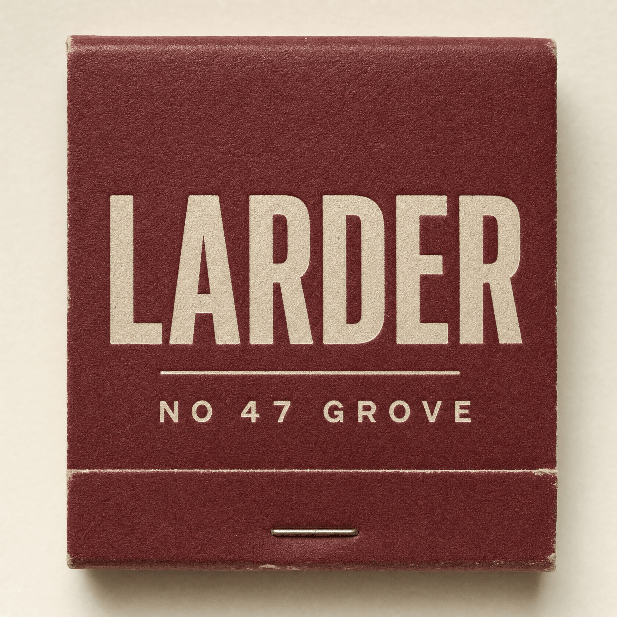
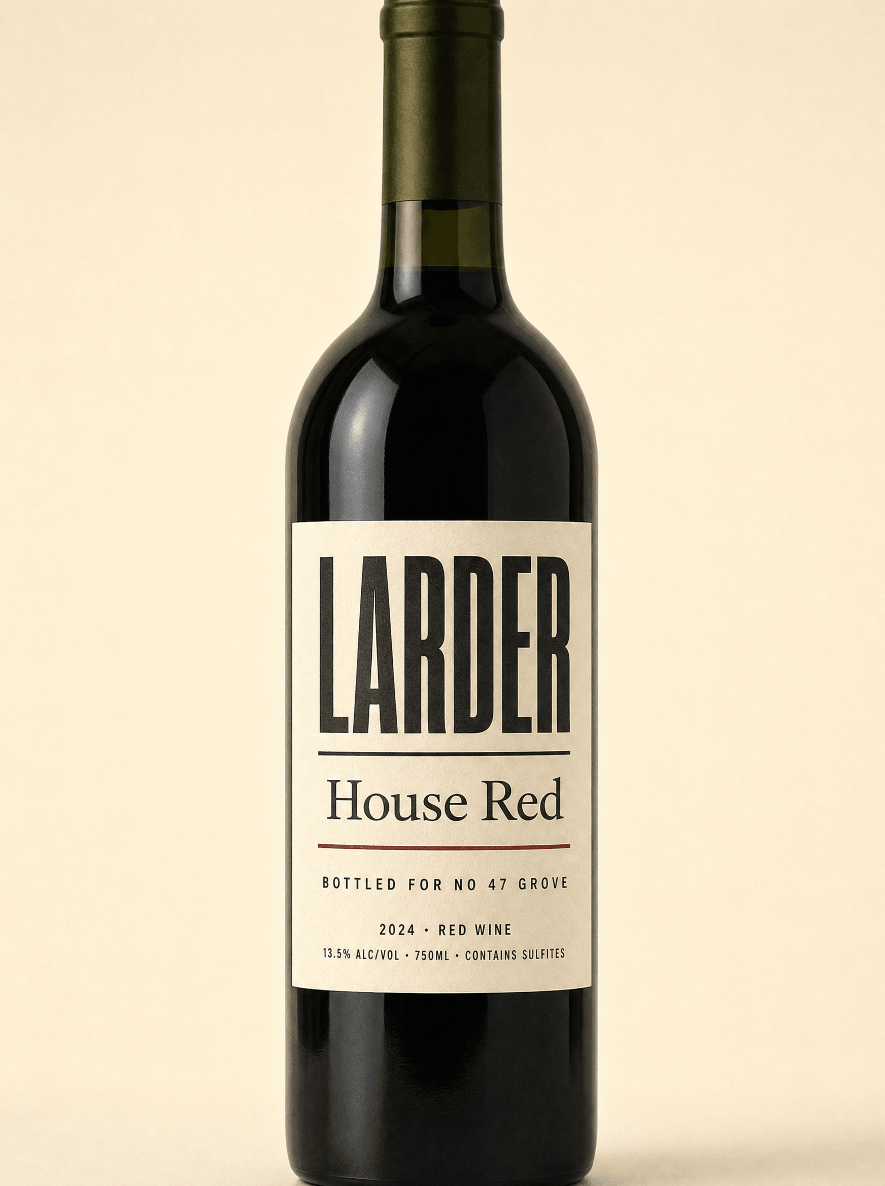
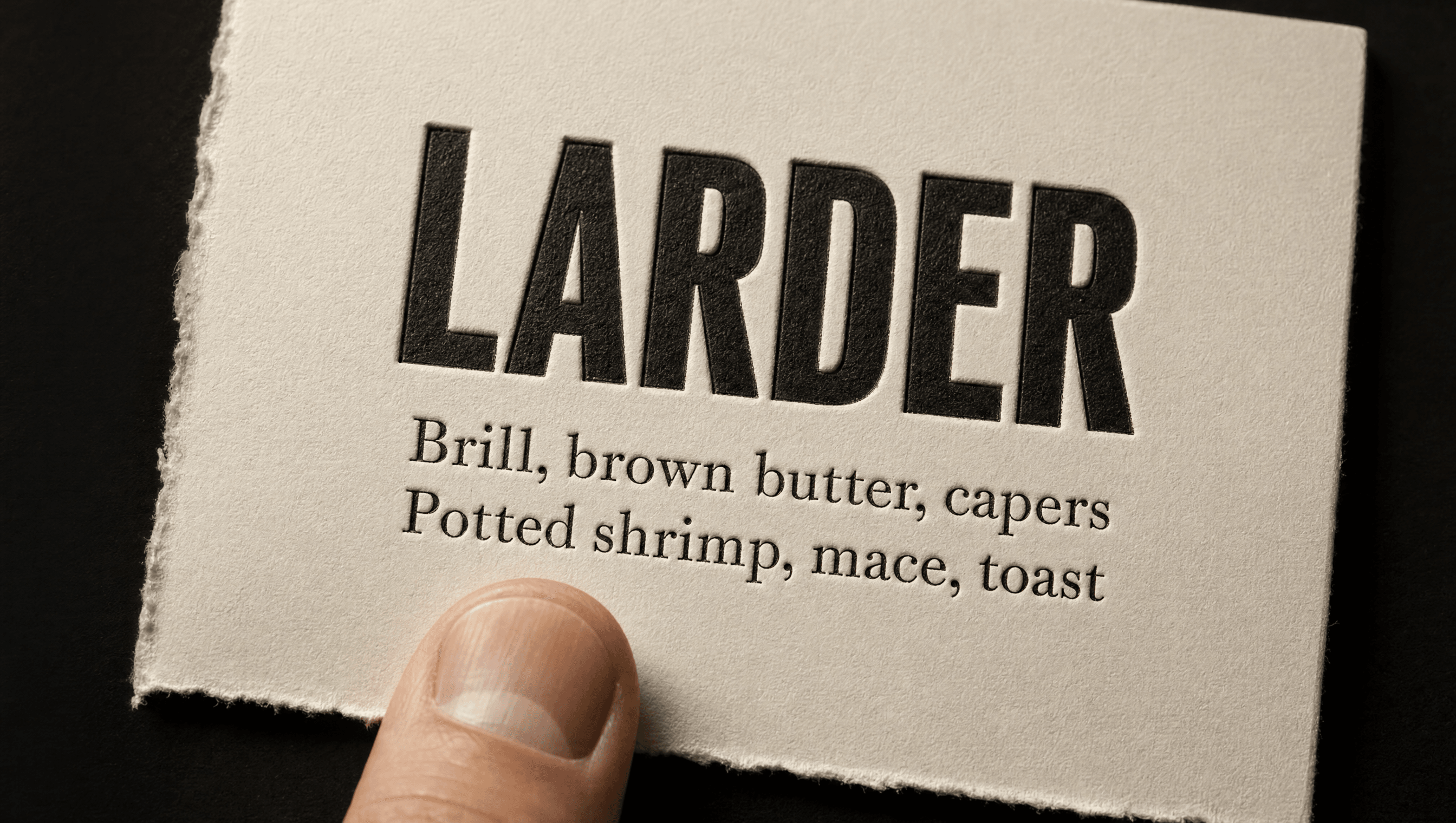
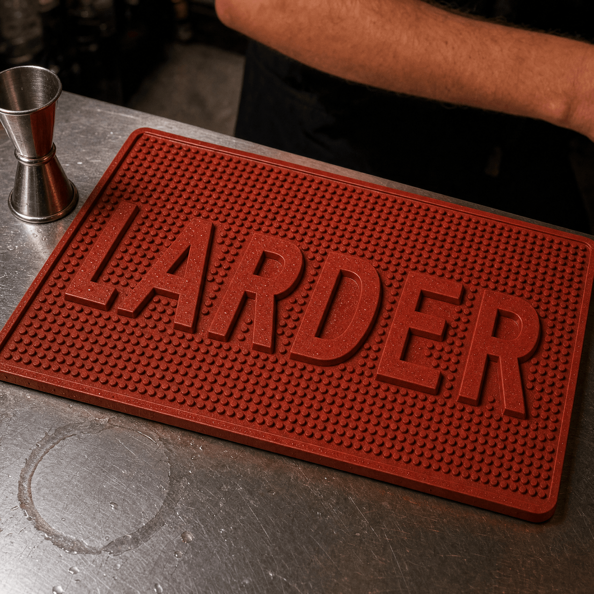
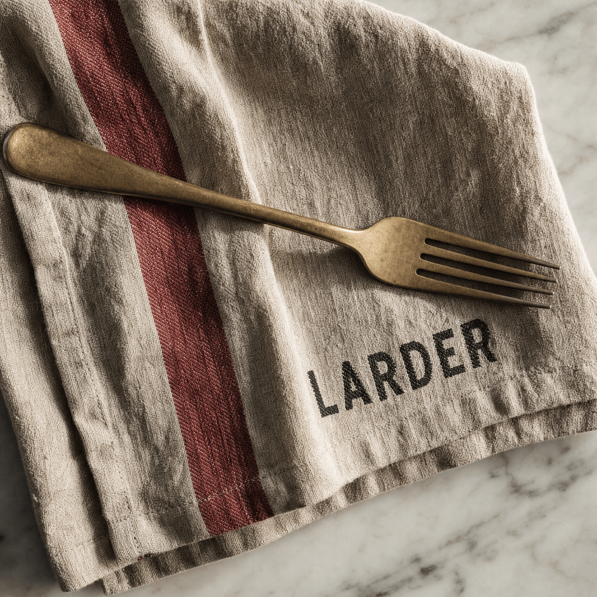
No wheat sheaf, no fork, no hand-drawn anything. The identity is a single wordmark in a nineteenth-century grotesque, letterpress printed so the impression is physically visible in the paper. The category signals craft with illustration. This signals it with a printing method the customer can feel with a thumb.
Colour
Paper, ink, and two things from the kitchen
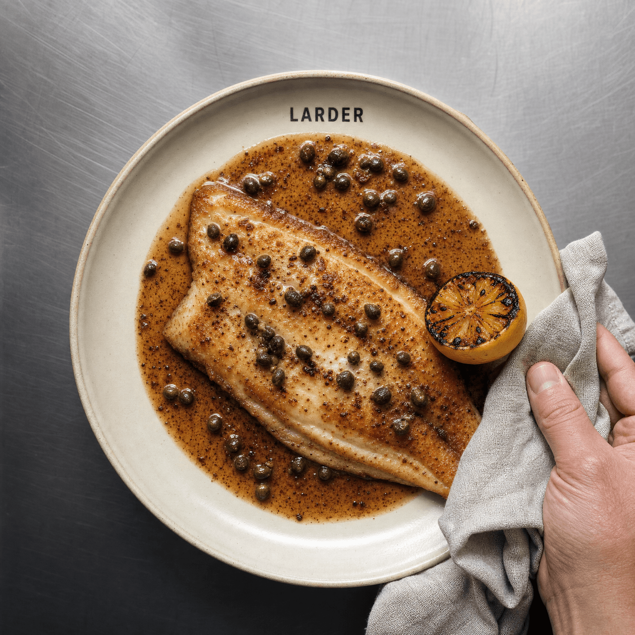
Uncoated paper and ink carry the system. The two accents are taken from the kitchen itself rather than a mood board: preserved lemon and the deep red of a vinegar reduction. Both are things the kitchen actually makes, which means the palette can be explained to a line cook in one sentence.
Typography
A grotesque with a century on it
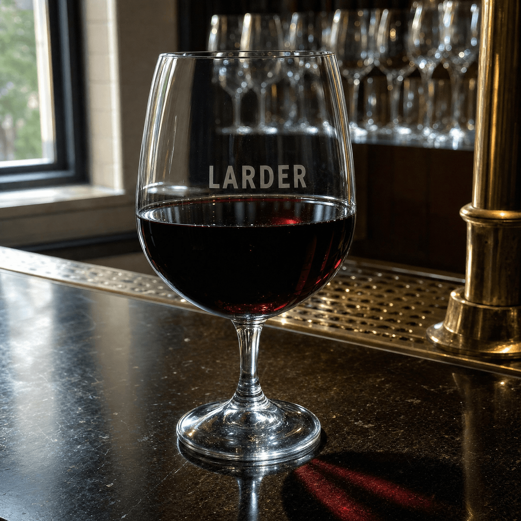
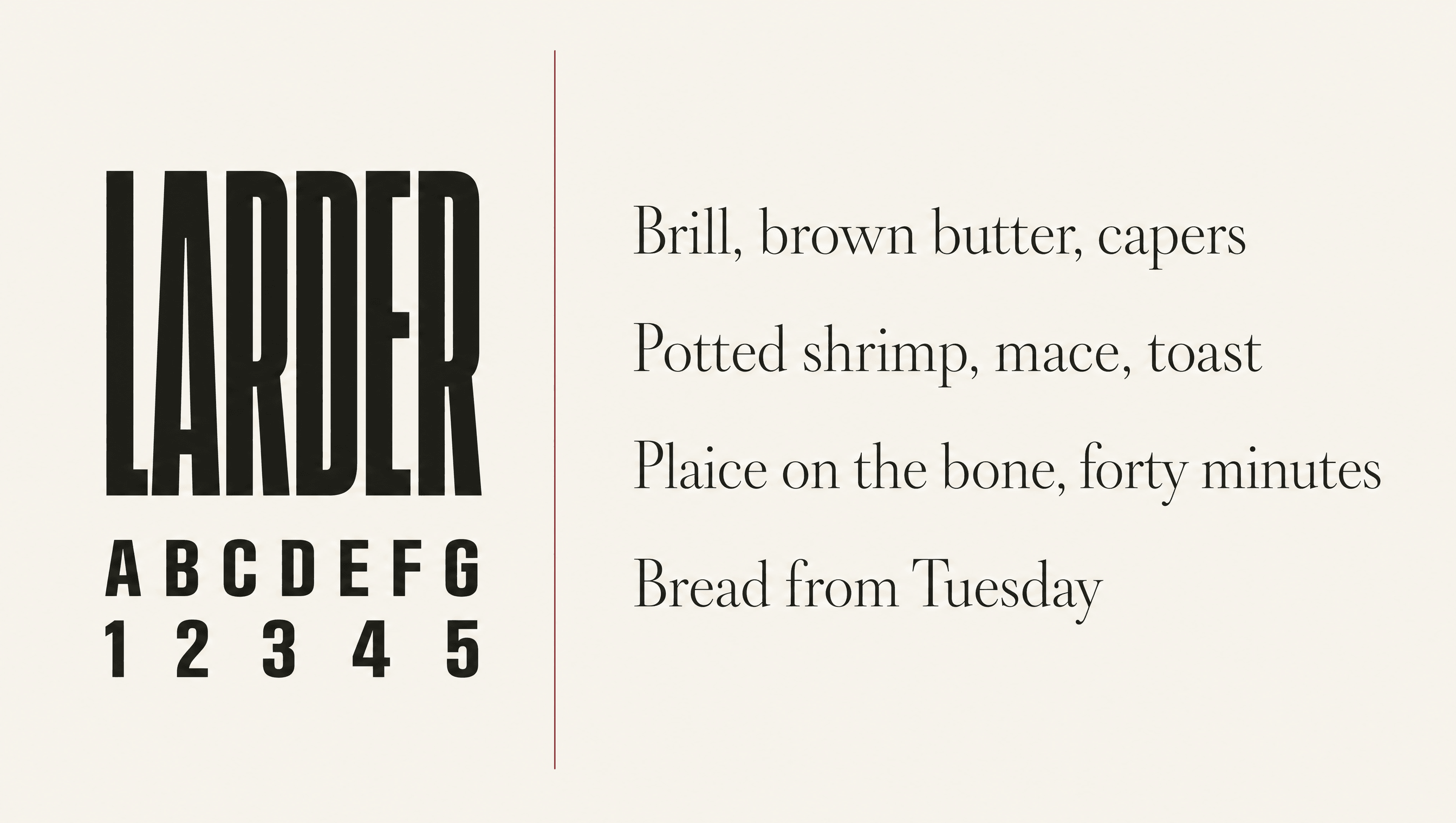
The display face is a nineteenth-century grotesque, chosen because it predates the farm-to-table look by a hundred years and therefore cannot be read as part of it. The text serif carries the menu. Both are set with generous leading and printed letterpress, so the page holds up under a candle and a wine glass.
Application
Rolled out from the menu outward
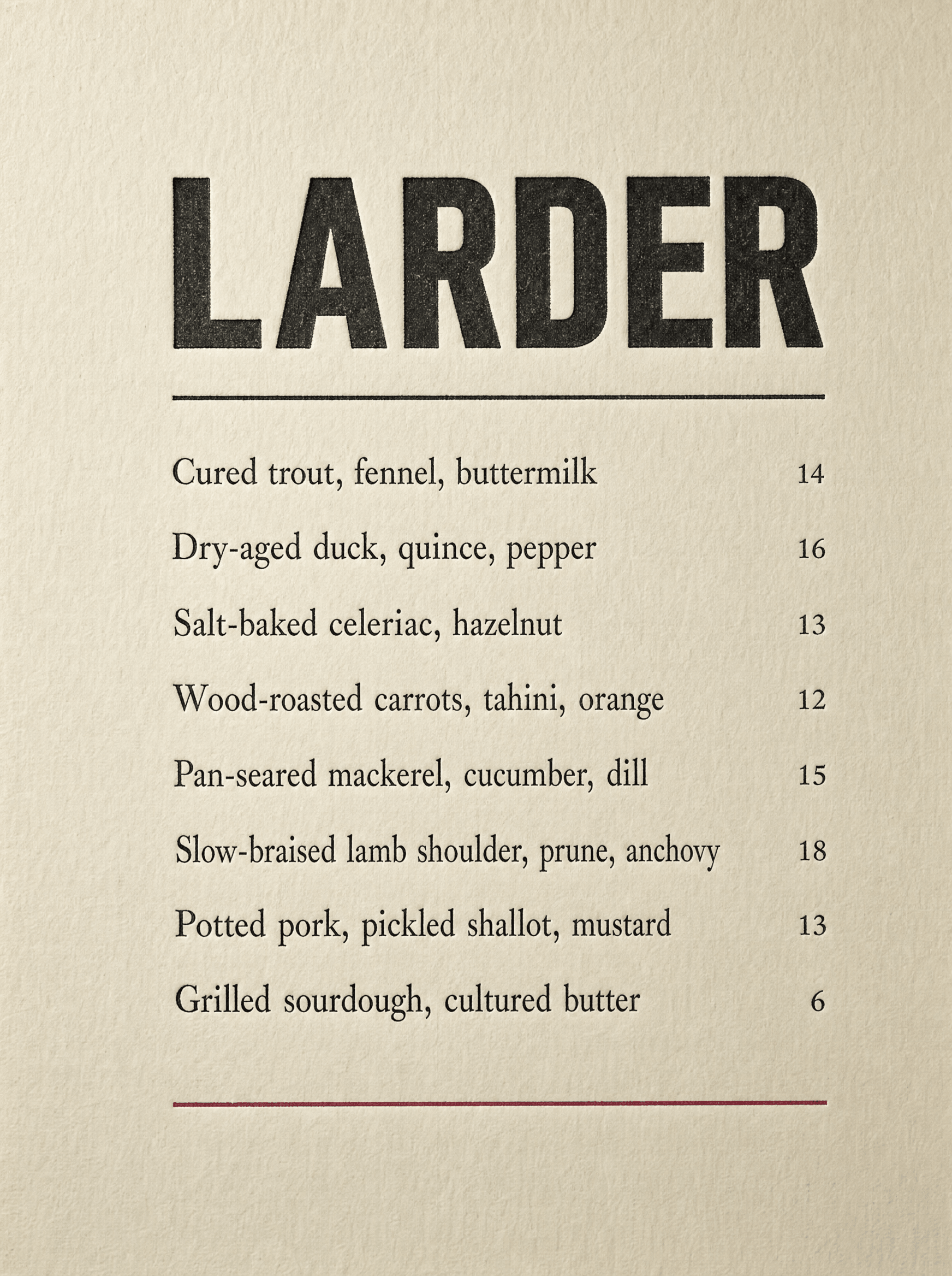
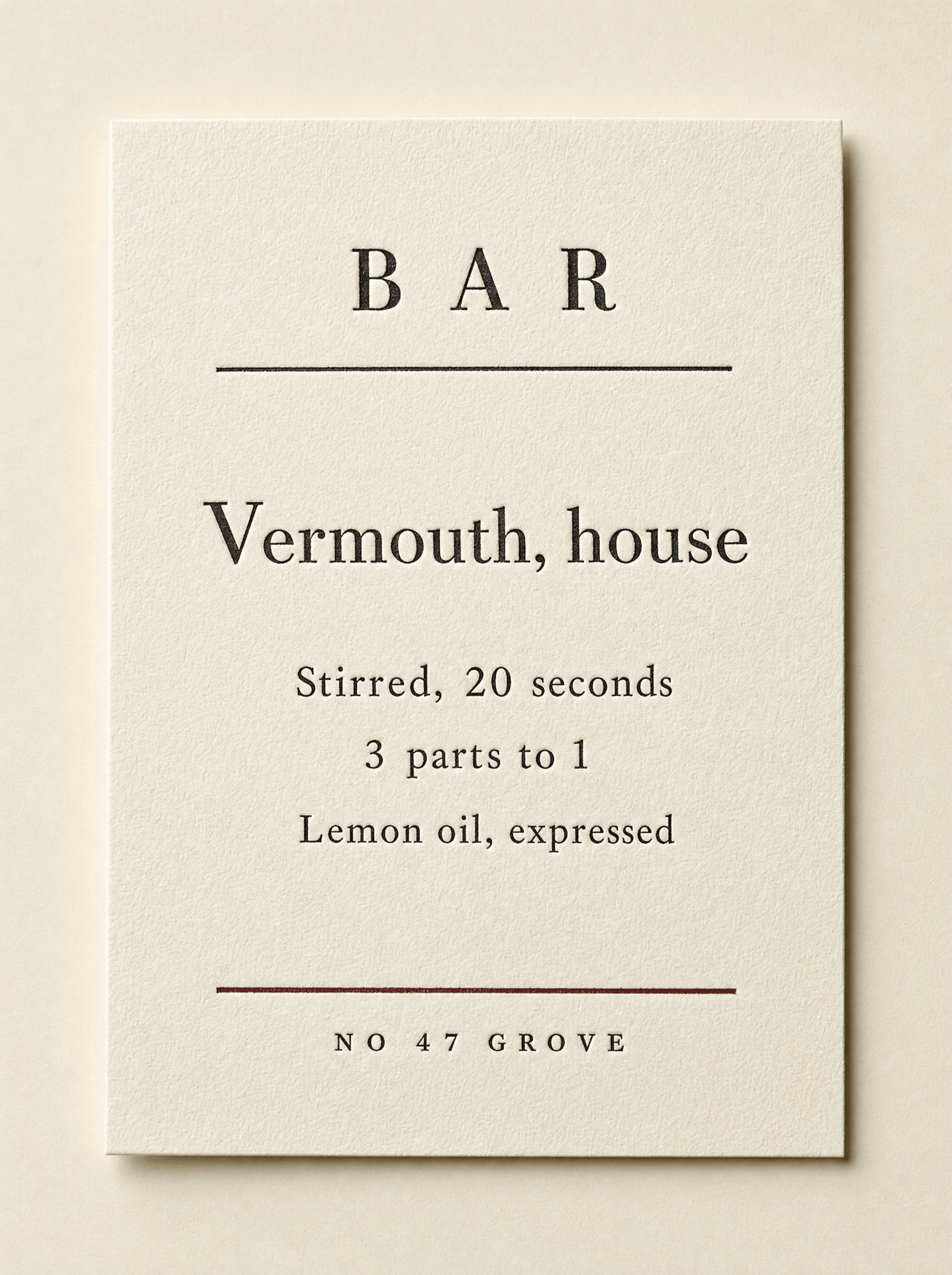
The menu changed first, because it is the cheapest thing to reprint and the thing every customer reads. Then the bar cards, which explain technique instead of listing tasting notes. Then signage, then the room. Sequencing it this way meant the repositioning was earning its keep months before anyone paid for joinery.
Palette
Paper
#F4F1E8
Ink
#14140F
Preserved Lemon
#C8A02C
Vinegar
#6E1F2A
Voice
It's in season because it's on the plate. That's all season means.
We don't do a tasting menu and we won't.
Bread's from Tuesday. Better Wednesday.
If you want it well done we'll do it, but we'll be sad about it.
Nothing on that menu needs explaining.
A gruff chef who is slightly annoyed you asked. Contracted, argumentative, willing to tell you no and then do it anyway with a comment. An adjective may never do a noun's job here, which is why nothing is seasonal, humble or thoughtfully sourced.
Typefaces
Caslon Doric
Display, signage
Lyon Text
Menu, long copy
Credits
Kyle C., Brendan Forbes
Strategy, identity and art direction
Next
Umbra